Tiles can drastically change the ambiance of a room, but not all colors are timeless. Some tile colors have faded out of style, leaving them only suitable for retro museums rather than contemporary homes.
Let’s explore 10 outdated tile colors that might once have dazzled but now detract from modern aesthetics.
1. Avocado Green
Avocado green was all the rage in the 1970s, gracing kitchens and bathrooms with its distinct hue. Despite its popularity back then, this shade now evokes a nostalgic yet outdated vibe.
Modern design trends favor more neutral and versatile colors, making avocado green tiles a challenging choice for contemporary homes. They often clash with today’s sleek and minimalist decor styles.
To update such spaces, consider replacing these tiles with softer greens or neutral tones that offer a fresh and timeless appeal. Avocado green tiles, though charming in their day, belong in the past.
2. Harvest Gold
Harvest gold was another staple of the 1970s, often paired with deep browns and oranges. This warm, mustard-like color was popular in kitchens and bathrooms.
However, its boldness now feels overwhelming and mismatched with contemporary decor themes that lean towards subtlety and sophistication. Harvest gold tiles can make a space feel dated and heavy.
For those looking to refresh their homes, opting for lighter, more neutral tiles can open up spaces, making them appear larger and more inviting. Harvest gold, while nostalgic, is best left in the past.
3. Mauve
Mauve, a soft purple hue, saw its heyday in the 1980s, especially in bathrooms. This color sought to create a calming atmosphere but now feels distinctly retro.
Today’s design preferences often favor clean lines and muted palettes, making mauve tiles a jarring addition to modern aesthetics. They can seem dated and out of place in contemporary settings.
Replacing mauve tiles with more neutral or earthy tones can instantly modernize a bathroom, aligning it with current design trends and creating a more cohesive look.
Mauve is a shade best admired in retro settings.
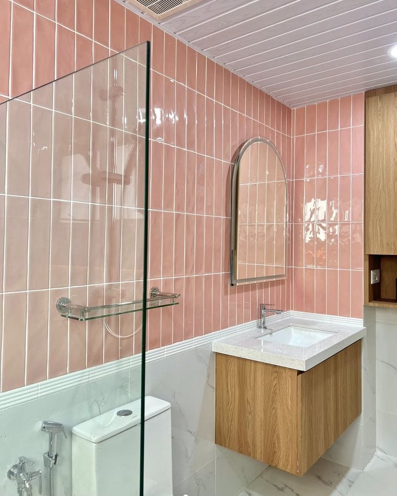
4. Peach
Peach tiles gained popularity in the 1990s, bringing a soft warmth into kitchens and bathrooms. Despite its once-charming appeal, peach now feels outdated in contemporary design.
Its subtle pinkish hue clashes with the more prevalent cool tones and monochromatic schemes found in modern homes. Peach tiles can make spaces appear smaller and less cohesive.
For a modern refresh, consider replacing them with muted grays or whites, which offer versatility and elegance. Although peach tiles were once trendy, they no longer align with today’s design sensibilities.
5. Powder Blue
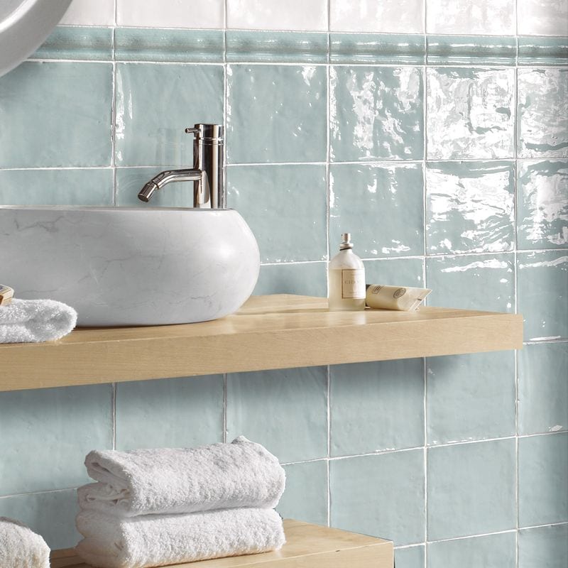
Powder blue was a beloved choice for bathrooms in the 1960s, offering a light and airy ambiance. However, its pale tone now feels more retro than relevant.
Modern interiors often embrace bolder or more neutral colors, leaving powder blue behind in the design world. It can make spaces seem old-fashioned and less dynamic.
To update a room with this hue, consider replacing the tiles with deeper blues or crisp whites, aligning with current trends. While powder blue tiles have charm, their time has passed.
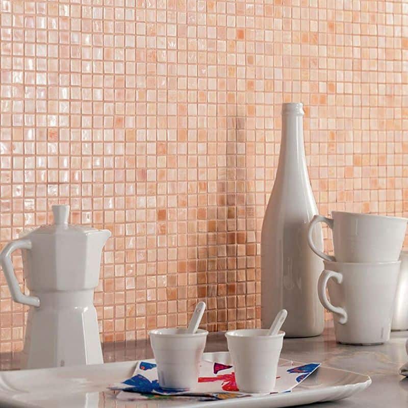
6. Salmon Pink
Salmon pink tiles were a popular choice in the 1950s, adding a pop of color to many kitchens.
This vibrant hue, while cheerful, now seems out of step with modern tastes. Today’s preferences often gravitate towards more subdued and versatile tones, making salmon pink appear outdated.
These tiles can dominate a room in a way that feels overpowering rather than stylish.
For a fresher look, consider tiles in softer pastels or neutral shades that balance well with diverse decor styles. Salmon pink is a color best appreciated in historical contexts.
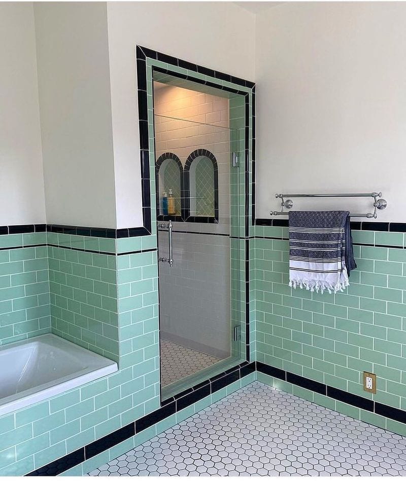
7. Teal
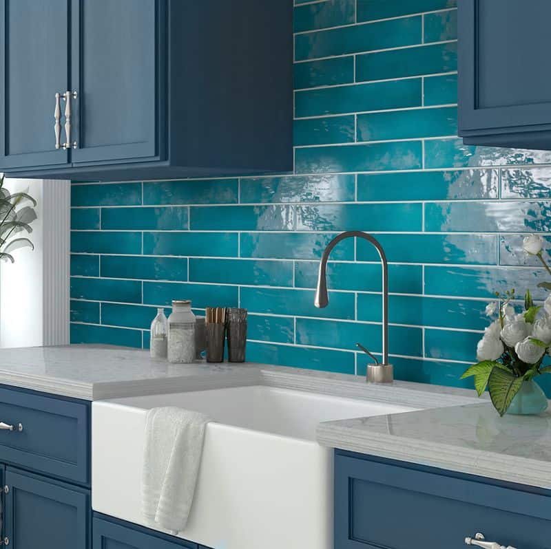
Teal tiles made a splash in the 1970s, providing a vibrant and exotic touch to bathrooms. However, this bold color now can feel overwhelming and passé.
Modern aesthetics often favor simplicity and a restrained color palette, leaving teal tiles looking like relics of a bygone era. They can complicate decor choices and limit design flexibility.
For a contemporary update, swap them for tiles in soft blues or muted earth tones, lending a serene and timeless feel to the space. Teal tiles, while once trendy, are now best suited to retro themes.
8. Terracotta
Terracotta tiles, with their warm, earthy tone, were a hit in the 1980s, especially in sunrooms and kitchens.
Despite their natural appeal, they can now appear dated. The rich, reddish-brown color can clash with modern decor styles that prefer lighter, airier palettes.
Terracotta can make spaces feel smaller and less open. Updating these spaces with softer neutrals or cool grays can create a fresh and inviting atmosphere.
While terracotta tiles have a certain charm, they often don’t complement today’s design trends effectively.
9. Dusty Rose
Dusty rose was a favored tile color in the 1990s, offering a muted pink option for bathrooms.
This subtle shade, however, feels distinctly dated today. Contemporary design often opts for more neutral or contrasting palettes, leaving dusty rose looking old-fashioned.
It can make spaces appear stuck in the past. For a modern makeover, consider replacing them with tiles in crisp whites or soft beiges, enhancing the room’s brightness and versatility.
Dusty rose tiles, while nostalgic, are not aligned with current design preferences.
10. Mint Green
Mint green tiles were a staple in the 1950s, bringing a fresh and lively touch to kitchens. However, this pastel hue now feels more nostalgic than modern.
Today’s design trends often embrace more saturated or neutral colors, making mint green seem outdated.
It can clash with contemporary decor, lacking the versatility needed for modern aesthetics. To rejuvenate such spaces, consider alternatives in cool grays or deeper greens, aligning with current styles.
Mint green tiles, while charming in their time, are best suited for retro designs.