When it comes to cabinet colors, experts have strong opinions about what not to choose. Here are 5 colors that designers recommend you avoid for your cabinets.
These choices can drastically affect the room’s ambiance and might not age well. Choosing the right color can enhance your space, while the wrong one may leave you regretting your decision for years.
Let’s explore these color choices and the reasons behind their absence from designer palettes.
1. Bright Orange
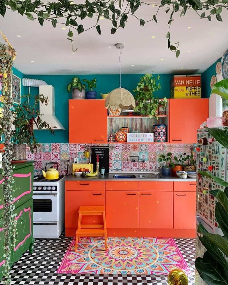
Bright orange can overwhelm a kitchen space, making it feel smaller and more chaotic. Its intensity draws too much attention and can clash with other elements in the room.
While it may seem like a fun choice initially, its boldness may soon become tiring. Many designers find that neutral tones allow for more flexibility in decor choices.
If you love orange, consider using it as an accent color instead. This can bring vibrancy without overwhelming the space. Opt for colorful utensils or small appliances instead.
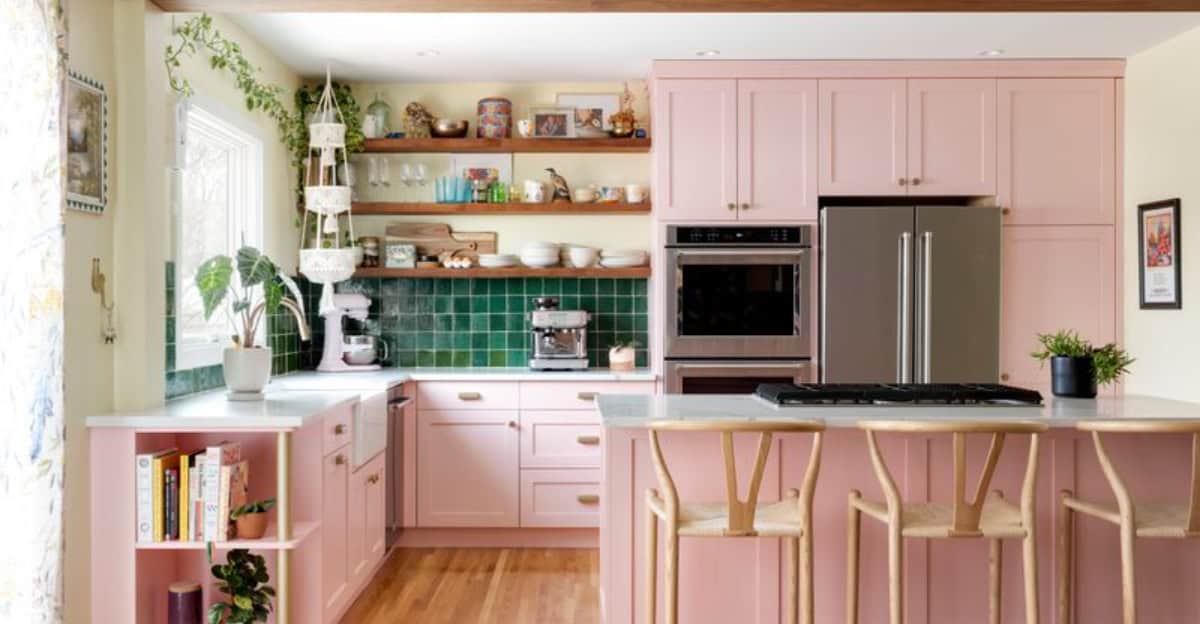
2. Pastel Pink
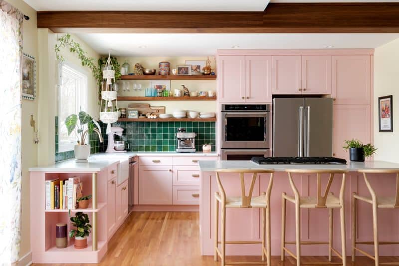
Pastel pink might seem charming, but it can make cabinets look dated and overly feminine. This color often struggles to pair well with most kitchen accessories.
Designers suggest that pastel pink can limit creativity in the kitchen’s overall design theme. Instead of a cohesive look, it may create dissonance.
If you’re a fan of pink, try incorporating it through flowers or dishware. This approach maintains the charm without dominating the color scheme. By doing so, you ensure a fresh and balanced appearance.
3. Jet Black
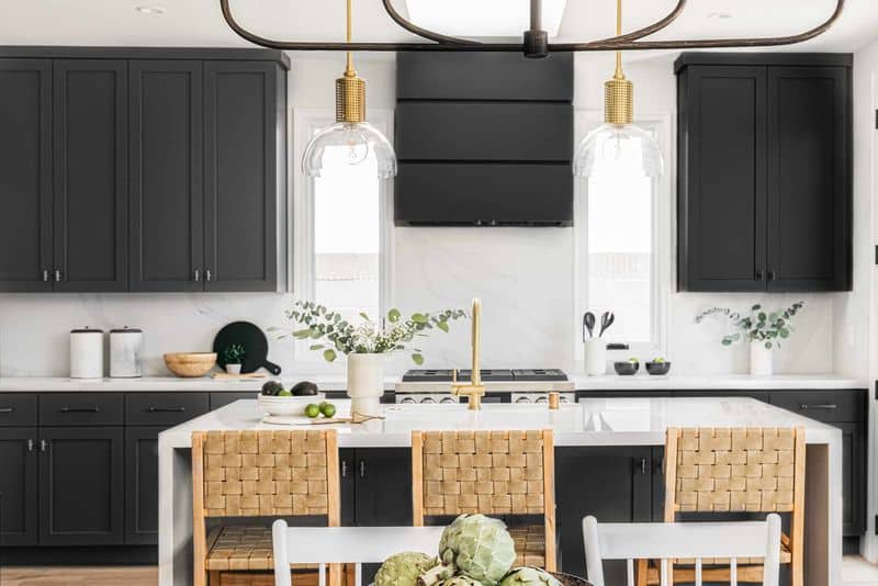
Jet black cabinets may seem sleek, but they often lead to a dark and closed-off kitchen space. This color tends to absorb light, making the room feel smaller.
Many designers advise against it due to the difficulty in maintaining a clean look. Dust and fingerprints are more noticeable on dark surfaces.
If you prefer a darker palette, consider deep greys or muted tones. These options offer sophistication without the maintenance challenges of black. Keep the room airy and balanced by incorporating lighter elements.
4. Lime Green
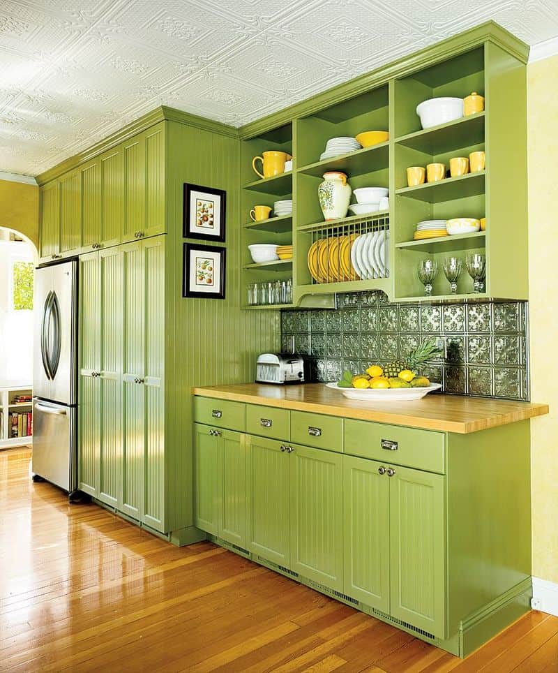
Lime green is vibrant, yet it can overpower a kitchen, leaving little room for adaptability in decor. Its starkness can clash with other hues, creating visual dissonance.
This bold choice might feel refreshing initially but can become overwhelming over time. Designers suggest choosing more subtle greens if you like the color family.
Consider using lime green in moderation, such as with accessories or a feature wall. This allows for a fresh feel without dominating the space. A balanced approach can enhance your kitchen’s design.
5. Fire Engine Red
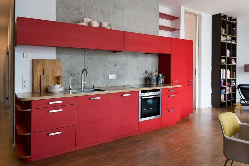
Fire engine red is striking but can make a kitchen look aggressive and unwelcoming. Its intensity often dominates, leaving little room for subtlety in design.
Designers caution that it can quickly become overbearing, clashing with softer tones and limiting decor options. Instead, choose muted reds to create a warm atmosphere.
Experiment with red accents through textiles or small fixtures. This approach maintains the energy of red without overwhelming the space. A well-balanced palette ensures a harmonious kitchen environment.