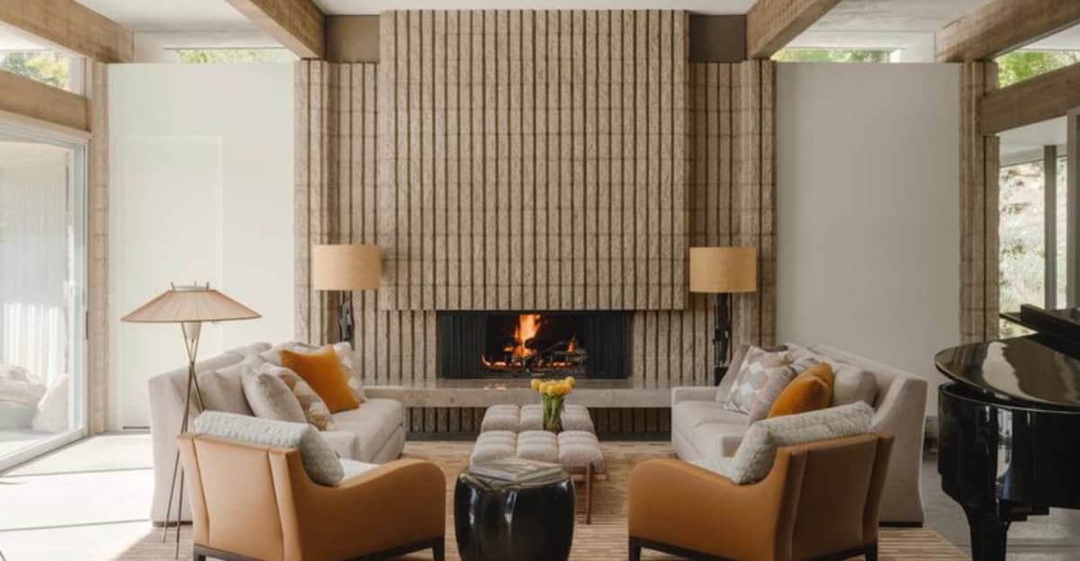
The world of interior design is vibrant and ever-evolving, with color playing a pivotal role in setting the tone and mood of a space.
Designers often rely on certain colors and shades to create harmony and evoke emotions. Here, we explore the top 10 colors and shades that are consistently favored in interior design projects.
Whether it’s a calm retreat or a vibrant gathering space, these colors are the go-to choices that every designer swears by.
1. Classic White
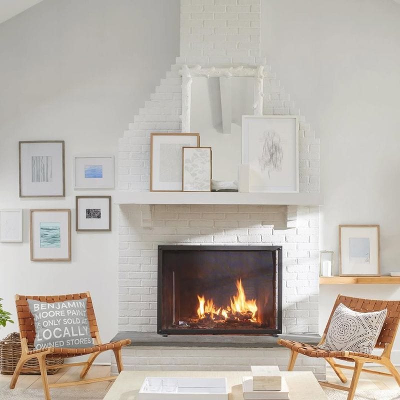
White is the epitome of purity and simplicity, often used as a base to let other elements shine. It’s a color that brings a sense of cleanliness and space, making rooms appear larger.
Designers love using white to create a neutral background that complements any style and allows for flexibility in decor.
Different shades of white, such as eggshell or ivory, can soften the look, adding warmth without losing the fresh vibe.
In modern spaces, white walls and ceilings can highlight architectural details, while in more traditional settings, they can provide a classic backdrop.
2. Soothing Gray
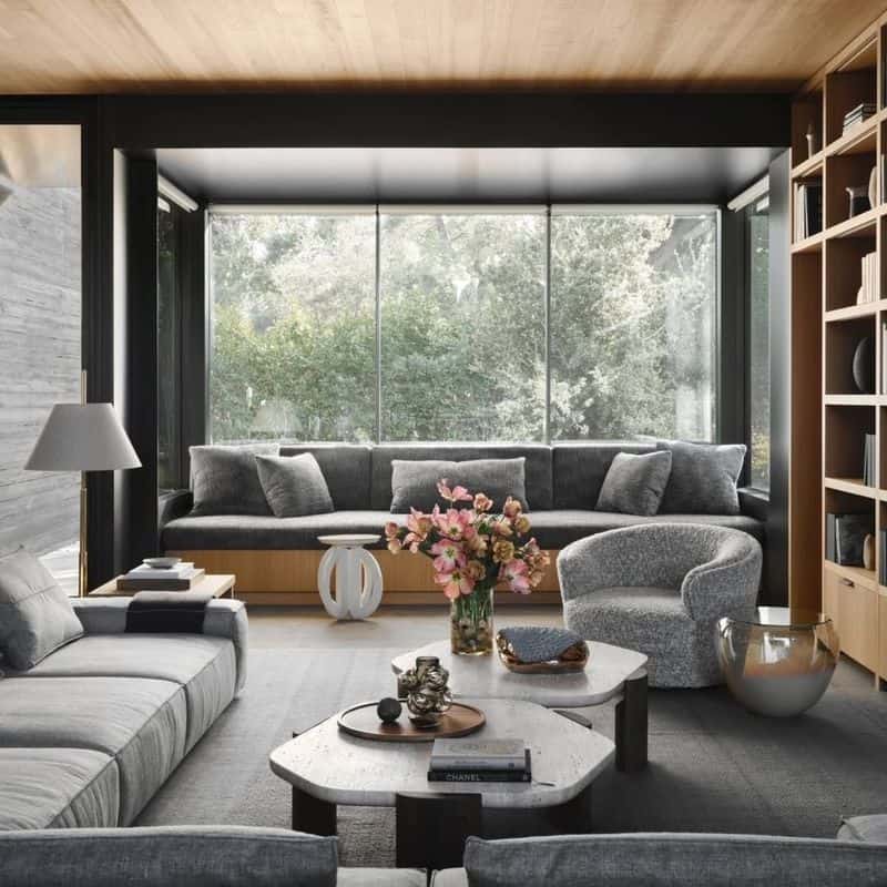
Gray offers a sophisticated and calming presence, acting as a versatile neutral that adapts to any style. It’s a favorite in countless design projects for its ability to exude elegance without overwhelming.
Light gray shades can make a space feel airy, while dark grays add depth and drama. Gray also pairs seamlessly with both bold and subtle colors, making it ideal for layering.
Designers often turn to gray to bring a modern touch to interiors, ensuring the ambiance remains serene and stylish. It’s less stark than white but equally adaptable.
3. Warm Beige
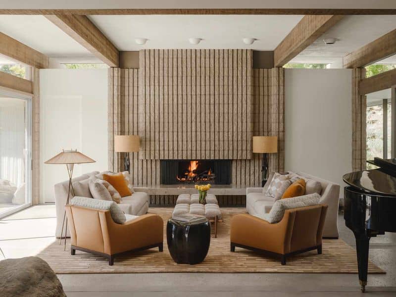
Beige is synonymous with warmth and comfort, often used to create inviting and cozy environments. Its earthy tones blend effortlessly with natural materials like wood and stone.
In interior design, beige offers a timeless appeal that suits a variety of styles from rustic to contemporary. It can transform a cold room into a welcoming sanctuary.
Designers appreciate beige for its versatility and ability to complement bold accents. It can be a calming backdrop or a main color in a palette, effortlessly adapting to the desired mood.
4. Elegant Navy Blue
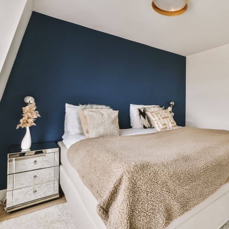
Navy blue is a color of elegance and depth, often used to add a touch of luxury to spaces. It brings a sense of calm and authority, making it perfect for dining rooms and offices.
Paired with metallics or whites, navy creates a striking contrast that elevates the room’s aesthetic. It’s a bold choice that speaks to both tradition and modernity.
Designers love navy for its ability to anchor a space, providing a rich backdrop that highlights art and furniture. It’s a classic color that never goes out of style, offering timeless appeal.
5. Fresh Sage Green
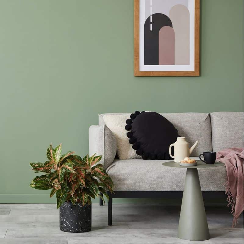
Sage green brings the serenity of nature indoors, offering a fresh and rejuvenating feel to any space. It’s often used to create a connection with the outdoors.
This soothing shade works beautifully in kitchens and bathrooms, providing a calm environment that promotes relaxation. Paired with natural wood tones, it can transform spaces into serene retreats.
Interior designers cherish sage for its subtlety and versatility, as it seamlessly blends with both contemporary and vintage styles. Its gentle tone allows for creativity in accessories and accents.
6. Rich Burgundy
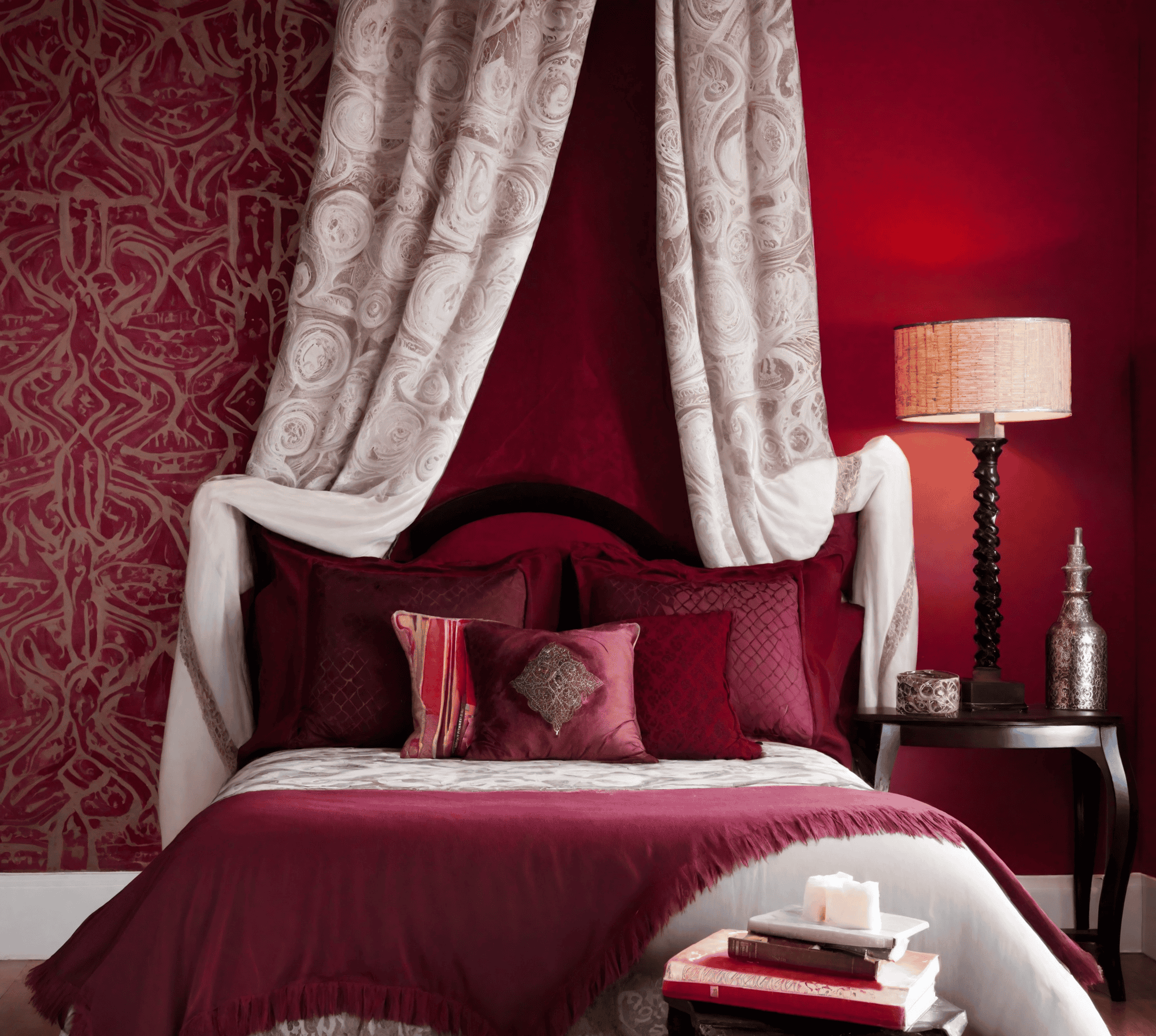
Burgundy is a rich, warm color that adds a sense of luxury and depth to interiors. It’s often chosen for its ability to create a cozy and inviting atmosphere.
This regal shade complements both classic and modern styles, offering an opulent touch without being overpowering. Paired with gold or cream accents, burgundy can transform a room into a lavish retreat.
Designers utilize burgundy to introduce warmth and sophistication, making it ideal for living rooms and libraries. It’s a bold choice that leaves a lasting impression, enhancing the overall decor.
7. Tranquil Lavender
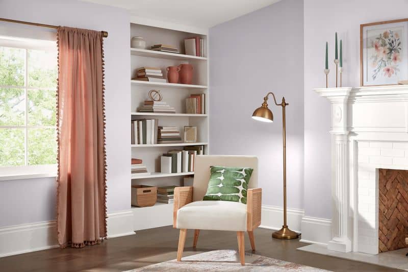
Lavender is synonymous with tranquility and relaxation, often used in bedrooms and bathrooms to create soothing retreats. Its gentle hue promotes a sense of calm and serenity.
This soft shade is perfect for spaces where relaxation is key, offering a peaceful ambiance that encourages rest. Paired with whites and pastels, lavender adds a dreamy quality to interiors.
Designers embrace lavender for its ability to soften a room while maintaining sophistication. It’s a versatile color that adapts well to various styles, from shabby chic to contemporary.
8. Moody Charcoal
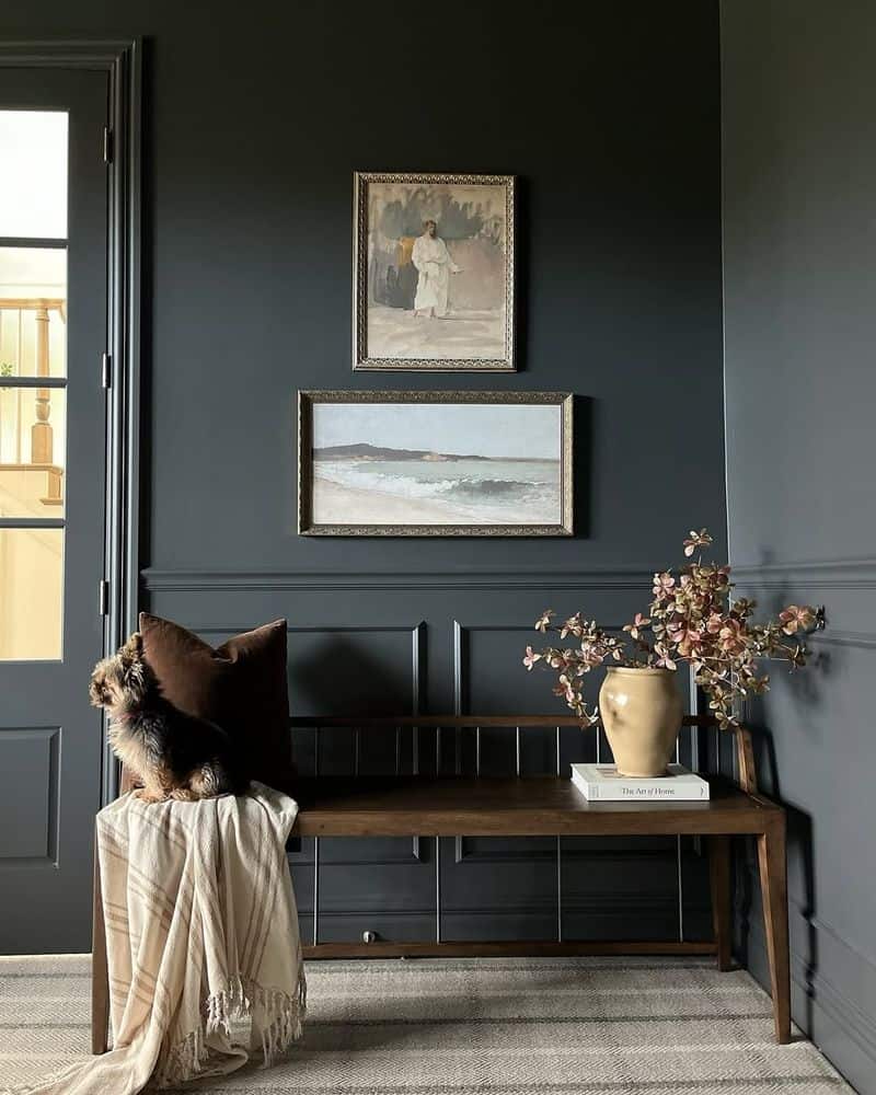
Charcoal adds a moody sophistication to spaces, often used in modern and industrial designs to create a dramatic effect. Its dark, rich tones bring a sense of depth and intrigue.
This versatile shade can ground a room, offering a bold backdrop that highlights art and furnishings. Paired with bright accents, it creates a striking visual contrast.
Designers favor charcoal for its ability to create a contemporary edge, making it a popular choice for feature walls and modern lofts. It’s a daring color that adds character and dimension.
9. Sunny Yellow
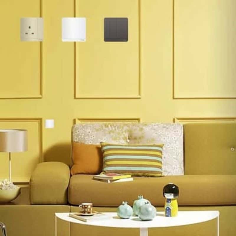
Yellow evokes happiness and warmth, bringing a cheerful vibe to any space. It’s frequently used in kitchens and dining areas to create an inviting atmosphere.
This lively color captures the essence of sunshine, making rooms feel brighter and more spacious. It pairs beautifully with whites and natural elements for a balanced look.
Designers often use yellow to energize a room, ensuring the space is welcoming and vibrant. It’s a bold choice that infuses interiors with positivity, perfect for spaces that thrive on activity and social interaction.
10. Timeless Black
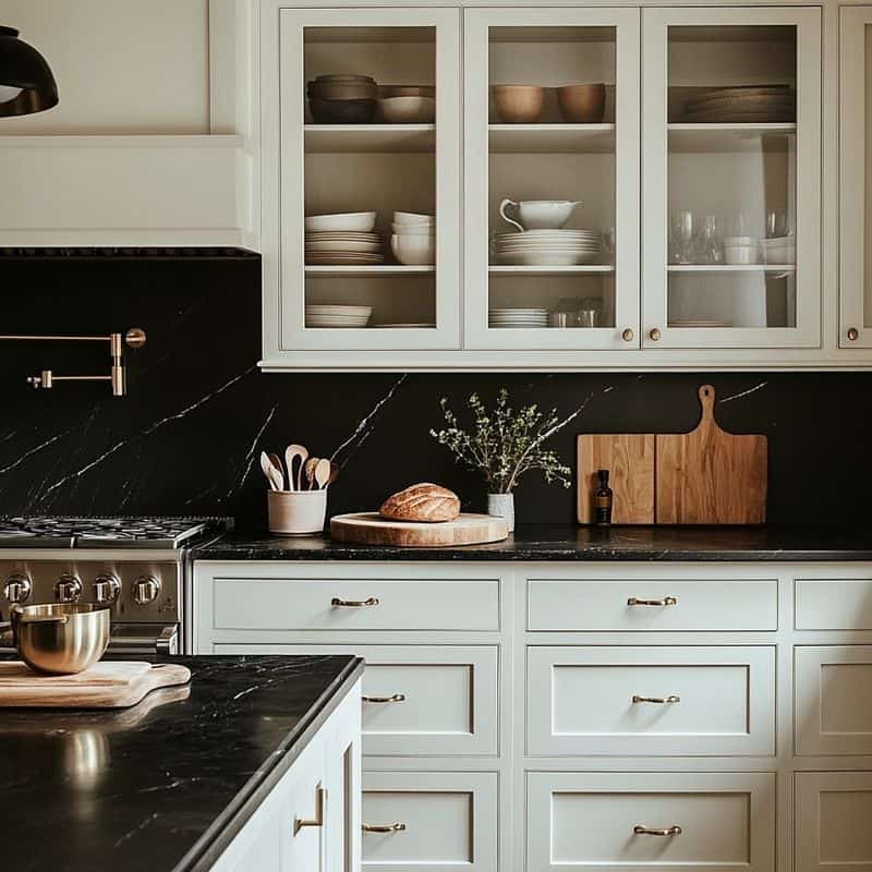
Black is the epitome of elegance and sophistication, a timeless choice for creating contrast and drama in interiors. It’s often used to highlight architectural features and decor.
This classic color can transform a space, adding depth and a sense of luxury. Paired with white, it creates a monochrome palette that’s both modern and striking.
Designers love black for its ability to anchor a room, offering a bold statement that never goes out of style. It’s a versatile color that complements a wide range of aesthetics, from minimalist to opulent.

