Kitchen colors, much like fashion, ebb and flow with the times.
While some hues stand the test of time, others… well, let’s just say they haven’t aged quite as gracefully.
Join us as we take a look at 10 kitchen colors from the past that may have seemed chic once upon a time but now leave us scratching our heads.
1. Avocado Green
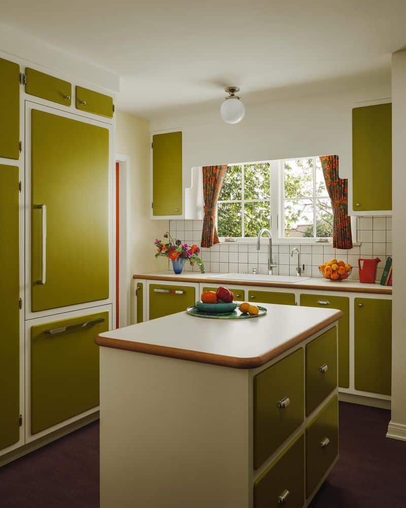
Ah, Avocado Green – the color that’s as divisive as pineapple on pizza. This hue dominated kitchens in the 1970s, adorning everything from fridges to ovens.
While it aimed to bring a natural element indoors, today it feels more like an overripe avocado left too long on the counter.
The color is reminiscent of a bygone era of shag carpets and disco balls, leaving us wondering what inspired such a verdant takeover.
Modern kitchens have since traded this bold green for more muted, neutral tones, leaving Avocado Green firmly in the past.
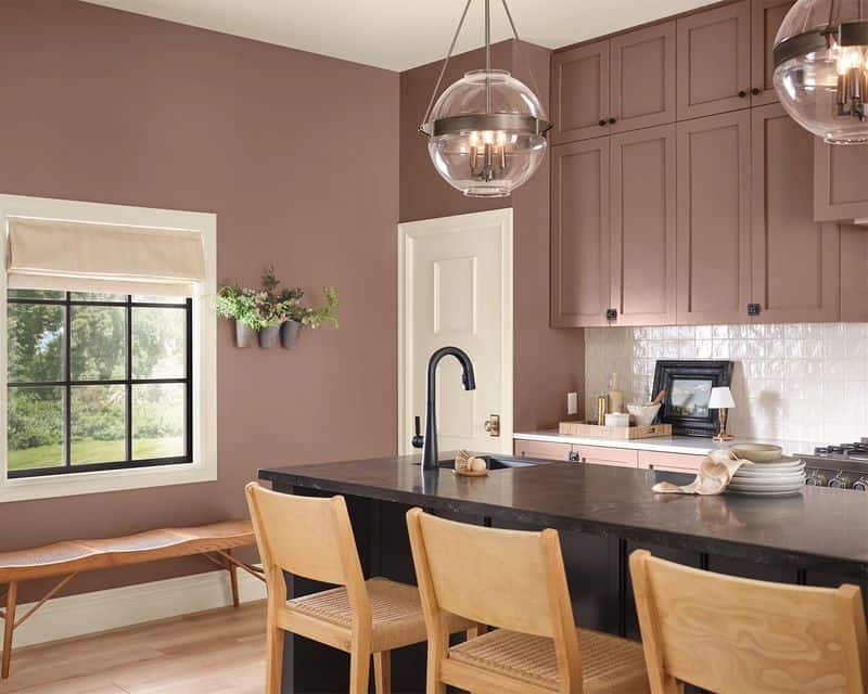
2. Pastel Pink
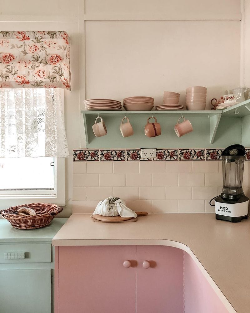
Pastel Pink had its heyday in the 1950s, when it painted kitchens in a rosy hue. Once the epitome of femininity and grace, this color now feels more like a nod to a candy store than a culinary space.
While it added a touch of innocence and warmth, kitchens today favor colors that evoke sophistication and elegance.
Pastel Pink has stepped aside for sleek whites and bold blacks, leaving behind memories of poodle skirts and soda fountains.
It’s a charming reminder of a simpler time, but one that most modern homes have retired.
3. Teal
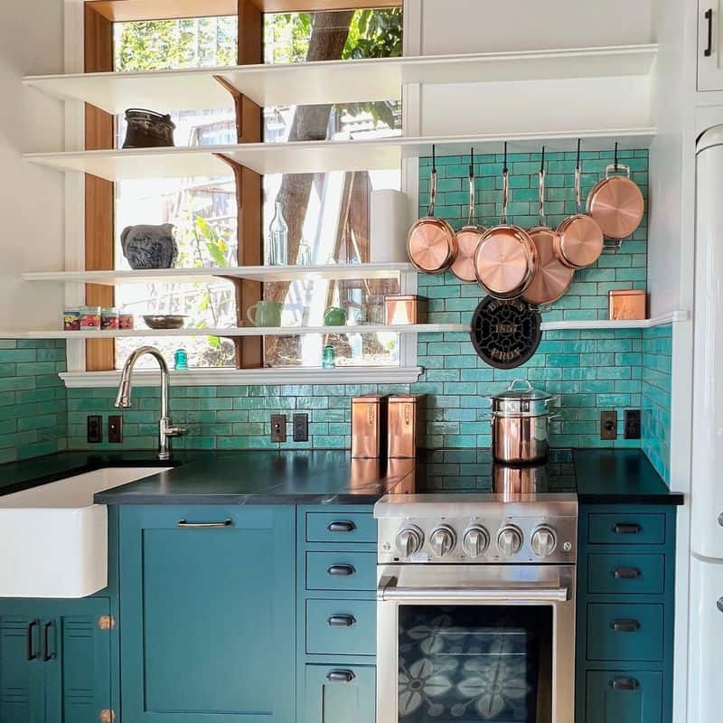
Teal once promised to be the cool, calming breeze of the 1980s kitchen scene. Instead, it now stands as a quirky relic of its time, often paired with equally audacious colors in a bid for attention.
This vibrant shade was a bold choice, aiming to infuse kitchens with a sense of energy and creativity. However, the passage of time has shown that Teal was perhaps too intense for daily living spaces.
As design sensibilities evolved, kitchens have sought balance and harmony, leaving Teal to serve as a colorful reminder of bolder times.
4. Cocoa
Cocoa, the rich and warm hue of the 1970s, tried to wrap kitchens in a cozy embrace. This chocolatey shade was meant to invoke comfort and homeliness, yet over time, it began to feel more like a murky shadow.
The deep brown was overshadowed by trends favoring brighter, airier spaces. While Cocoa had its moment, kitchens today often opt for lighter, more refreshing tones to create a feeling of openness.
The nostalgia for Cocoa remains, but it’s a color best left savoring in memory rather than in the modern-day kitchen.
5. Mustard Yellow
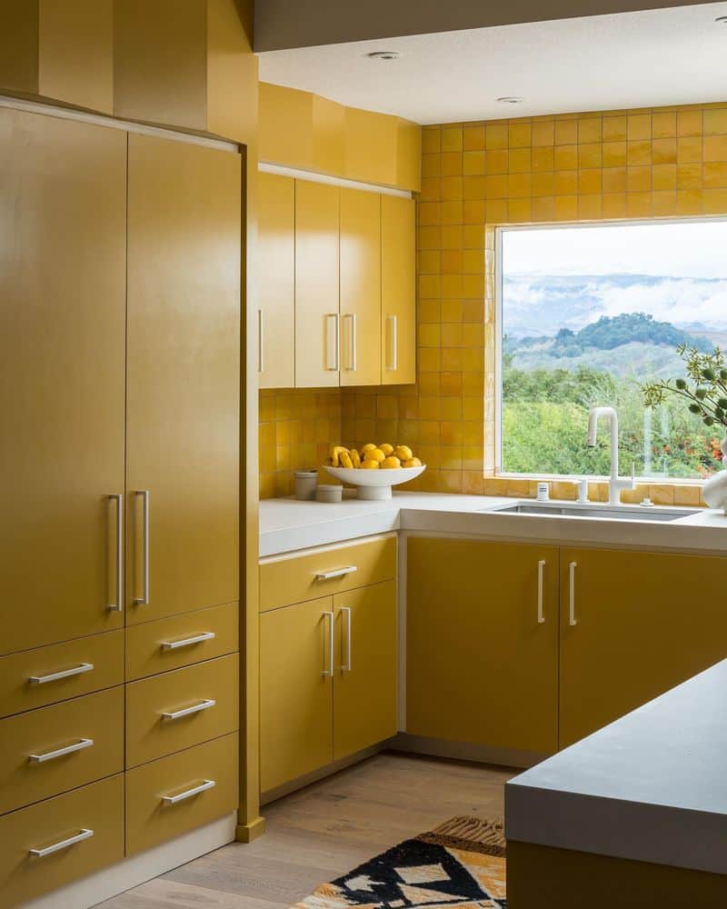
Mustard Yellow, a color as daring as it was divisive, painted kitchens of the 1960s with its unmistakable zest.
It was a bold statement, one that attempted to bring sunshine indoors, but in hindsight, it feels more like a faded Polaroid of excess.
This intense yellow could overwhelm the senses and clash with other elements in the space. It’s no wonder that today’s kitchens prefer a more subdued palette, favoring subtler hints of color.
Mustard Yellow, once a sign of culinary adventure, now serves as a sunny memory of yesteryear’s bold choices.
6. Mint Green
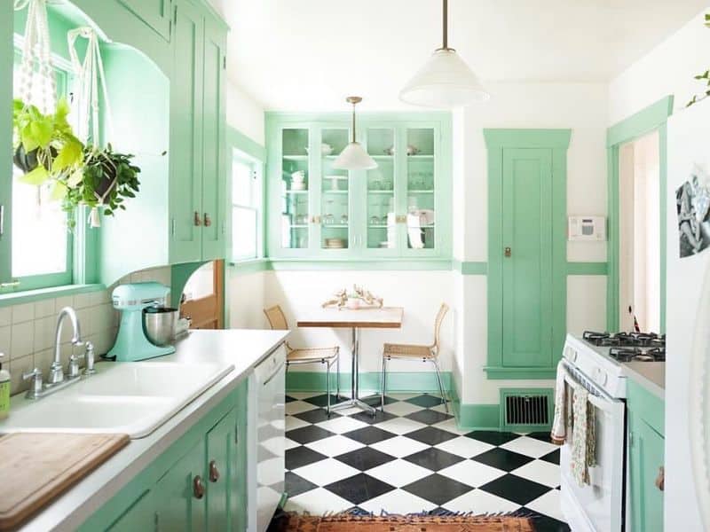
Mint Green was the darling of the 1950s, a hue that promised freshness and vitality. However, like a peppermint candy left out too long, it’s lost its initial appeal in modern kitchens.
The color can evoke a sense of nostalgia for an era filled with optimism, yet today’s designs seek more timeless elegance.
While Mint Green once brought a light, airy feel to kitchens, it now stands as a quaint reminder of a time past.
Contemporary kitchens have moved toward colors that offer versatility and a more sophisticated charm.
7. Orange Wood
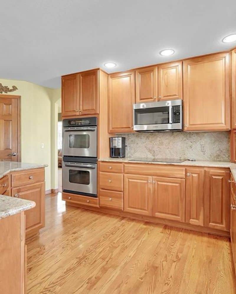
Orange Wood, a staple in the 2000s, aimed to infuse kitchens with warmth and a sense of nature. Unfortunately, it often resulted in spaces that felt more like a pumpkin patch than a home.
The bold orange hue tried to make kitchens vibrant and lively, yet it often clashed with other design elements. As tastes shifted, the trend moved towards more neutral and harmonious wood tones.
Orange Wood’s time in the spotlight has passed, but it remains a vivid memory of a period unafraid of color experimentation.
8. Bright Red
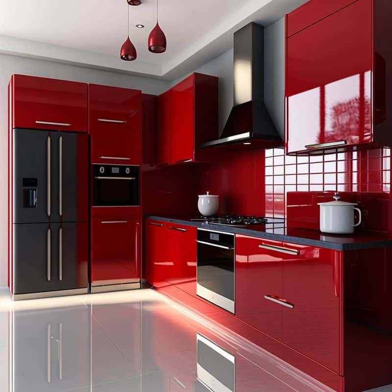
Bright Red burst onto the kitchen scene in the 1980s with the intensity of a fire engine.
This daring color was meant to ignite passion and energy, but it often resulted in kitchens that felt more like fast-food joints than cozy family spaces.
The boldness of Bright Red can be overwhelming, especially when used in large doses. Today’s kitchens lean toward colors that promote calmness and tranquility, setting aside the fiery tones of the past.
Bright Red, while unforgettable, is a blazing icon of a more audacious design era.
9. Purple
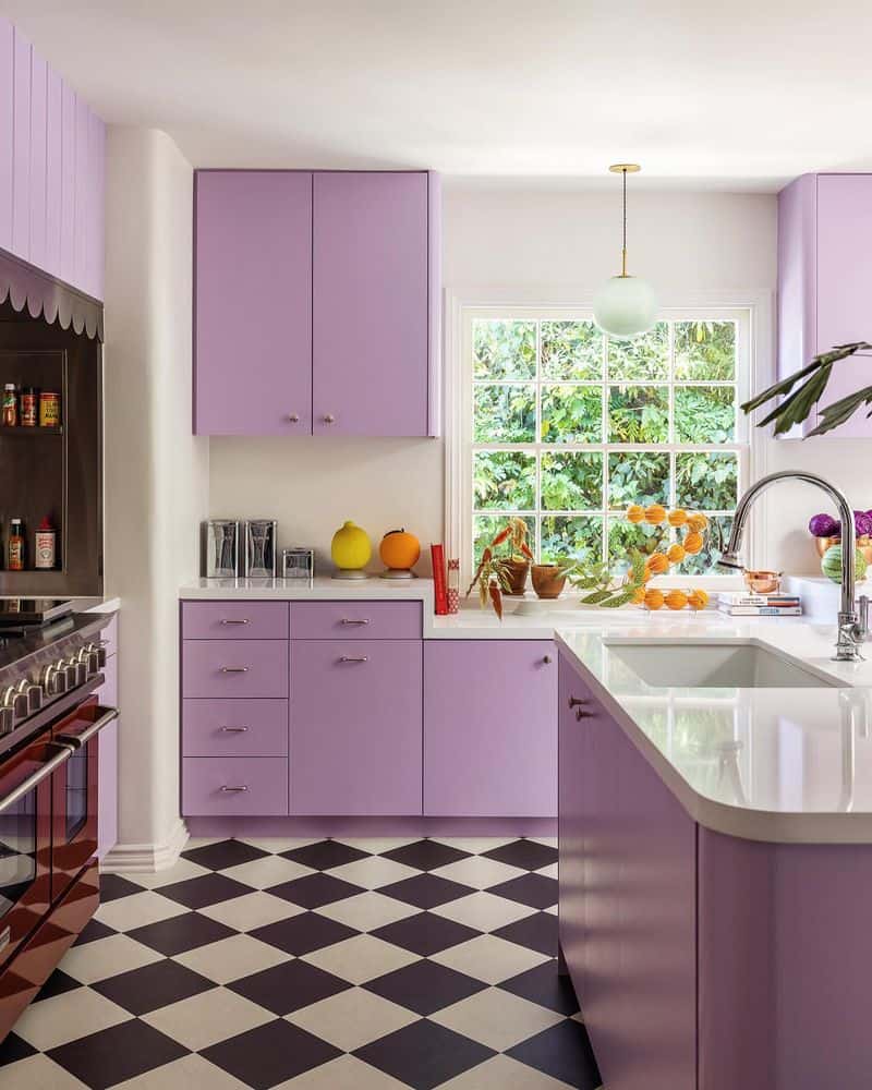
Purple, the regal color of the 1990s, attempted to bring a touch of royalty to kitchens. However, it often created spaces that felt more like a whimsical fairy tale than a practical cooking area.
The vibrant hue could easily dominate and overwhelm, making it challenging to pair with other colors. Kitchens today tend to favor more balanced and versatile palettes, moving away from the grandeur of Purple.
While it left a royal mark, Purple serves as a colorful reminder of a decade unafraid to make bold statements.
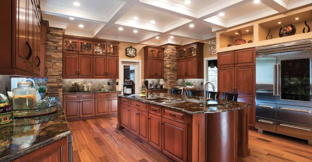
10. Cherry Red Wood
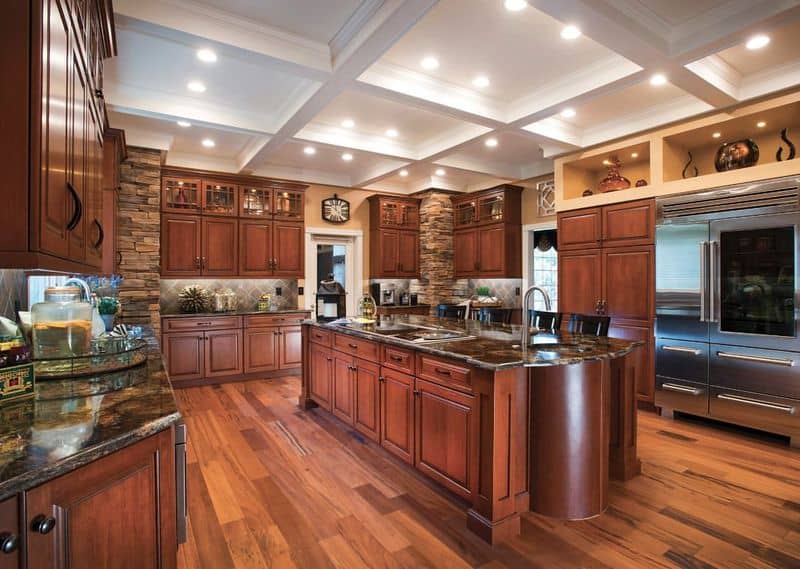
Cherry Red Wood, popular in the 1990s, aimed to add an element of luxury and warmth to kitchens. While initially appealing, the deep red tones began to feel heavy and dated over time.
The richness of the color often competed with lighter elements, creating a sense of imbalance. Modern kitchens seek to create spaces that are open and inviting, opting for lighter wood finishes or painted surfaces.
Cherry Red Wood, though luxurious, is a reminder of a time when bold was beautiful, yet not always practical.