Creating a flawless color scheme for your interior design can be as rewarding as it is challenging.
From understanding color theory to applying practical tips, these 11 tips will guide you through choosing the perfect colors that reflect your style and enhance your space.
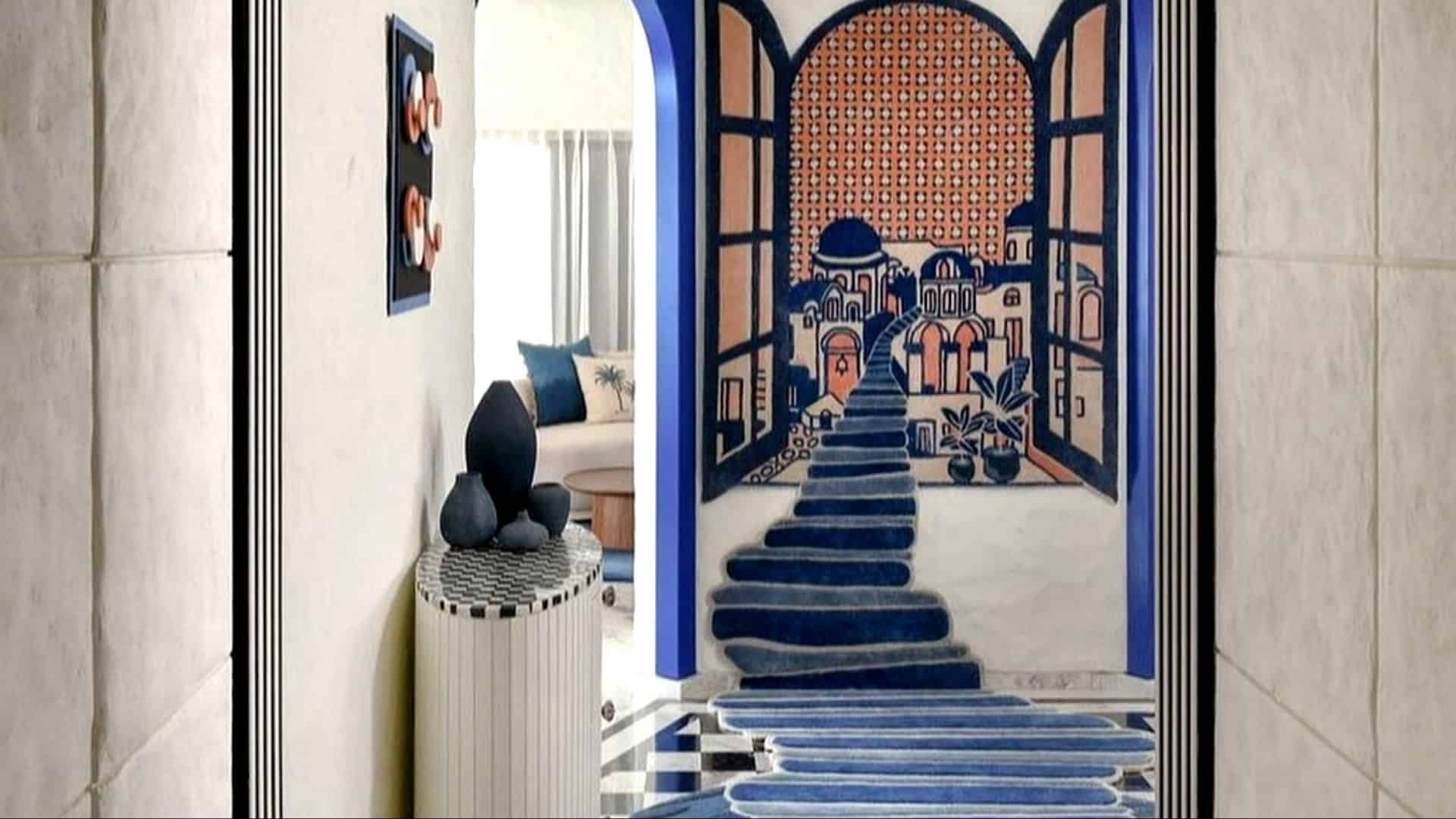
1. Trust Your Intuition
While guidelines are helpful, your intuition is key. Trust your gut when choosing colors. Personal taste often leads to the most satisfying results.
If a combination resonates with you, it’s likely to feel right in your space. Don’t be afraid to experiment beyond conventional palettes.
Your home should reflect your personality and preferences.
This personal touch is what makes a space uniquely yours. Embrace the joy of creating a color scheme that feels like home.
2. Start with a Base Color
Selecting a base color sets the tone for your entire color scheme. This dominant hue should reflect your intended atmosphere.
Whether it’s a calming blue or a neutral gray, the base color anchors your design. Once chosen, use it consistently across large surfaces such as walls and floors.
This creates a cohesive look. Next, integrate secondary and accent colors that complement and highlight the base, enhancing your room’s aesthetic.
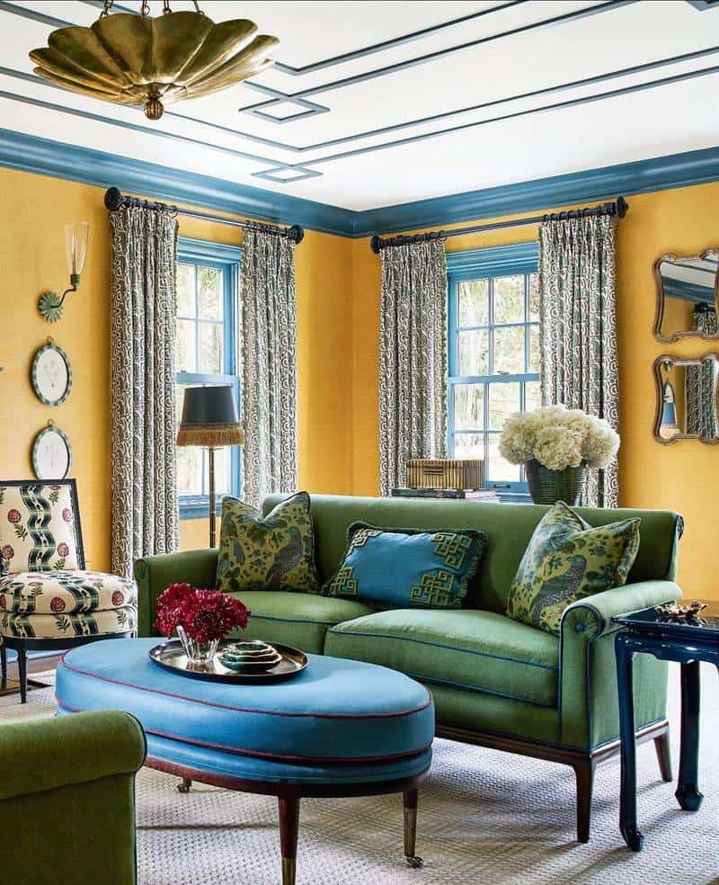
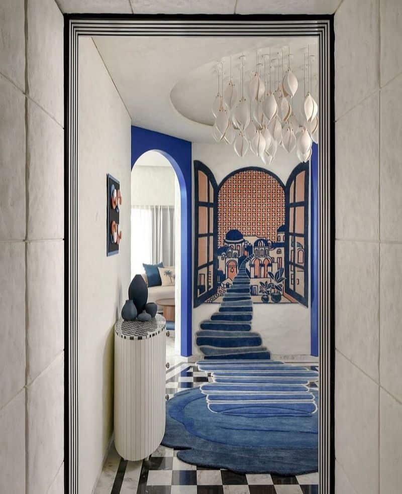
3. Use the 60-30-10 Rule
The 60-30-10 rule ensures a balanced color distribution. It involves using 60% of a dominant color, 30% of a secondary color, and 10% as an accent.
This method helps create a harmonious flow throughout your space. Start by painting the walls the dominant color.
Furniture and upholstery can follow the secondary color. Finally, use the accent color for accessories, like cushions or artwork.
This balance adds depth and interest to your design without overwhelming it.
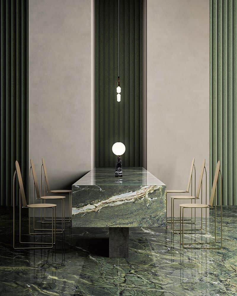
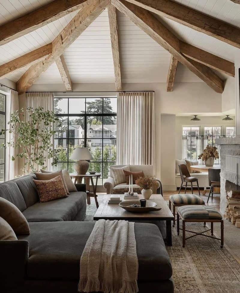
4. Experiment with Texture
Texture brings another dimension to your color scheme. Mixing different materials, such as smooth metals, soft fabrics, and rustic woods, adds interest.
Even if colors are subtle, textures can create visual depth and richness. Velvet cushions, for instance, offer luxury, while wooden elements add warmth.
Consider how light interacts with these textures, enhancing their effect.
Combining textures thoughtfully can elevate your design, making it more engaging and sophisticated.
5. Consider Color Psychology
Colors evoke emotions and influence mood. Understanding color psychology can guide your choices.
Blues and greens often promote calmness, ideal for bedrooms or relaxation areas.
On the other hand, reds and yellows stimulate energy, perfect for kitchens or social spaces. Decide what atmosphere you want to create, and select colors accordingly.
Consider cultural and personal associations, too. A well-thought-out color scheme can enhance not only aesthetics but also how you feel in a space.
6. Embrace Natural Light
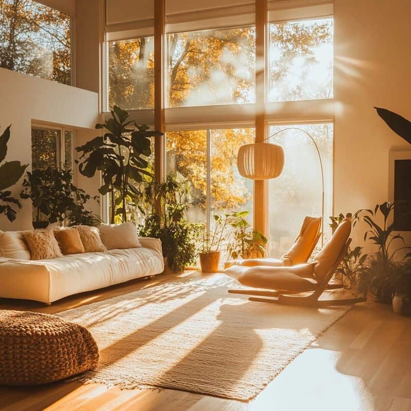
Natural light significantly impacts how colors appear. A room’s orientation and the time of day can change the perception of your color scheme.
West-facing rooms enjoy warm hues during sunsets, whereas north-facing ones have cooler light.
Consider these variations when choosing colors, as they may appear different at various times. You might love a color by day but find it lacking at night.
Test your choices in different lighting before finalizing.
7. Seek Inspiration from Nature
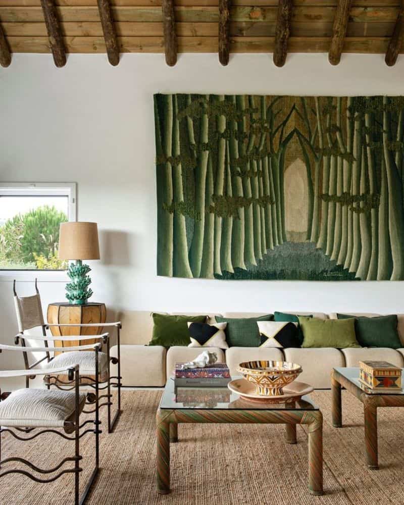
Nature offers endless color combinations. From lush greens to earthy browns, these palettes are timeless and grounding.
Look to landscapes or gardens for ideas. A room inspired by nature can feel both inviting and tranquil.
Incorporate natural materials like stone or wood to complement the colors. Bringing elements of the outdoors inside connects you to nature, fostering a serene environment.
This approach can also promote well-being, making your home a restful retreat.
8. Balance Warm and Cool Tones
Balancing warm and cool tones adds harmony to your space. Warm tones, like reds and oranges, create energy, while cool tones, like blues and greens, are calming.
Use them together to craft a pleasing ambiance. A predominantly cool room can be invigorated with warm accents.
Conversely, a warm space benefits from cool touches. This balance can be visually exciting and emotionally satisfying.
Play with different proportions to see what suits your style best.
9. Incorporate Patterns
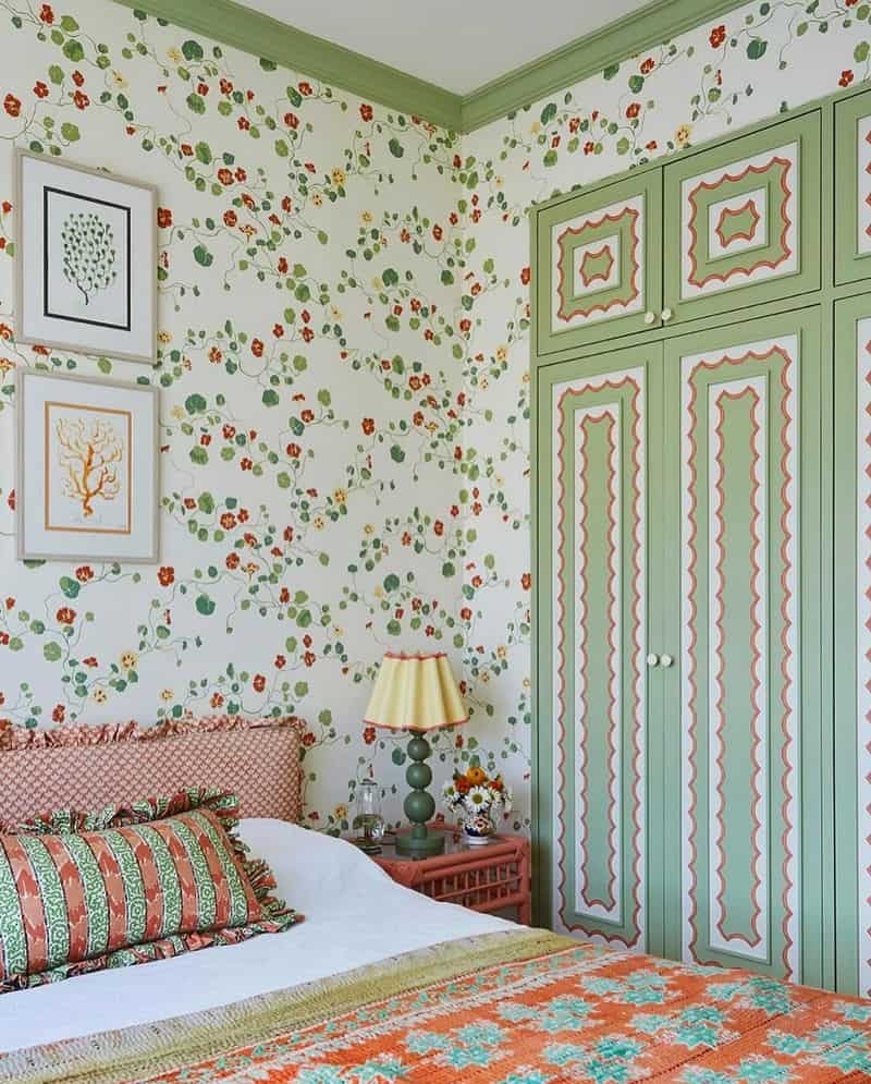
Patterns breathe life into flat schemes. They introduce movement and draw attention.
Stripes, florals, or geometric designs can be integrated through wallpapers, fabrics, or decor. Patterns should complement your color palette rather than compete.
Start with subtle designs if you’re cautious. For bold statements, ensure they are consistent with your overall theme.
Mixing patterns requires balance, so pair large patterns with smaller ones to avoid visual clutter. This approach adds character and sophistication.
10. Adapt to Seasonal Changes
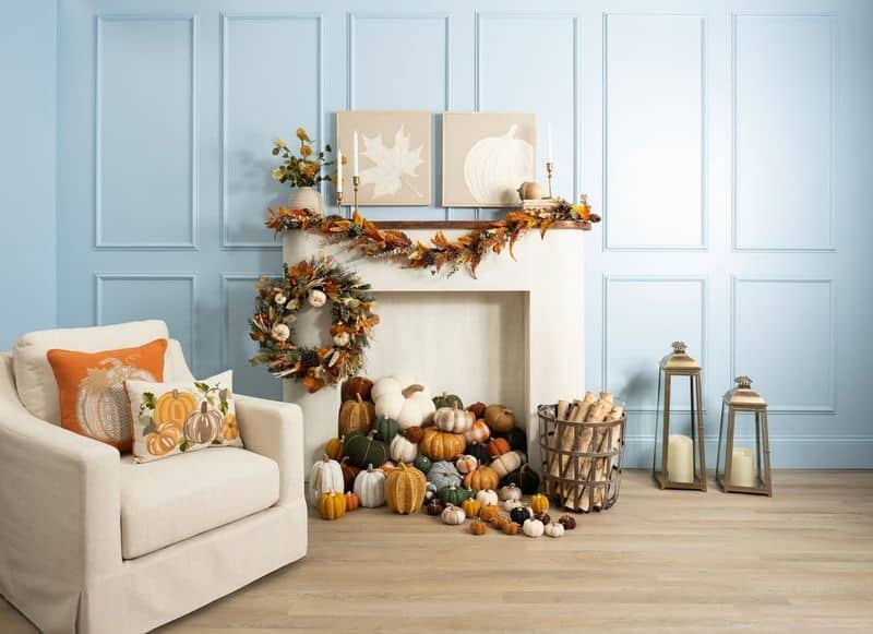
Adapting your color scheme to seasons keeps spaces fresh and engaging. Warm, cozy colors suit autumn and winter, while vibrant, lighter hues fit spring and summer.
Update decor items such as throws, cushions, and art to reflect seasonal tones.
This doesn’t mean completely overhauling your scheme, but rather making subtle adjustments. It allows flexibility and keeps your environment lively.
Seasonal changes bring a dynamic flow, enhancing the enjoyment of your home.
11. Understand the Color Wheel
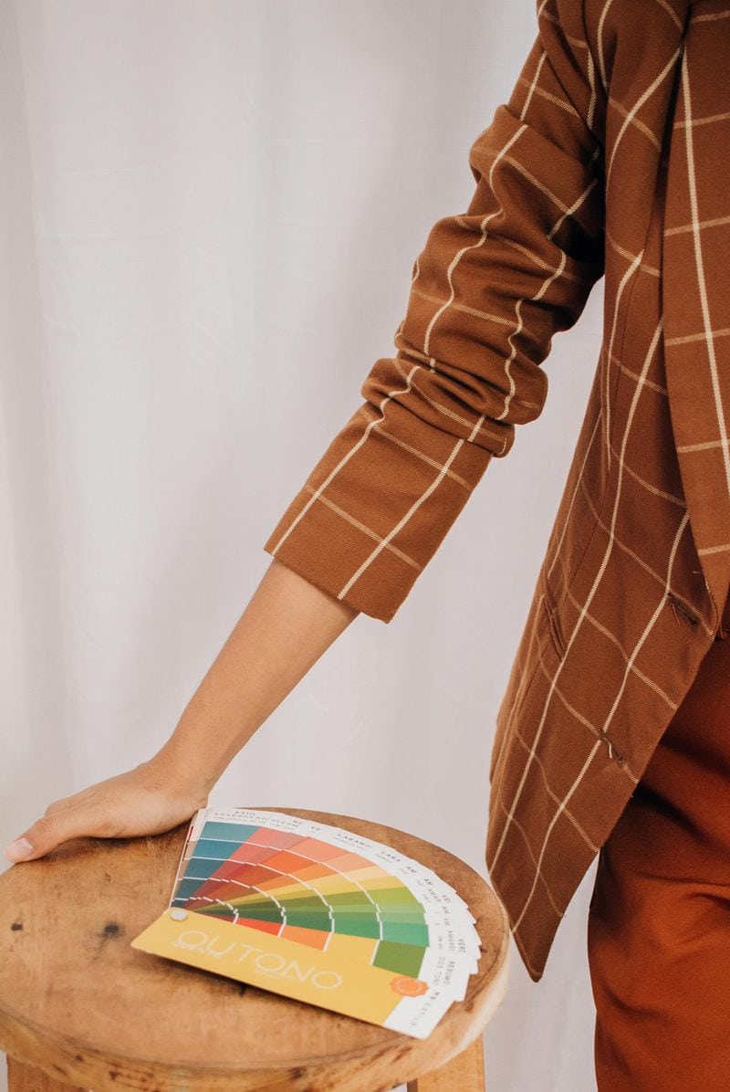
The color wheel is a fundamental tool for designers. It displays how colors relate, such as complementary and analogous hues.
This knowledge helps in selecting harmonious combinations. Primary colors, like red, blue, and yellow, form the wheel’s base and mix to create secondary colors.
Tertiary colors fill the gaps, offering more options.
By understanding these relationships, you can start experimenting with different schemes. Try using this wheel to find a balance between bold and subtle tones.