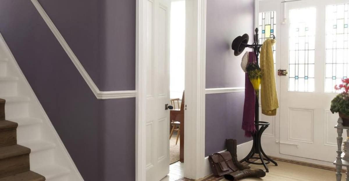
Choosing the right paint color for your hallway is crucial, as this space sets the tone for the rest of your home. Some colors can make your hallway feel cramped, dark, or even uninviting.
Here are 10 paint colors to avoid when selecting a shade for your corridor.
1. Dark Brown
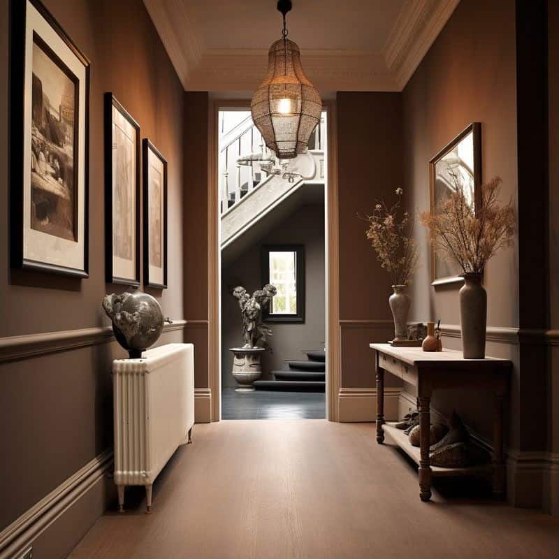
Dark brown can make any space feel smaller and more confined, especially a hallway. Generally, hallways are narrow and require a lighter color to open them up.
The darkness of brown tends to absorb light rather than reflect it, leading to a dim, cramped feeling.
This can cause the hallway to appear even longer and narrower than it is, making it feel like a tunnel. Instead, opt for lighter tones that enhance natural light and make the area feel airy.
Consider shades like taupe or light beige to maintain warmth and openness.
2. Bright Red
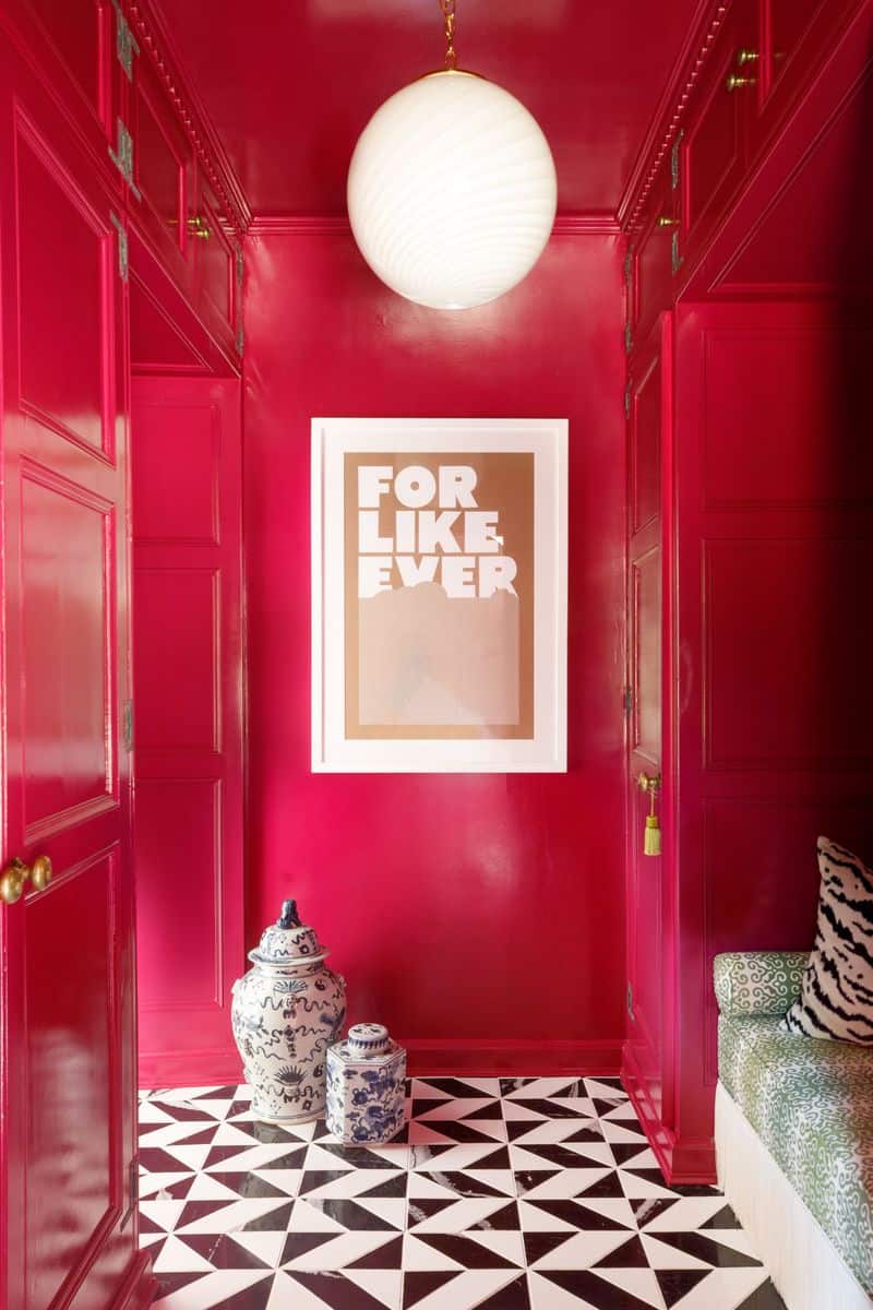
Bright red is a bold choice that can feel overwhelming in confined spaces, such as hallways. This vibrant hue can evoke feelings of anxiety or urgency, making it difficult for guests to feel relaxed.
Additionally, red may clash with other elements in your home’s décor, leading to a sense of disharmony. It’s preferable to choose softer colors that encourage calmness and continuity.
Soft pastels or muted earth tones work well, as they provide a welcoming atmosphere without overwhelming the senses.
3. Neon Green
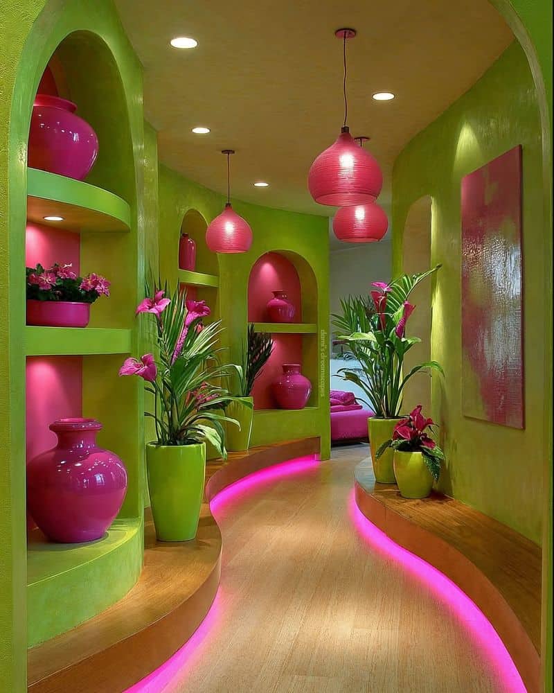
Neon green is a striking color that might seem fun, but it can quickly become overwhelming in a hallway.
The vibrancy of neon green can create a sense of unease and even disorientation, especially under artificial lighting common in hallways.
Such a bold color can be visually jarring and detract from the overall aesthetic of your home.
Consider more subdued greens or sage hues that provide a refreshing and soothing backdrop, enhancing the hallway’s appearance without overpowering it.
4. Black
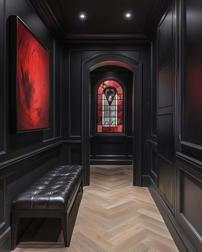
Black is a powerful color often used for dramatic effect, but in a hallway, it can make the space feel suffocating.
The lack of natural light in most hallways exacerbates black’s light-absorbing qualities, resulting in a gloomy environment.
Rather than creating an elegant look, black can make the hallway appear oppressive and cramped.
It’s better to choose lighter shades that reflect light, like whites or soft grays, to help brighten the space and create a more inviting atmosphere.
5. Bright Orange
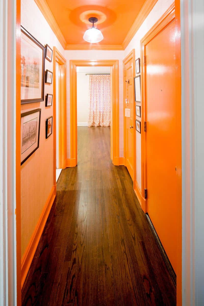
Bright orange is an eye-catching color that can be too intense for a hallway. Its boldness may cause the space to feel chaotic and overwhelming, especially in the confined area of a hallway.
The color’s intensity can overshadow architectural features and make the space feel cluttered. Opt for softer tones like peach or terracotta, which maintain a warm ambiance without being overpowering.
These shades can highlight the hallway’s features without causing visual fatigue.
6. Fuchsia
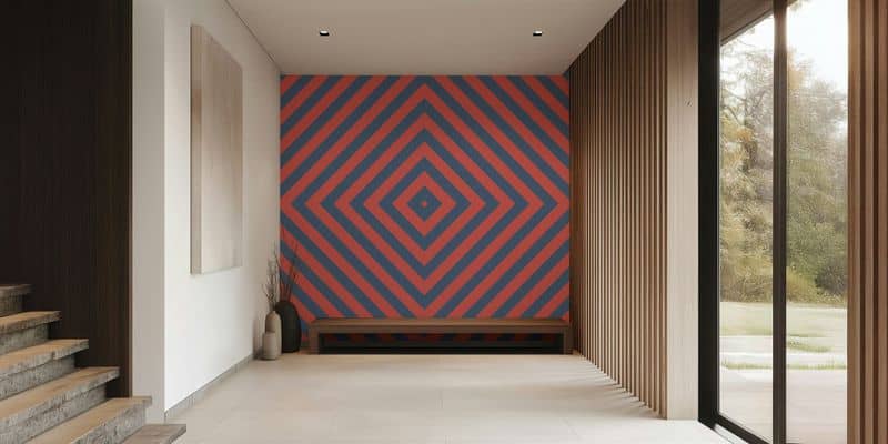
Fuchsia is a vibrant and unapologetic color that might seem stylish initially, but it can quickly dominate a space like a hallway.
The intensity of fuchsia can clash with other colors and decorations, creating a sense of chaos rather than harmony.
For a more balanced look, try using softer pinks or blush tones that provide a gentle and sophisticated touch, enhancing the hallway’s decor without overwhelming it.
7. Dark Purple
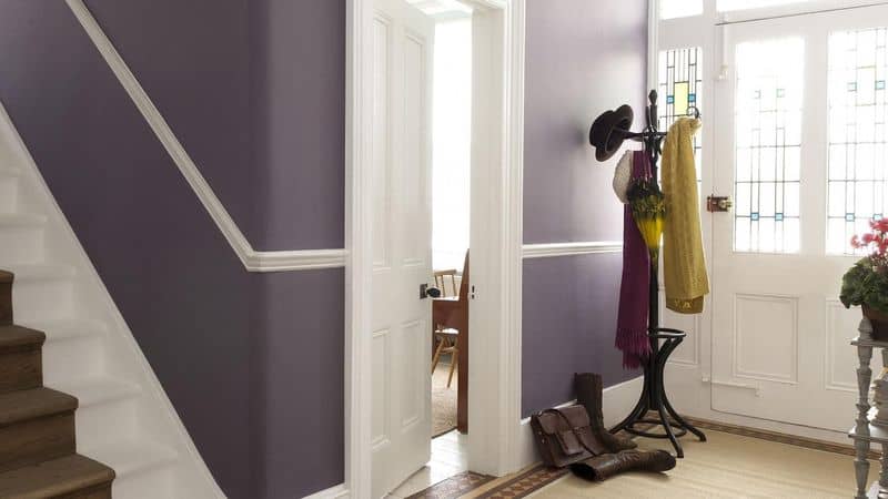
Dark purple is a regal and luxurious color, but in a hallway, it can feel oppressive and heavy.
The color absorbs light, making the space feel darker and more confined. It also tends to clash with lighter decor, creating a disjointed look.
Instead, consider lighter purples or lilac shades that bring a touch of elegance without closing off the space.
These colors can complement a variety of decors, enhancing rather than detracting from the hallway’s style.
8. Yellow
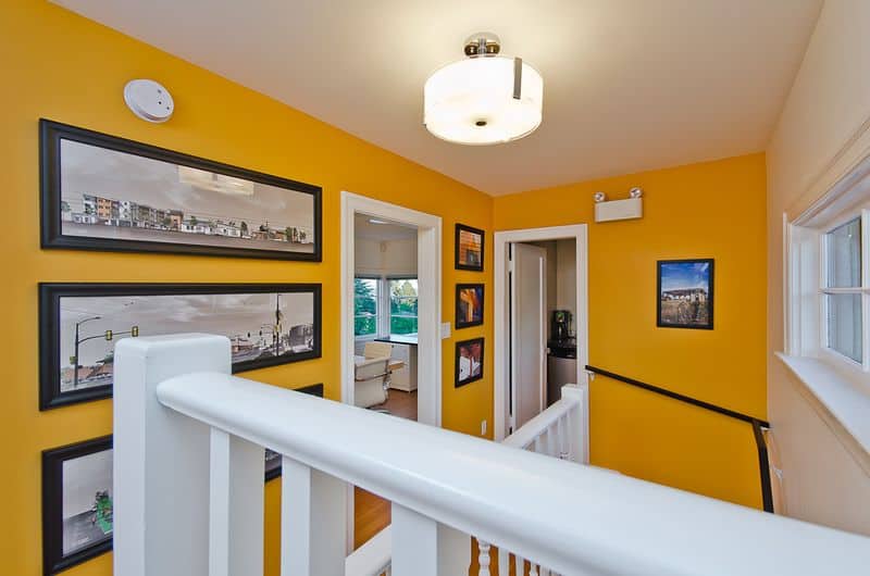
Yellow is typically associated with cheerfulness, but in a hallway, it can be overwhelming and overly bright.
The reflective nature of yellow under artificial lighting can cause a glare, resulting in visual discomfort.
It can also clash with various furnishings and artwork, diminishing the hallway’s appeal. Softer yellows or cream hues are a better alternative, providing warmth and brightness without the harshness.
These colors can help make the hallway feel more welcoming and less visually aggressive.
9. Dark Gray
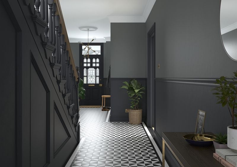
Dark gray is a contemporary choice that can appear sophisticated, but in a hallway, it can feel dreary and uninspiring.
The color’s muted tone absorbs natural light, which can make the hallway feel small and enclosed.
This can lead to a monotonous and bland environment that lacks character. Lighter grays or silvers are preferable, as they brighten the space and add a touch of modern elegance without overpowering it.
These shades help create a more spacious and inviting atmosphere.
10. Beige
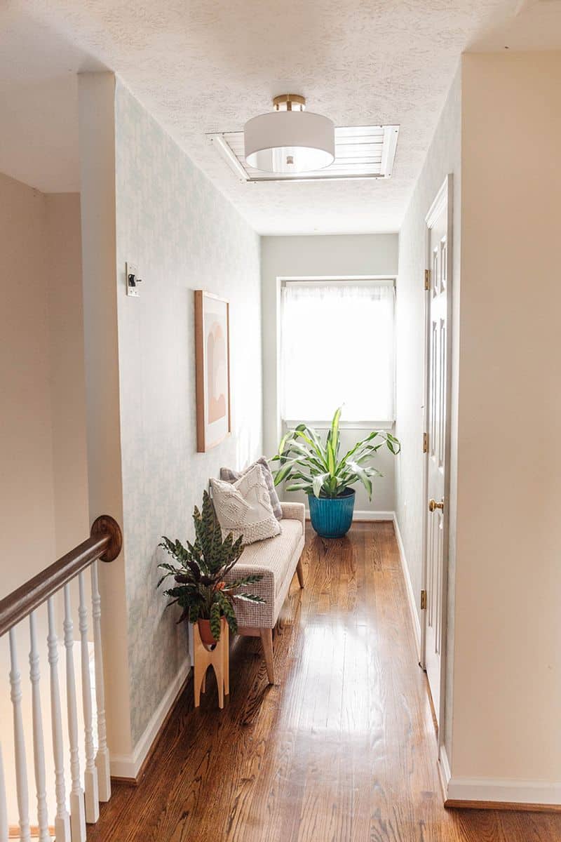
Beige might seem like a safe choice, but it often results in a bland and uninspired hallway.
The neutrality of beige can make the space feel lifeless and unmemorable, lacking in personality. This can lead to a sense of monotony for both residents and guests.
For a more vibrant look, consider using shades with a hint of color, such as soft blues or greens.
These can provide depth and interest, making the hallway more welcoming and engaging without losing its neutral appeal.

