Styling with prints and patterns can add vibrancy and energy to any room, but it’s easy to fall into common traps that can make your space look chaotic or overwhelming.
Here are 10 rookie mistakes to avoid to ensure your patterns work harmoniously together.
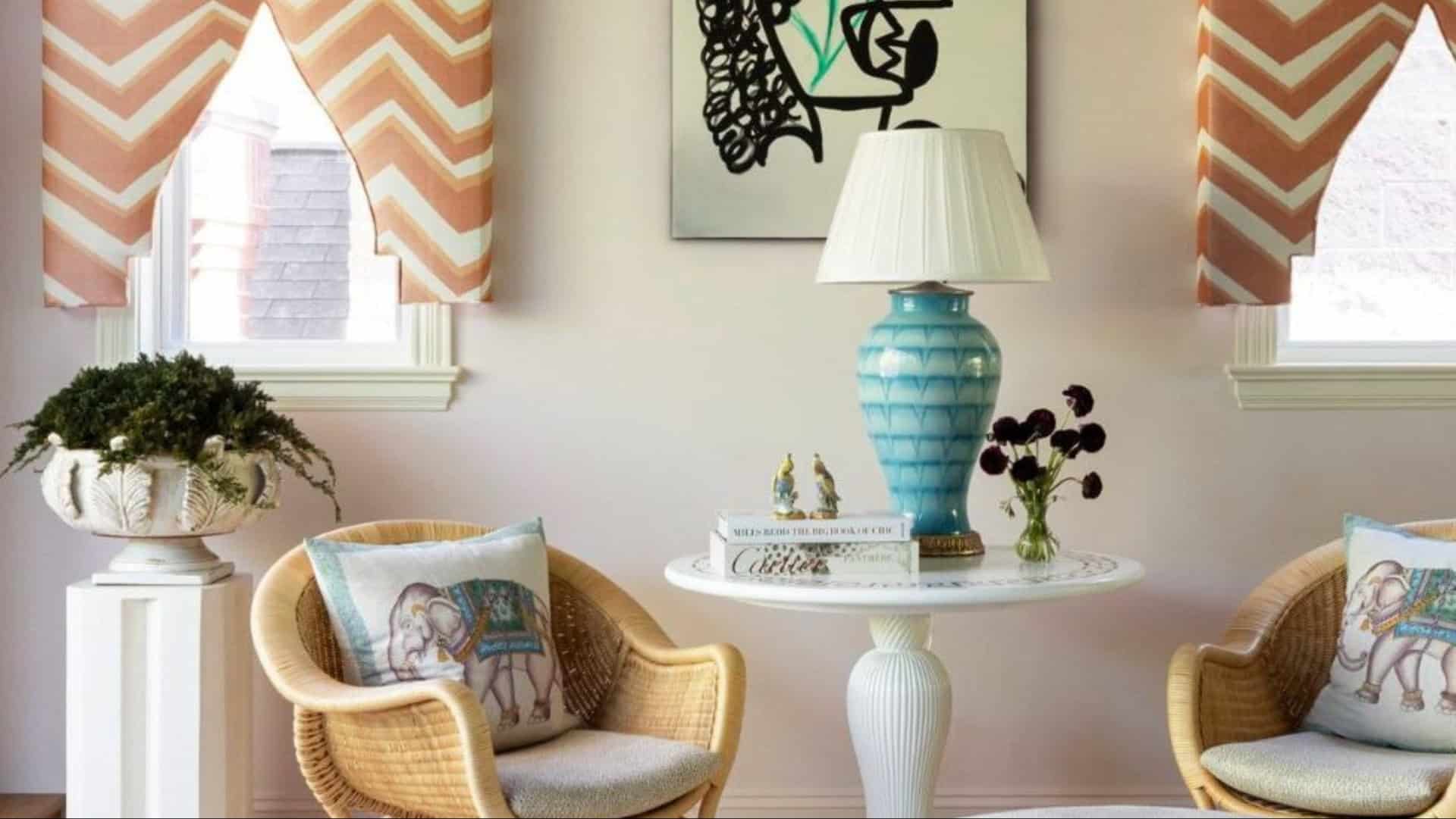
1. Forgetting to Vary Scale
Varying the scale of patterns is crucial for creating visual interest. A room where all patterns are of the same size appears flat and lacks depth.
Without variation, the space feels monotonous and uninspired.
To add dimension, mix large-scale patterns with smaller ones. This creates a layered effect, drawing the eye across different elements.
The interplay of different scales adds dynamism and keeps the space engaging. Remember, diversity in scale can transform a room from dull to lively.
2. Choosing ‘80s Pop Art
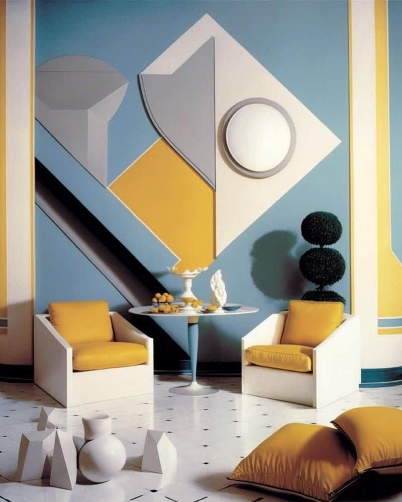
The ‘80s pop art trend is bold, colorful, and energizing, but it can easily overwhelm a space. Too many bright neon colors and graphic prints can clash and create visual chaos.
A room filled with comic book prints and geometric shapes can feel more like an art gallery than a home.
To avoid this, use ‘80s pop art as an accent. Pair it with neutral tones and simpler designs to balance the vividness.
This allows the pop art to stand out without overpowering the room.
3. Mixing Very Similar Patterns
Mixing patterns requires a keen eye for detail.
Very similar patterns, like chevron and herringbone, can appear almost identical, causing visual confusion and a lack of distinction in your space.
Instead, opt for contrasting patterns to provide clear differentiation. For example, pair a large floral print with thin stripes.
This contrast allows each pattern to shine while complementing one another.
The key is to maintain harmony through deliberate choices that showcase each pattern’s unique characteristics.
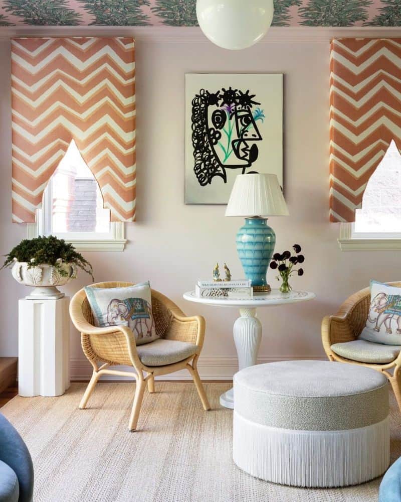
4. Choosing Two-Tone Chevron
Two-tone chevron is a popular choice due to its simplicity and elegance. However, using it excessively can dominate a room and clash with other elements.
A bold two-tone pattern can overwhelm the senses, making the space feel busy.
To avoid this, use chevron sparingly. Incorporate it in small doses, like on a cushion or a single accent wall.
This prevents it from overpowering the room while still adding visual interest. Balance is key to maintaining a cohesive look.
5. Zigzag Prints
Zigzag prints are dynamic and playful, but too much of them can create a dizzying effect.
Imagine a bedroom with zigzag patterns on both bedding and curtains—it might feel more like a funhouse than a peaceful retreat.
To keep zigzags from becoming overwhelming, use them sparingly. Pair them with solid colors or subtle textures to break up the pattern.
By doing so, you maintain the energy and playfulness of zigzag without sacrificing harmony in your decor.
6. Using Too Many Colors
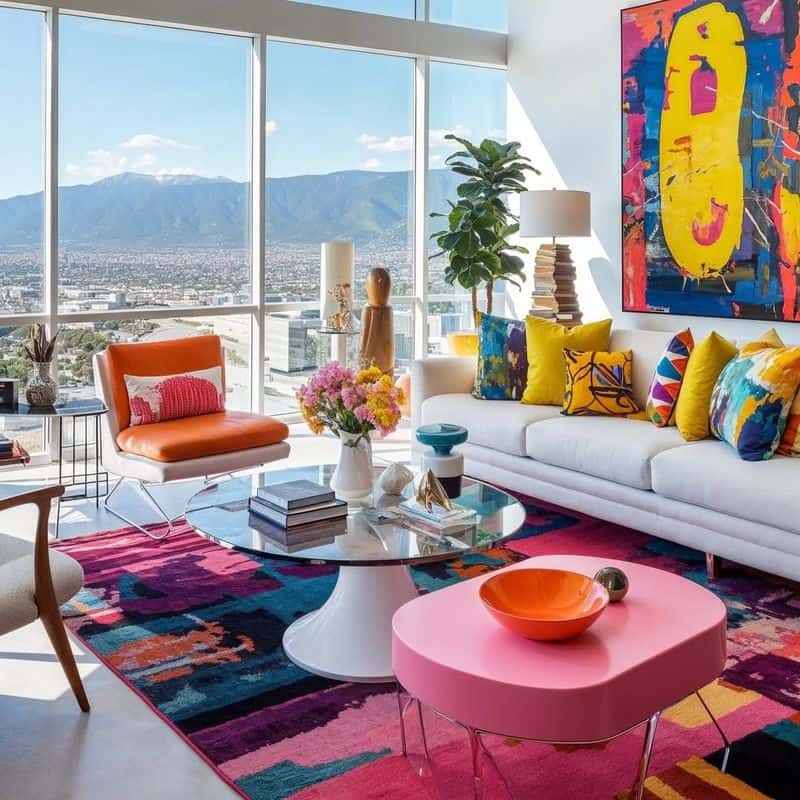
Using too many colors when styling with patterns can lead to a chaotic space. Bright, clashing colors in various patterns create visual noise and overwhelm the senses.
A room filled with a rainbow of hues can feel disorganized and tiring.
To avoid this, stick to a cohesive color palette. Choose two or three main colors and incorporate them across different patterns.
This approach creates harmony and allows individual elements to shine without competing for attention. Simplicity in color choice is often the best route.
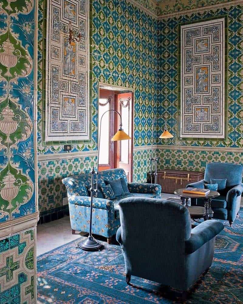
7. Overly Thematic Prints
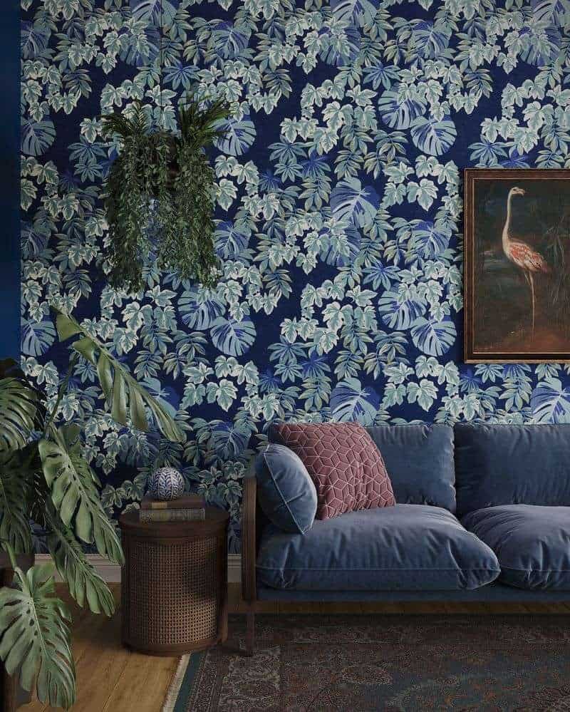
When it comes to styling with prints, using overly thematic designs can be a pitfall. Imagine a room filled with nautical elements—anchors, stripes, and shells.
It becomes overwhelming rather than cohesive. Mixing too many themes can lead to a space that feels cluttered and lacks focus.
Instead, aim for balance. Choose a primary theme and subtly incorporate complementary elements.
This creates a unified look while allowing creativity. By focusing on a single theme, your space will appear well-curated and inviting.
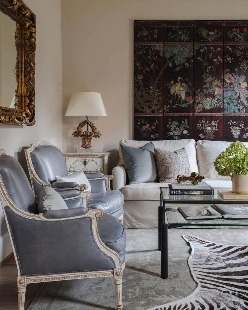
8. Pairing Modern and Traditional Patterns
Pairing modern and traditional patterns can be challenging. Modern geometric designs and traditional florals often clash when placed side by side, creating a jarring disconnect.
A dining room with such contrasting patterns can feel disjointed.
To achieve a cohesive look, find a common color palette or theme that bridges the styles.
This creates a visual link between the patterns.
Alternatively, choose one style as the dominant element and use the other in small accents for a harmonious blend.
9. More Than One Dominant Pattern
Having more than one dominant pattern in a room can lead to visual competition.
Large, bold patterns on walls, rugs, and furniture can create a sense of chaos as each element vies for attention.
To ensure harmony, choose one dominant pattern and let the others play a supporting role. Use subtle patterns or solid colors for accompanying elements.
This allows the dominant pattern to stand out while maintaining a sense of balance and calm in the space.
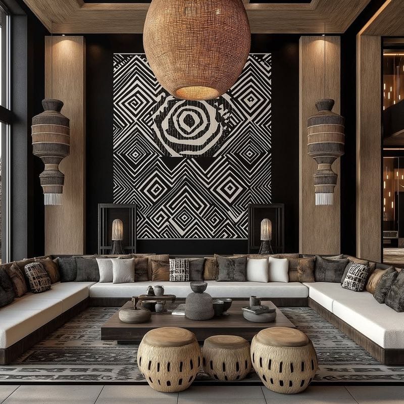
10. Ignoring the Textures in the Room
Textures play a significant role in styling with prints. Ignoring them can lead to a disjointed look.
A home office with clashing textures, such as a smooth glossy desk paired with a heavy textured rug, lacks cohesion.
To create a unified space, consider the textures alongside the patterns. Pair smooth prints with softer textures and textured patterns with sleek surfaces.
This balance ensures a harmonious interplay between visual and tactile elements, enhancing the overall aesthetic of the room.