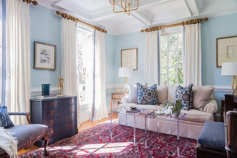
Colors have a profound impact on our moods and emotions. While some hues inspire happiness and tranquility, others might evoke feelings of sadness or unease.
Understanding which colors to avoid can be crucial, especially when choosing shades for our living environments.
Here, we explore 10 colors that color psychology experts advise against using for your walls if you wish to maintain a cheerful and welcoming atmosphere.
1. Drab Olive
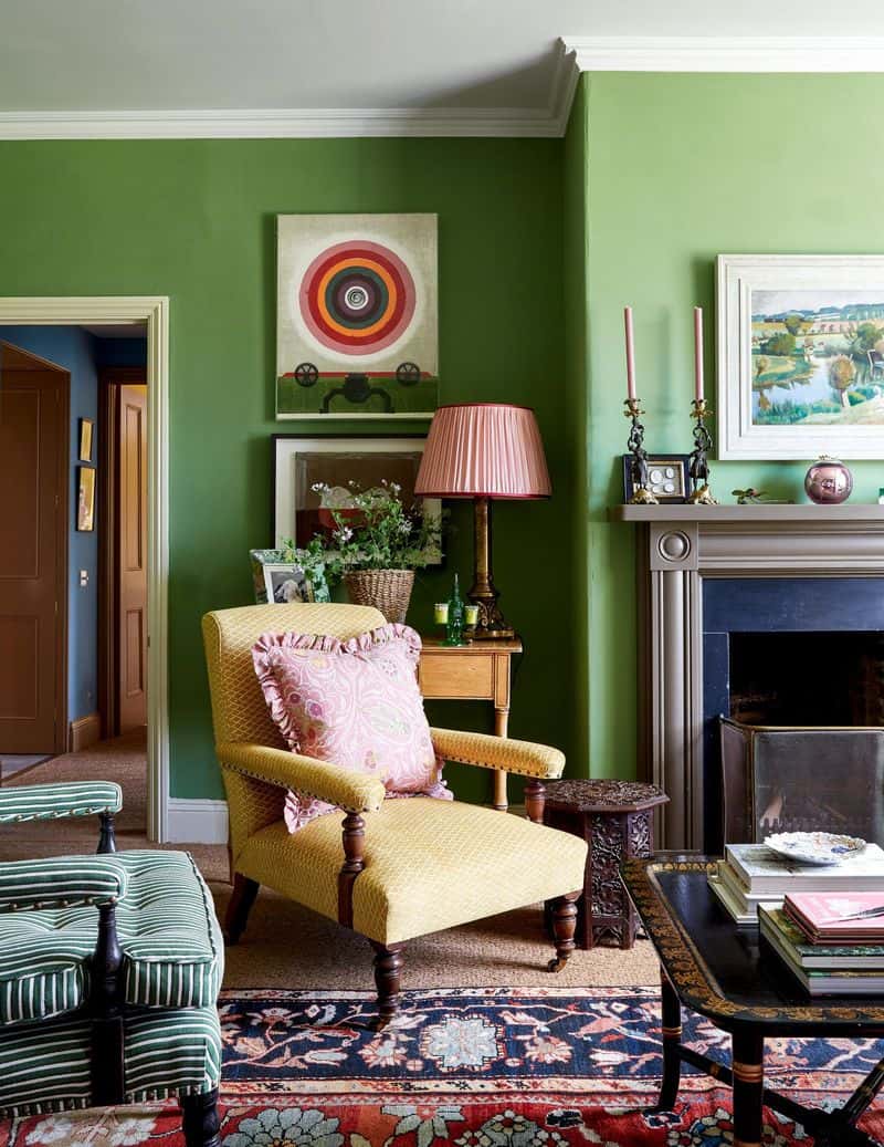
Drab Olive is often associated with military uniforms and can evoke a sense of dullness or dreariness.
It is not a color that promotes feelings of joy or warmth. Instead, it can make a space feel closed off and confining.
This shade lacks the vibrancy needed to inspire positive emotions or energy, often leading to a sense of stagnation. Rooms painted in Drab Olive may come across as outdated or poorly maintained.
For a more uplifting environment, consider using brighter, nature-inspired greens that promote tranquility and peace.
2. Muddy Brown
Muddy Brown can create a feeling of heaviness and gloom, making a room feel smaller and less inviting. It tends to absorb light, which can lead to a dark and oppressive atmosphere.
This color reminds many of dirt or dried mud, which may not be the most appealing association in a living space.
Instead of Muddy Brown, consider soft earth tones that add warmth without overwhelming the senses, creating a cozy but lively room.
3. Dull Gray
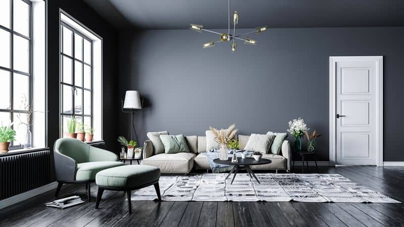
Dull Gray is a color often linked with overcast skies and can bring about feelings of sadness or depression.
Its lack of warmth and personality can make a room feel sterile or clinical rather than welcoming.
While gray can be elegant, Dull Gray lacks the depth and richness that might bring sophistication to a room.
Opt for a warmer gray with subtle undertones to create a balanced space that feels both modern and inviting rather than bleak.
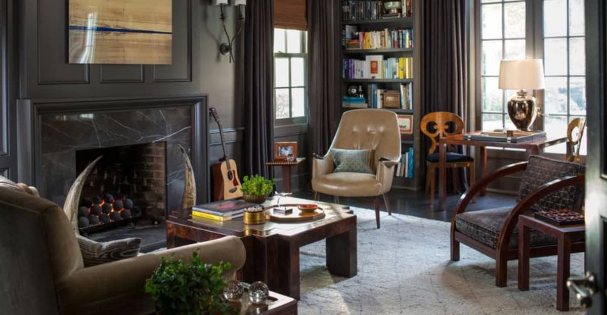
4. Gloomy Black
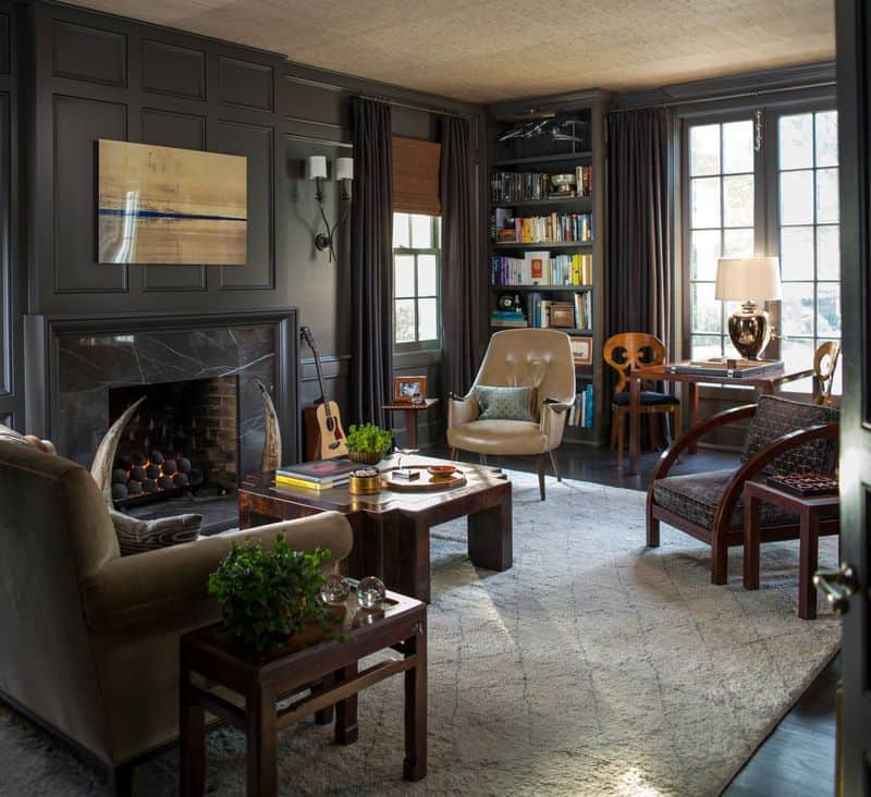
Gloomy Black can make a space feel excessively dark and small, often evoking feelings of confinement or sadness.
While black can be chic, without adequate lighting and contrast, it becomes overwhelming.
This color can absorb the most available light, leaving a room feeling lifeless. Using black strategically as an accent can create drama without the gloom.
For those who appreciate dark colors, try incorporating rich blues or deep greens to bring depth and warmth.
5. Sickly Yellow
Sickly Yellow can evoke feelings of nausea or unease, especially under harsh lighting. This shade of yellow is often too pale or washed out, lacking the warmth or cheerfulness typically associated with the color.
Instead of energizing a space, it can make it feel unsettling. Bright yellows should be chosen with care, ensuring they enhance rather than overpower.
Consider warm, golden yellows that offer cheer and optimism without the harshness.
6. Harsh White
Harsh White can come across as too stark, making an environment feel cold and uninviting. This shade is often associated with hospitals or laboratories, where warmth and coziness are secondary.
Without the right balance of textures and colors, a Harsh White wall can feel sterile and devoid of personality.
To soften the space, consider using off-whites or creamy tones that add warmth and character while maintaining a clean aesthetic.
7. Pale Lavender
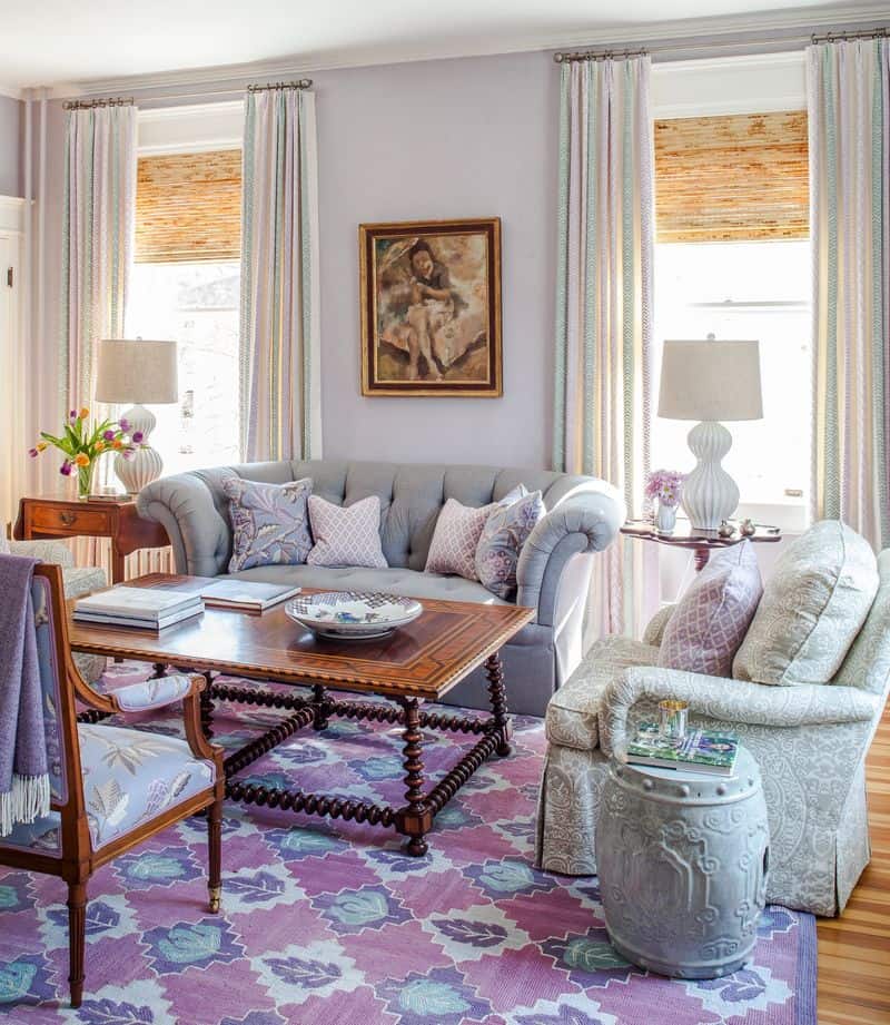
Pale Lavender can sometimes be perceived as cold and distant, lacking the warmth that might be expected in a comforting space.
Lavender can be calming, but its pale version might not provide the depth needed for a cozy room.
This color might wash out under bright lights, leaving a stark and uninspired atmosphere.
For a warmer touch, consider deeper purples or lilacs that offer tranquility along with a sense of comfort.
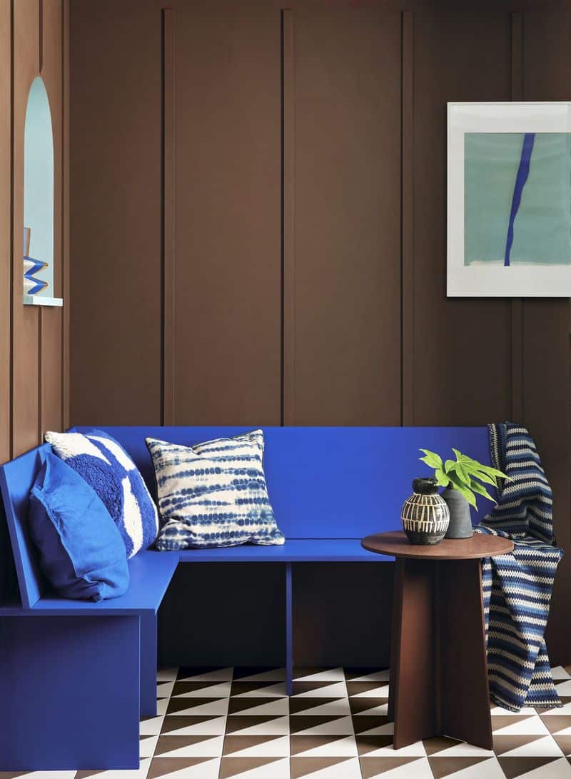
8. Desaturated Blue
Desaturated Blue can create an atmosphere that feels cold and unwelcoming, similar to a cloudy day.
Its dull tone lacks the vibrancy that can make a space feel alive and invigorating.
This shade might make a room feel like it’s stuck in perpetual twilight, which may not be ideal for lively environments.
Instead, opt for blues with warmer undertones to evoke the calming essence of clear skies or oceans.
9. Overbearing Red
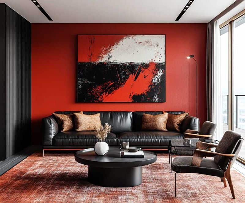
Overbearing Red can evoke a sense of agitation or tension, being too intense for most residential spaces.
Red is known for its energy, but too much can make a room feel uncomfortable or claustrophobic.
Used in large quantities, it may overwhelm, rather than energize, leading to discomfort.
To harness red’s vibrancy, consider using it in moderation, or choosing softer, muted reds that offer warmth without excess intensity.
10. Somber Violet
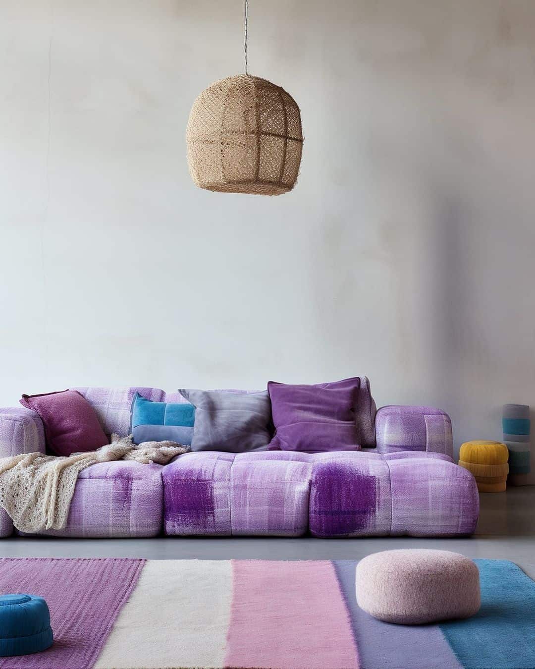
Somber Violet can lead to a melancholic atmosphere, as its dark undertones tend to absorb light and reduce cheerfulness. This color’s richness can weigh heavily in a space, creating a sense of heaviness.
While violet can denote luxury and creativity, the somber shade lacks the brightness or warmth needed for an uplifting environment.
To create an inviting space, consider combining violet with lighter accents or choosing brighter hues that encourage creativity without the gloom.