Recreating the vibrant and eclectic style of the 70s can be a delightful journey back in time.
However, it’s easy to trip over a few common pitfalls that can turn your retro dream into a disco disaster.
From avocado greens to mismatched patterns, let’s explore these missteps and how to sidestep them gracefully.
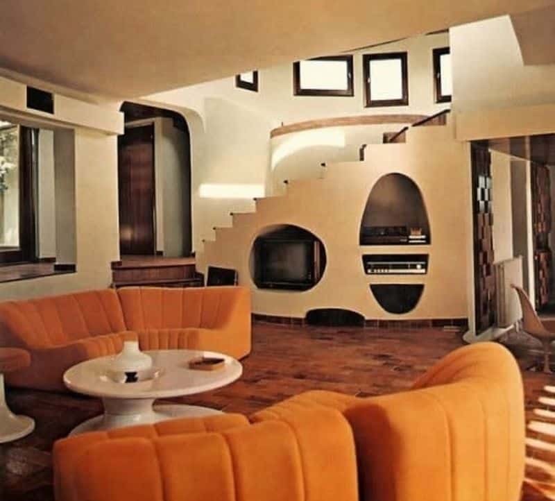
1. Overuse of Avocado Green
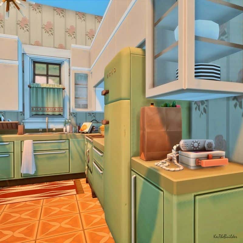
Avocado green is a classic 70s color, but overusing it can make your space look dated and overwhelming. Instead, use this bold hue as an accent.
Pair it with neutral colors like beige or cream to create balance. Adding texture with natural materials such as wood or jute can also break up the monotony.
Layering different shades of green can bring depth without overpowering the room. Remember, a little avocado goes a long way in creating that nostalgic yet modern look.
Avoid turning your home into a guacamole dip gone wrong!
2. Cheap Wood Paneling
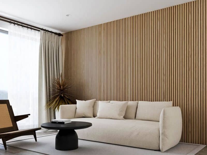
Wood paneling was all the rage in the 70s, but cheap options can make your room look more like a basement than a retro haven.
Opt for high-quality materials that offer texture and warmth. Choose rich, deep stains or paint them in soft pastels for a modern twist.
Consider vertical or diagonal installations to add interest and avoid the flat, generic look. Proper installation is key; well-fitted panels can transform a room.
Embrace the wood, but do it with style and craftsmanship to ensure it adds value and beauty.
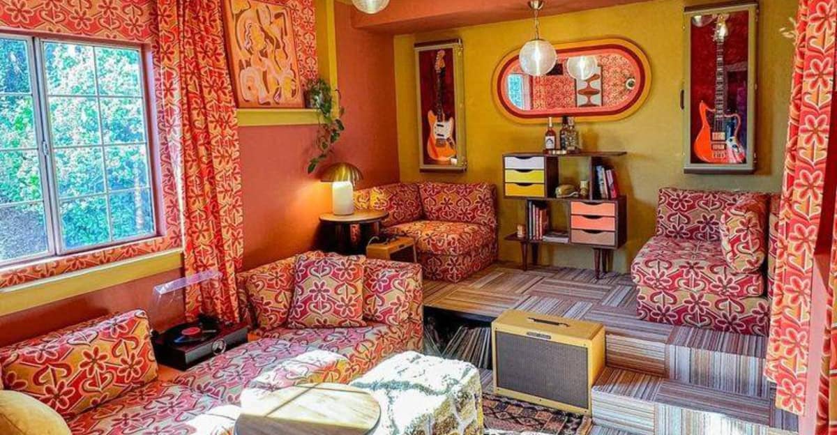
3. Pattern Mixing Gone Wrong
Patterns are essential to 70s design, but mixing them requires finesse. Avoid a chaotic clash by sticking to a cohesive color palette. Select one dominant pattern and complement it with simpler designs.
Balancing bold patterns with solids can prevent visual overload. Pay attention to scale—large patterns work well with small, subtle prints.
Mixing patterns successfully involves rhythm and balance. Think of it as a symphony, not a cacophony.
Proper pattern play will have your interiors singing in harmony rather than screaming in discord.
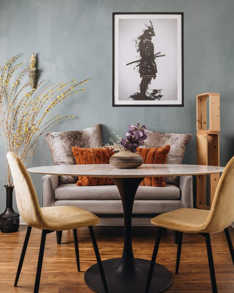
4. They Don’t Use Natural Elements
Neglecting natural elements can make a 70s-inspired space feel sterile. Incorporate plants, wicker, and stone to add warmth and life. Hanging or potted plants can soften harsh lines and add a pop of green.
Natural fibers in rugs and textiles bring texture and comfort. Elements like macramé and terracotta offer an authentic 70s vibe.
Embrace the outdoors within your interior for a more inviting and balanced space. Nature speaks a language of tranquility, and its inclusion will harmonize your vintage style with modern comfort.
5. Wrong Metals
Metal accents were significant in 70s decor, but using the wrong finishes can jolt the aesthetic. Stick to one or two metal types for unity. Brass and gold tones complement the retro palette and offer warmth.
Avoid mixing cool and warm metals, as it can create visual tension. Consistent metal choices in lighting, handles, and decor unify the space.
If you must mix, do so sparingly and mindfully, ensuring a purposeful design. Metal should accentuate, not dominate, helping your 70s look shine without clashing.
6. Mixing Up Wallpaper Designs
Wallpaper is a ’70s staple, but mismatching styles can lead to chaos. Stick to one era-inspired design throughout a room or use complementary styles.
Choose bold patterns for feature walls and subtle prints for others.
Color coordination is crucial to prevent a jarring mismatch. Ensure designs flow seamlessly from one space to another.
When done right, wallpaper can encapsulate the spirit of the 70s, offering depth and character. Let your walls tell a coherent story, not a confusing jumble of eras and styles.
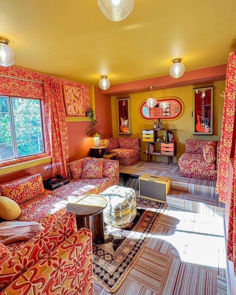
7. Overdoing the Carpet
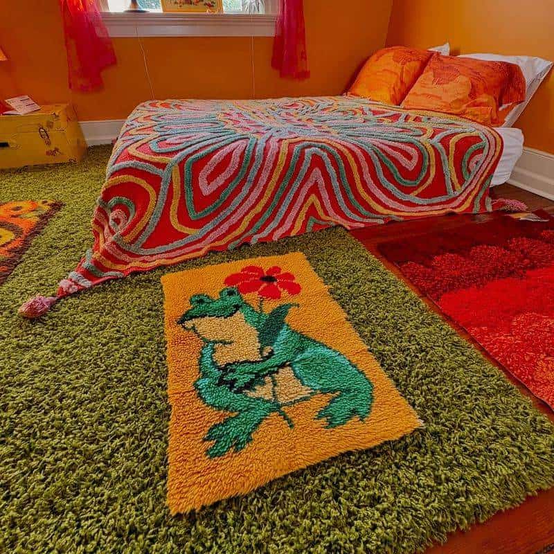
While plush carpets were beloved in the 70s, going overboard can make a room feel suffocating. Opt for area rugs in bold patterns or textures to highlight spaces without overwhelming them.
Shag rugs can offer texture, but in moderation.
Mixing carpet styles with hard surfaces like wood or tile creates visual interest. Balance is key—let bold rugs be the focal point without dominating.
Keep colors in harmony with the rest of the decor. This way, rugs enhance rather than envelop, providing warmth without smothering your style.
8. Not Prioritizing Functionality
Embracing the 70s style doesn’t mean sacrificing function. Avoid clutter by choosing furniture that suits your lifestyle and space. Opt for multi-functional pieces that offer storage and style.
Consider the flow of the room to ensure ease of movement. Practicality enhances the aesthetic; a well-planned layout highlights design elements.
Combining form with function results in a space that’s both beautiful and livable. Remember, a 70s-inspired room can be both a nod to the past and a functioning space for today’s needs.
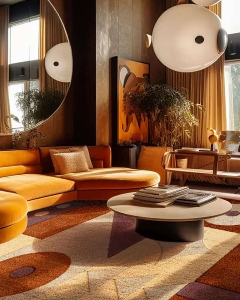
9. Decorating with Cold Tones
The 70s were about warmth and vibrancy, so cold tones can sap the energy from your decor. Opt for earthy hues like mustard, ochre, and warm browns. These colors evoke the era’s cozy, welcoming feel.
Mix and match with brighter accents for a lively yet balanced look. Layering textures in these tones adds depth and interest.
A warm color palette invites comfort and connection, creating a space that feels both nostalgic and nurturing. Let your space glow with the warmth of the 70s spirit.
10. Wrong Light Fixtures
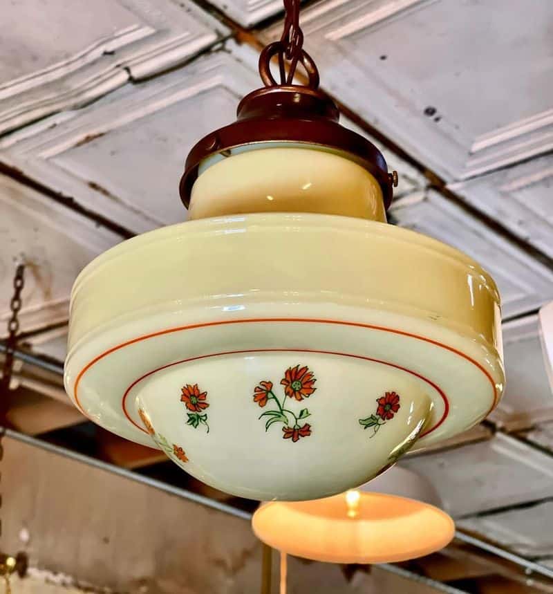
Lighting is crucial in capturing the 70s vibe, so choose fixtures that reflect the era’s style. Avoid overly modern designs that clash with retro elements.
Seek out vintage-inspired lamps and chandeliers with warm metals and soft, diffused lighting.
Consider scale and placement to enhance ambiance and functionality. Proper lighting highlights the design and mood of the room.
Integrate fixtures that complement your decor to avoid a discordant look. Good lighting ties the theme together, illuminating your 70s-inspired journey with authenticity and charm.