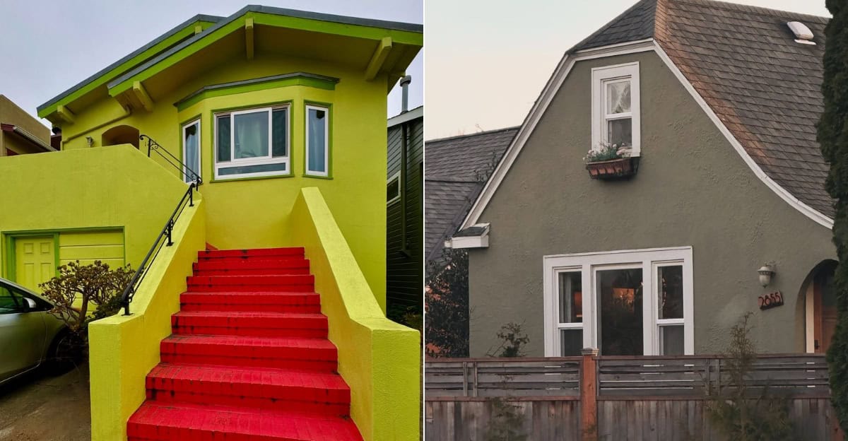
Choosing the right facade color is not just about aesthetics; it’s about longevity and impact.
In this blog, we explore 8 such colors that you might want to avoid for your home’s exterior.
1. Neon Green
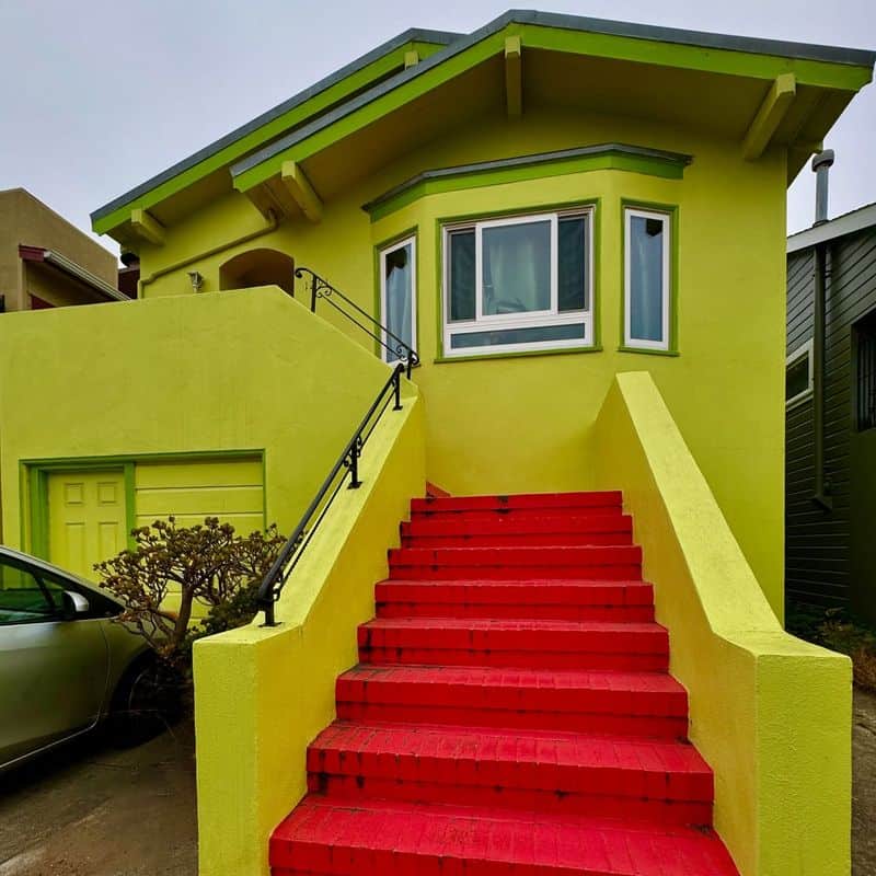
Neon green might seem lively at first, but it quickly becomes overwhelming.
This bold color often clashes with the natural landscape, creating a jarring effect.
Moreover, neon shades are notorious for fading under sunlight, leading to uneven and patchy appearances.
As the vibrancy diminishes, you’re left with a dull and unattractive facade. Consider softer greens or earth tones for a more harmonious look.
2. Hot Pink
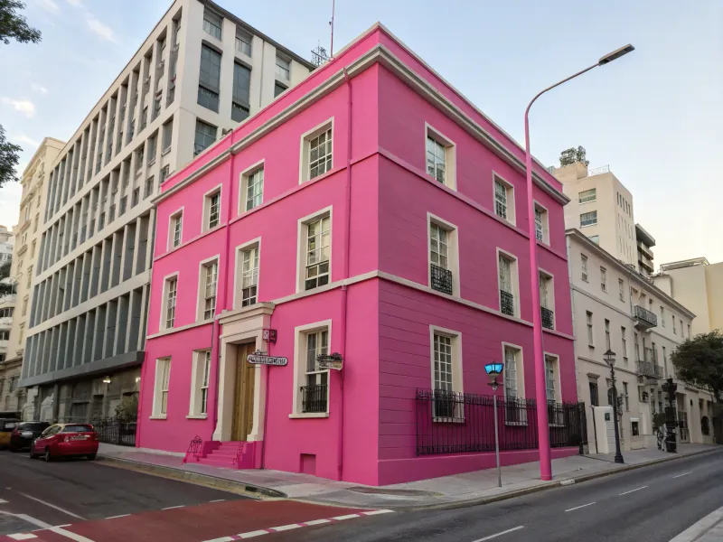
Hot pink is eye-catching, but it’s a risky facade choice. Over time, intense sunlight can cause this vibrant hue to lose its brightness.
The fading results in an inconsistent, washed-out look that detracts from the overall elegance of your home.
Additionally, hot pink can clash with neighboring buildings, disrupting the street’s visual harmony. Opt for subtle shades to maintain a cohesive exterior aesthetic.
3. Bright Yellow
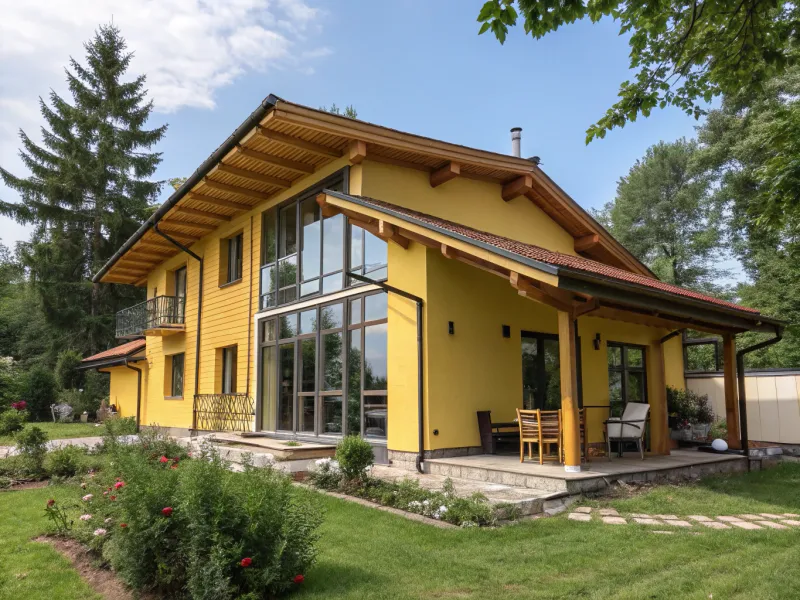
Bright yellow, though cheerful, can quickly become overwhelming on large surfaces.
The sun’s rays can cause this color to fade, leaving your home looking tired and worn out.
Also, bright yellow can attract insects, creating an unintended nuisance. For a more lasting and pleasant facade, consider muted yellows or cream tones that endure the elements and offer a warm, inviting appearance.
4. Deep Purple
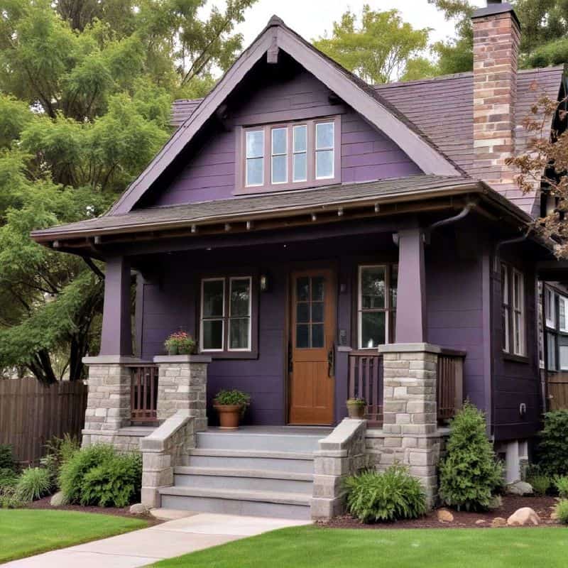
Deep purple is a regal color, but it’s not ideal for facades. This dark hue absorbs heat, leading to faster paint deterioration.
As the color fades, it can become patchy and uneven, losing its initial charm.
The maintenance required to keep deep purple looking fresh can be costly and time-consuming. Choose colors like soft lavenders or greys, which age gracefully and require less upkeep.
5. Sandy Beige
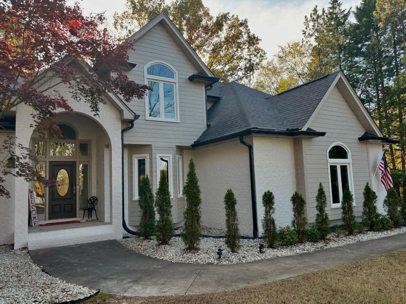
Sandy beige might seem like a safe choice, but it often lacks character.
It can blend too seamlessly with certain environments, leading to a monotonous appearance.
Moreover, sandy beige easily shows dirt and stains, requiring frequent cleaning to maintain its look. For a more dynamic facade, consider warmer beige tones or taupes that offer depth and resist common blemishes.
6. Dark Brown
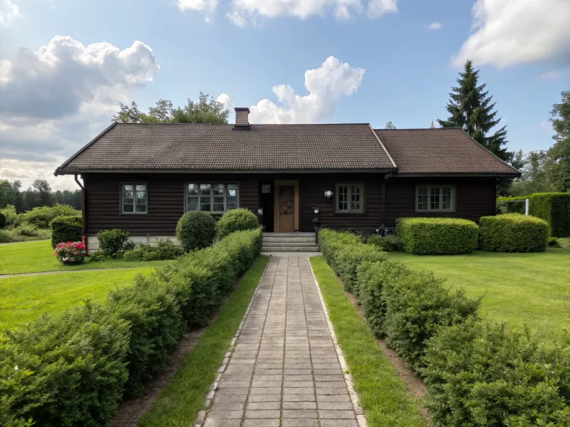
Dark brown can make a home look dated and overly somber.
In addition to absorbing heat, which can accelerate fading, it often blends too well with wooded surroundings, causing the house to disappear into the landscape.
Maintaining a fresh appearance can be challenging as dark brown quickly shows imperfections. Consider lighter browns or natural wood finishes for a more appealing facade.
7. Pastel Blue
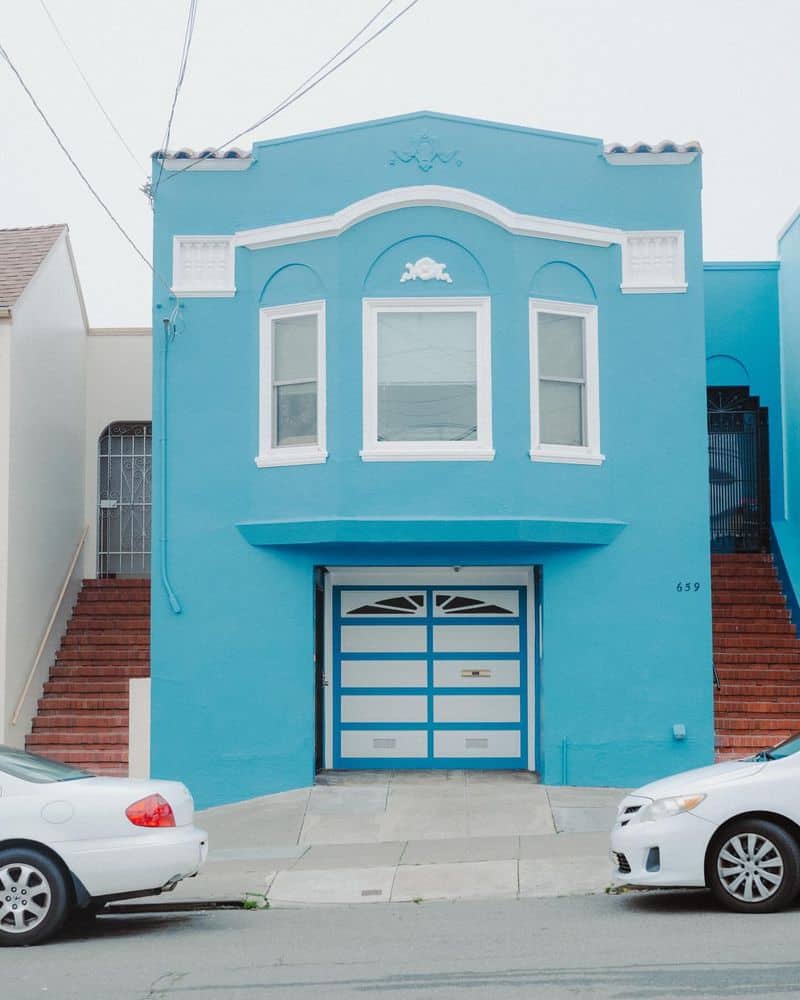
Pastel blue is charming but can appear washed out over time.
The gentle hue is prone to fading, especially in areas with intense sunlight, leading to a pale and uninviting facade.
This color can also clash with other architectural elements or neighboring homes, disrupting cohesion.
Opting for deeper blues or complementary shades can provide a more lasting and visually appealing exterior.
8. Olive Green
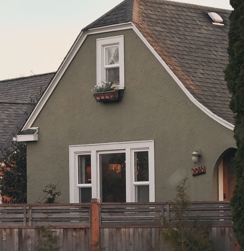
Olive green can appear dull and uninspiring, especially as it fades.
This color tends to absorb dust and pollution, leading to a dirty appearance.
Additionally, olive green doesn’t always complement other design elements, creating a disjointed look.
For a more vibrant and harmonious facade, explore brighter greens or combinations with white trims that emphasize architectural features.

