In the ever-evolving world of interior design, certain trends emerge that, despite their popularity, can make even the most seasoned designers cringe.
These trends are often regarded as outdated, overly flamboyant, or simply lacking in taste.
In this blog post, we’ll explore 7 such trends, providing insights into why they miss the mark and offering modern, tasteful alternatives that can enhance your home’s aesthetic appeal.
1. Over-the-Top Animal Prints
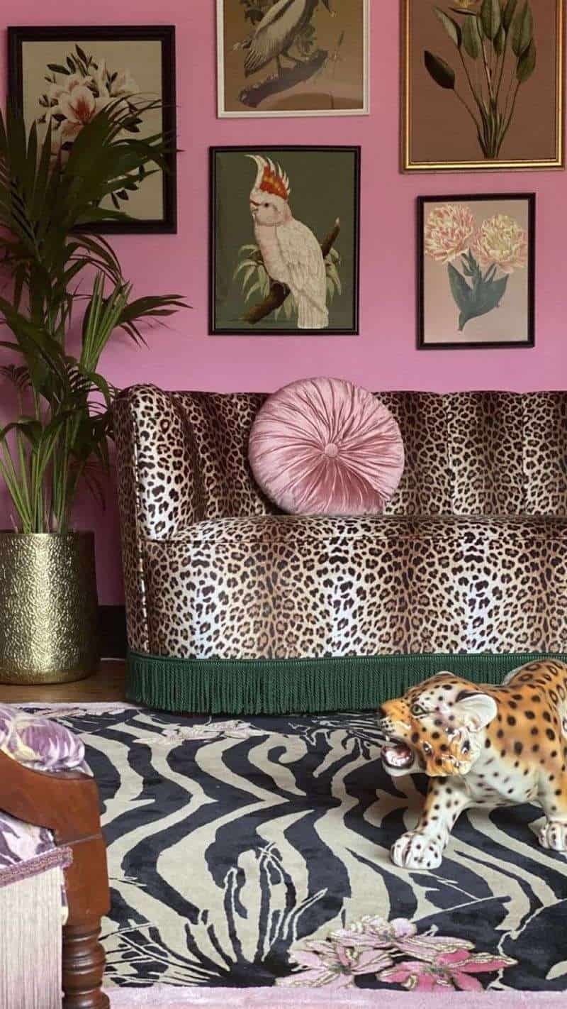
Animal prints were once considered bold, but now they often scream ‘too much’.
Combining zebra, leopard, and tiger patterns in one room creates visual chaos. Instead, opt for subtle animal accents.
1.1. Over-the-Top Animal Prints
A single statement piece, like a leopard print throw or zebra cushion, maintains style without overwhelming.
Balance is key. Pair with neutral colors to allow these prints to shine without dominating, creating a sophisticated, modern look.
2. All-Matching Furniture Sets
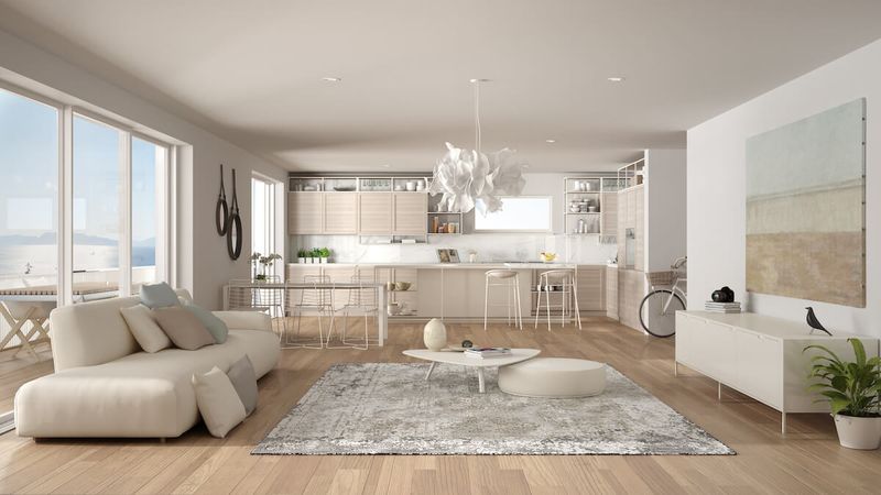
All-matching furniture sets, once a staple, now feel impersonal and outdated. Identical tables, chairs, and sofas lack character.
To refresh, mix different styles and textures.
2.1. All-Matching Furniture Sets
Combine contemporary chairs with a vintage coffee table.
This approach adds depth and personality to your space. Embrace eclecticism, allowing each piece to tell its own story while harmonizing with the room’s overall aesthetic.
3. Heavy Drapery and Curtains
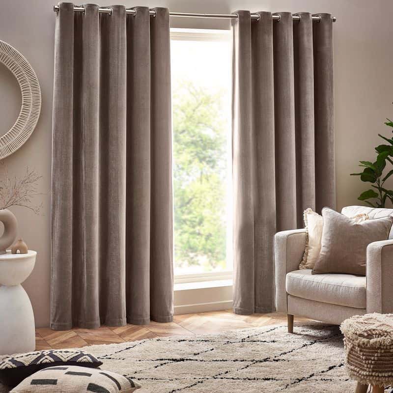
Heavy drapery can make a room feel closed off and outdated, especially in smaller spaces.
They block natural light, making areas seem smaller and dim.
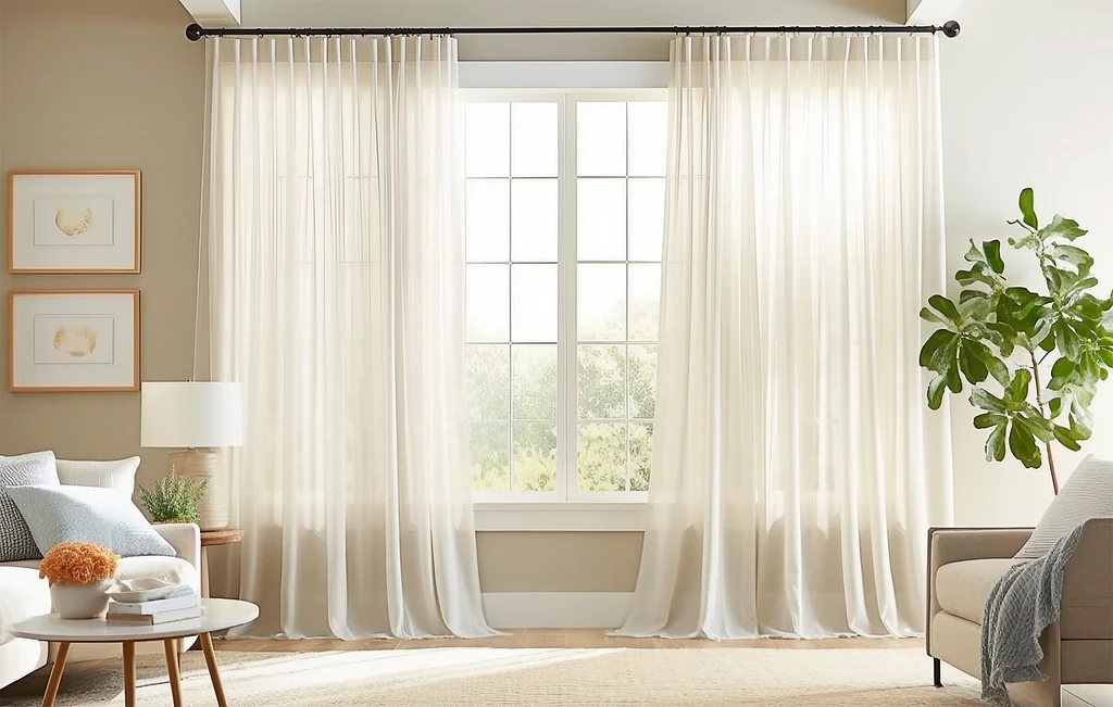
Opt for light, sheer curtains.
3.1. Heavy Drapery and Curtains
They invite sunlight, creating an airy, open feel.
This change can transform your room into a bright, welcoming space, enhancing both mood and perception of space, while remaining stylishly inviting.
4. Word Art Decor
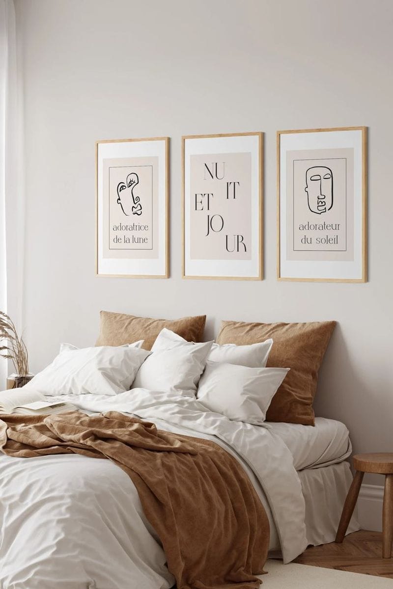
Word art, like ‘Live Laugh Love’ plaques, often becomes clutter rather than inspiration. It quickly dates a space and lacks originality.
Consider abstract art or minimalist wall decor instead. And if you really want words, neon signs are another good option.
4.1. Word Art Decor
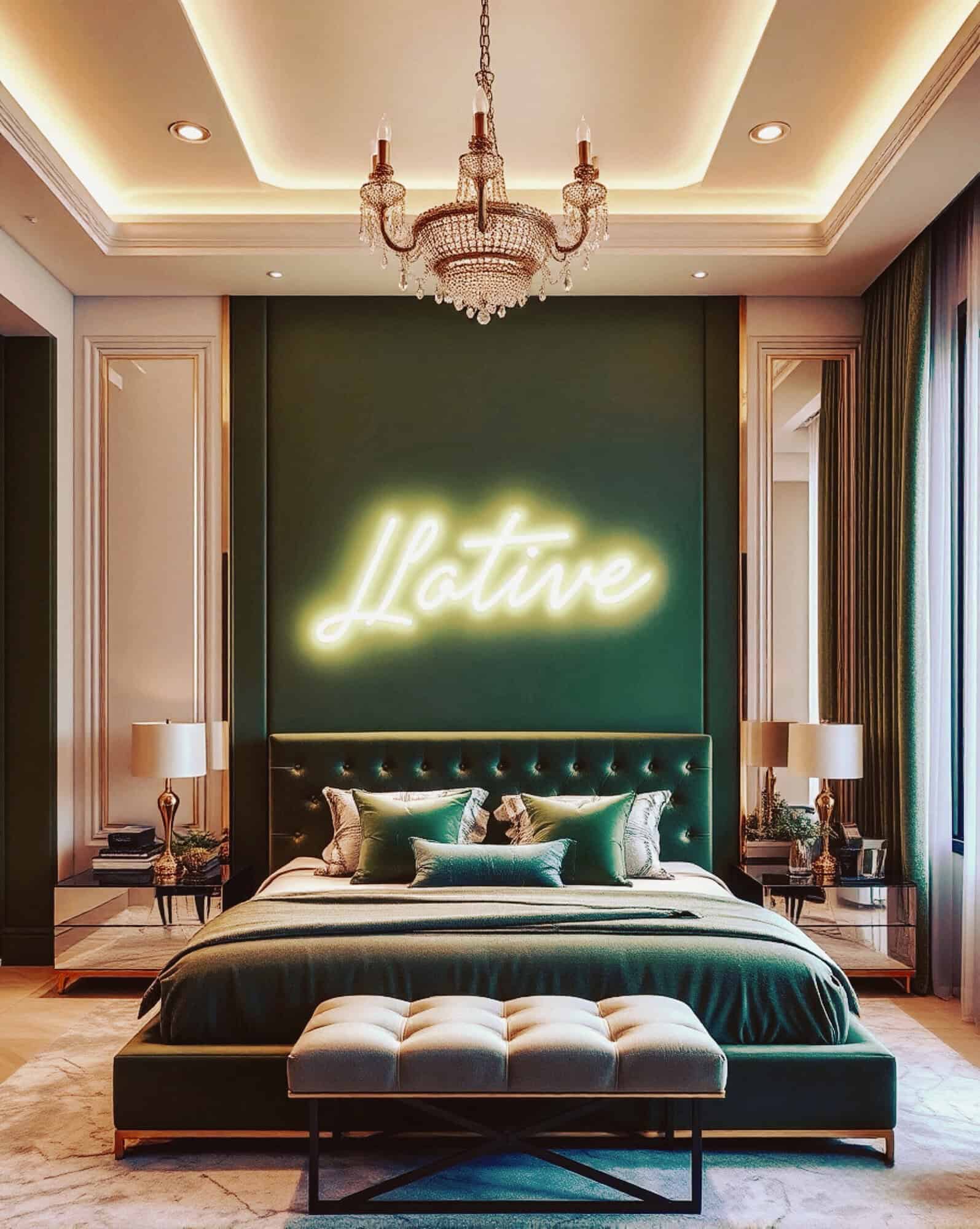
These other options allow for personal expression without the clichés.
This change brings a modern flair, keeping your space timeless and uniquely yours, steering clear of overused phrases and adding genuine character.
5. Wall-to-Wall Carpeting
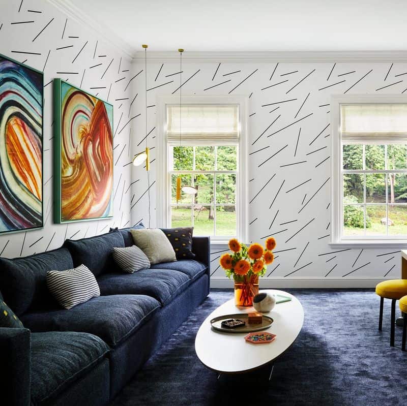
Wall-to-wall carpeting, especially in shag styles, feels outdated and can harbor allergens. It limits decor flexibility.
Opt for hardwood floors with area rugs instead.
5.1. Wall-to-Wall Carpeting
This choice offers easy cleaning and a stylish, contemporary look.
Area rugs provide comfort and design versatility, allowing for seasonal changes and various designs, giving your space a fresh, updated feel.
6. Faux Finishes
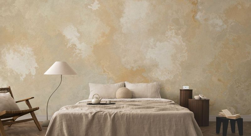
Faux finishes, like sponge painting, were trendy but now feel tacky and outdated. They often poorly imitate natural materials.
Choose solid colors or quality wallpapers for a more authentic look.
6.1. Faux Finishes
These options provide a polished, modern appearance.
Embrace simplicity and elegance, letting real materials shine. This approach enhances your space’s beauty with genuine, timeless charm.
7. Excessive Use of Neon Colors
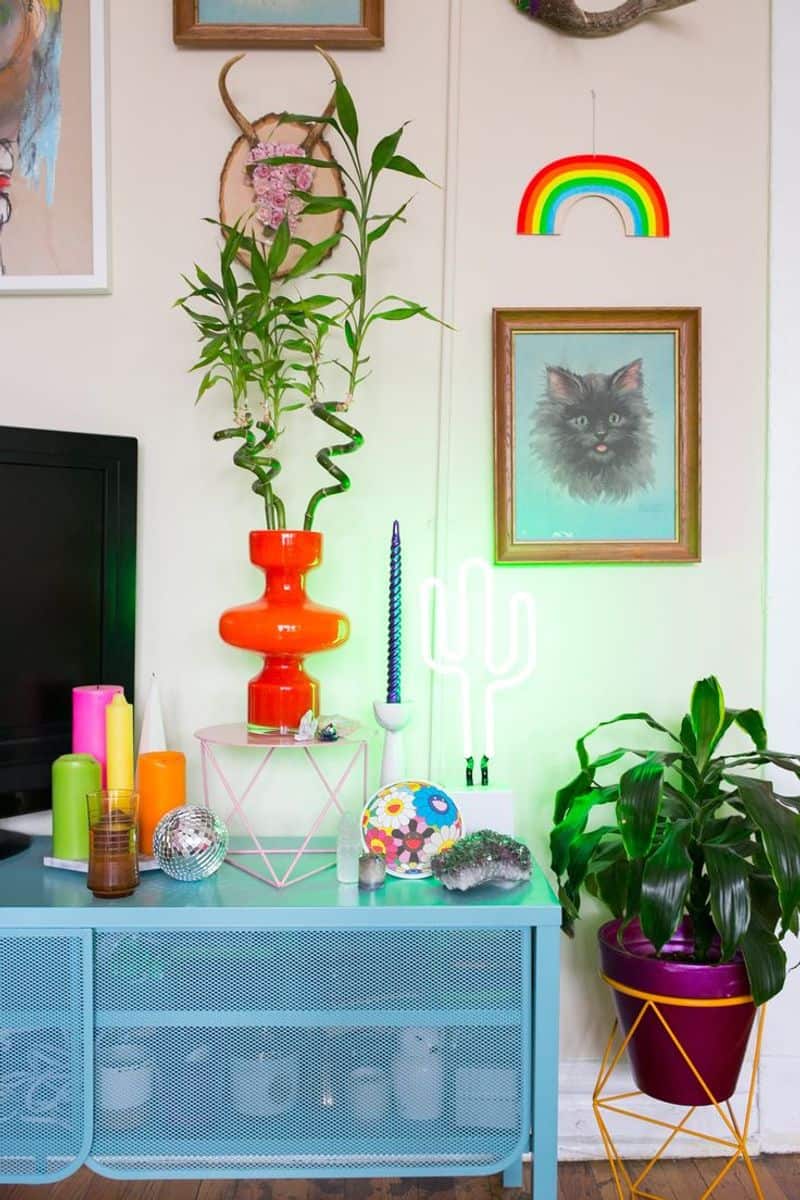
Neon colors, while vibrant, can overwhelm a space, creating visual strain. Rooms flooded with bright hues often feel chaotic.
Instead, use pastels or muted tones. And if you really crave neon, opt for achieving it with LED lights.
7.1. Excessive Use of Neon Colors
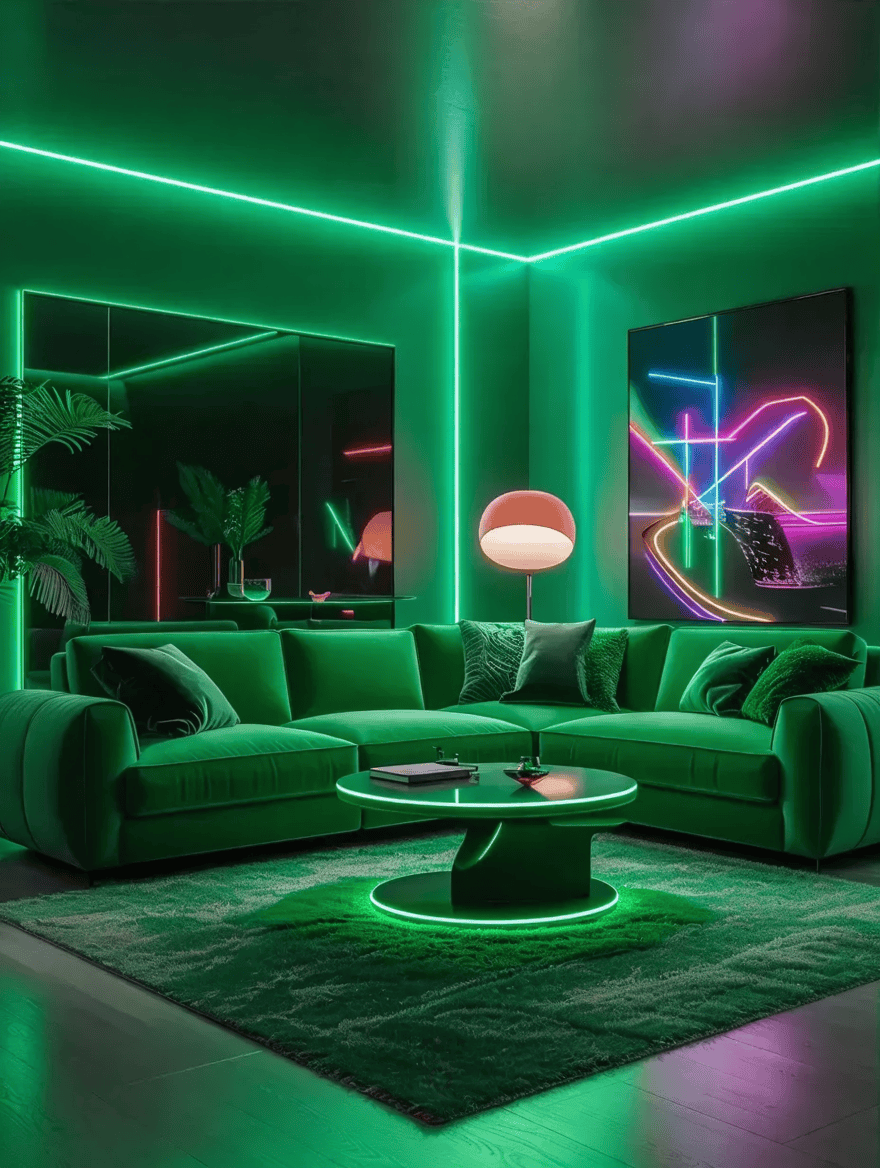
These alternatives provide a calm, peaceful environment.
Incorporate neon as accents to retain vibrancy without overpowering. This approach maintains energy while ensuring a balanced, harmonious design.

