
As we step into the future, some tile designs simply don’t belong in modern interiors. These styles, though once trendy, now feel out of place and outdated.
Here’s a look at 10 tile designs that need to be retired permanently and why they clash with contemporary aesthetics.
1. Tuscan Sunburst
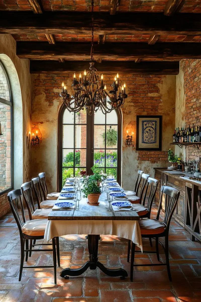
Tuscan sunburst tiles, once cherished for their warm, earthy tones, now stand out like a sore thumb. Modern kitchens favor sleek lines and neutral palettes, making these tiles feel dated.
The bold ochre and burnt orange hues overshadow subtle, sophisticated aesthetics. Instead of blending in, they dominate the space, creating a chaotic look.
Consider swapping these for natural stone tiles or muted ceramics to achieve a classy, timeless look.
2. Checkerboard Black & White
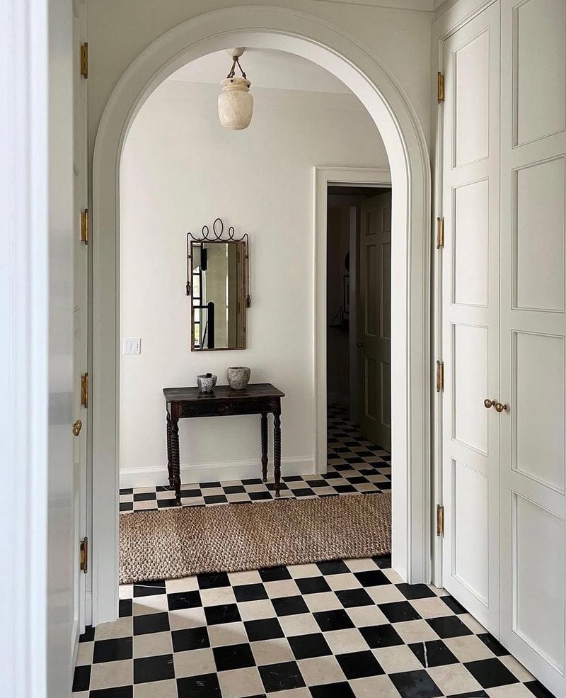
Checkerboard black and white tiles evoke a nostalgic diner vibe that feels out of place in contemporary settings. The stark contrast often appears harsh rather than chic.
They’re also prone to showing dirt and wear, detracting from their crisp look.
Opt for more forgiving patterns like soft herringbone or subtle geometric designs that provide visual interest without overwhelming the room.
3. Retro 70s Green
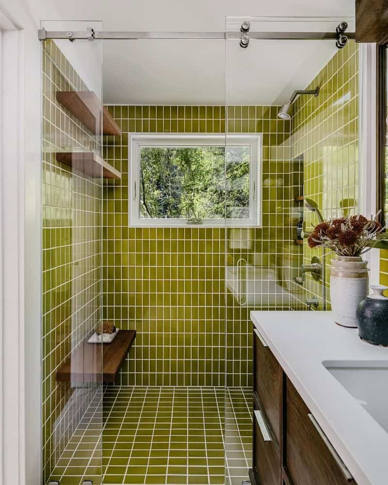
The avocado green tiles from the 1970s are a glaring example of a color that hasn’t aged well. Instead of invoking nostalgia, they create a jarring aesthetic.
Modern design leans towards calming, neutral tones, making these tiles a challenge to incorporate.
For a fresh update, consider replacing them with calming blues or soft grays that enhance rather than distract from the room’s overall harmony.
4. Peach Pastel Squares
Peach pastel square tiles once brought charm to spaces but now look washed out in comparison to crisp, modern designs. They often appear dusty, diminishing the room’s vibrancy.
Today’s bathrooms crave clean lines and bold contrasts, making these tiles less desirable.
Transition to marble or high-gloss tiles that catch the light and add dimension, ensuring a contemporary feel.
5. Glossy Gold Squares
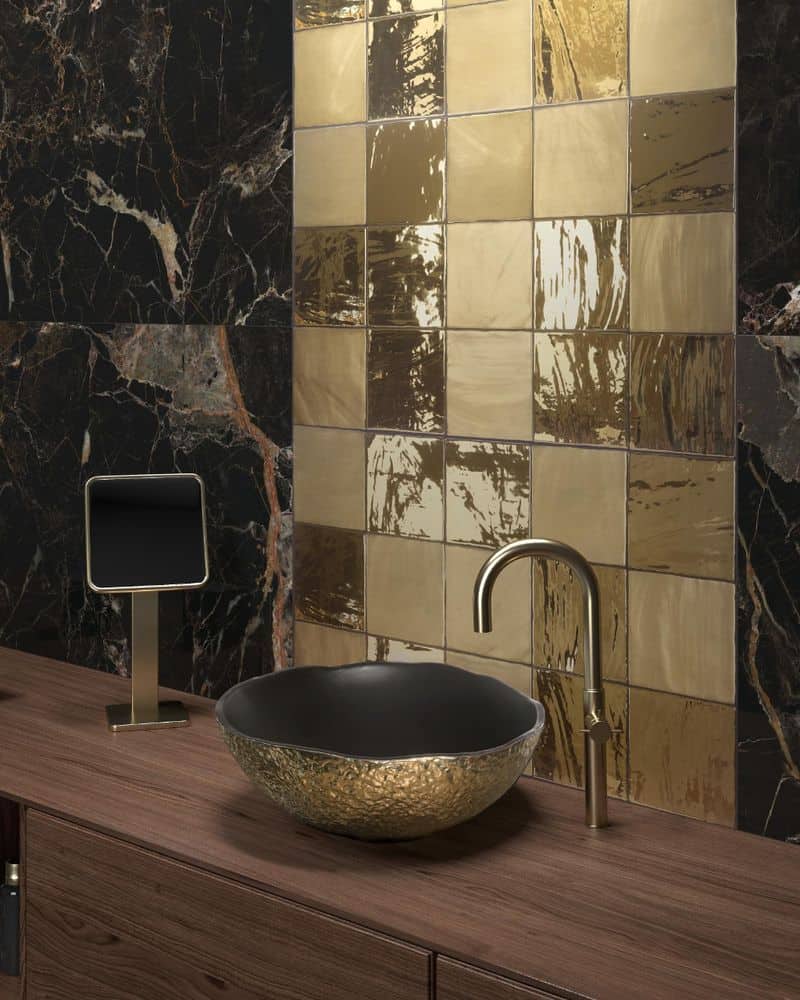
Glossy gold tiles can overpower a space with their reflective nature. They often create an opulent yet dated appearance that feels out of sync with today’s minimalist trends.
Modern design prefers understated elegance, focusing on texture and natural finishes.
Consider swapping gold squares with muted metallics or brushed textures that add sophistication without overwhelming the senses.
6. Beige Bevelled Tiles
Beige bevelled tiles, once a staple of neutral interiors, now appear flat and uninspired. They lack the vibrancy and depth that modern spaces demand.
Beige on beige feels monotonous and staid. Today’s interiors celebrate color and texture.
Replace them with patterned encaustic tiles or textured ceramics for a splash of modern sophistication and visual depth.
7. Faux-Country Floral
Faux-country floral tiles were once charming but now feel kitschy and outdated. Their overly intricate patterns clash with the clean lines of modern kitchen designs.
The busy patterns can make a space feel cluttered.
Instead, opt for simple, elegant tiles, such as subway or hexagonal designs, that contribute to a serene and sleek environment without overpowering it.
8. Southwestern Terra Cotta
Southwestern terra cotta tiles, known for their warm, rustic feel, struggle to fit in with current minimalist trends.
The bold, earthy hues can dominate a space, clashing with sleek decor. Contemporary designs favor subtler shades and smoother textures.
Switching to polished concrete or wood-effect tiles can better complement today’s streamlined interiors, providing warmth without overwhelming.
9. Fish Scale in Bright Colors
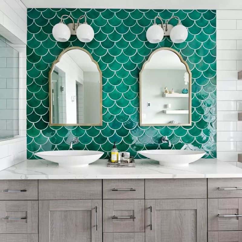
Brightly colored fish scale tiles, although visually striking, can overwhelm a space with their boldness.
The vibrant hues often clash with the understated elegance of modern decor. Achieving a tasteful balance becomes difficult, leading to a cluttered appearance.
Swap these for monochromatic or subdued tones that still offer unique shapes without overwhelming the room’s calm, modern aesthetic.
10. Pink and Mint Combo
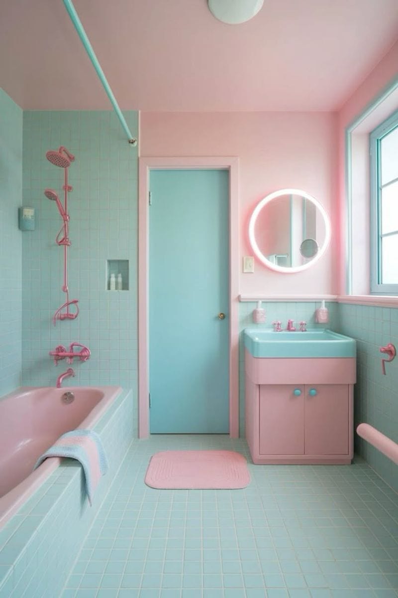
The pink and mint tile combination screams retro in a way that feels outdated in modern spaces.
This pairing can make a kitchen look like a throwback rather than a sleek, current space. Today’s designs prefer cohesive color schemes that don’t distract.
Replace these with understated tones like charcoal or taupe, which allow the room’s features to shine without competing for attention.