Choosing the right colors for your interior can significantly affect the perception of space. Some colors have the ability to make a room feel smaller and more confined.
Here, we explore 12 colors that can shrink your interior space, providing you with insights to make informed decorating decisions.
1. Dark Gray
Dark gray can create a moody and intimate atmosphere. However, it absorbs light, making rooms appear smaller.
Use it sparingly or balance with bright accents. Consider limiting its use to accent walls. Pair with ample lighting to counteract its shrinking effect.
Strategic placement is key to maintaining a spacious feel. Despite its elegance, be cautious with this bold choice to avoid a cramped environment.
2. Forest Green
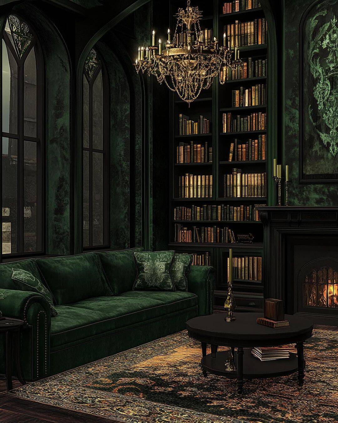
Forest green evokes a natural, calming vibe yet can dominate a small room. Its dark tones make walls recede, creating a closed-in feeling. Limit its use to strategic areas or accents.
When used wisely, it brings nature indoors without compromising space.
To enhance openness, complement with lighter colors or ample lighting, aiding in breaking the visual density of dark green.
3. Rust Orange
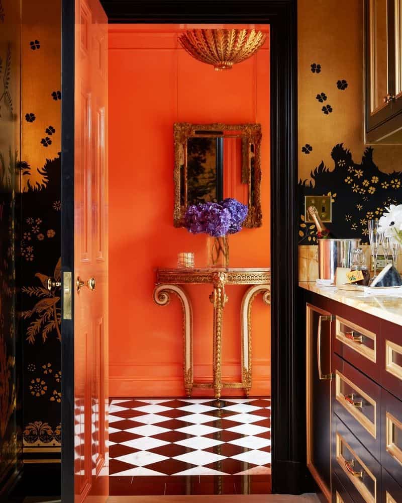
Rust orange adds warmth and vibrancy but can also constrict space. Its boldness can make walls seem closer, creating an enclosed feel.
To maximize space, use sparingly or as an accent. Pair with lighter colors for contrast. Rust works best in well-lit areas, maintaining warmth while avoiding a stifled atmosphere.
Its earthy tone adds character without overpowering the room.
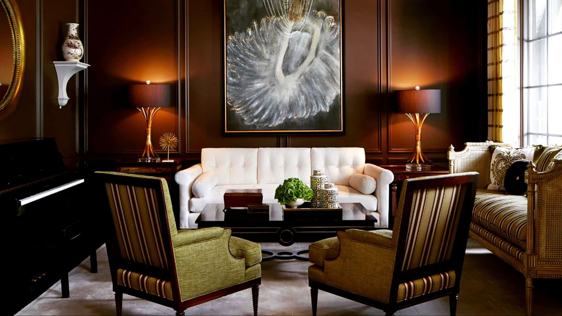
4. Chocolate Brown
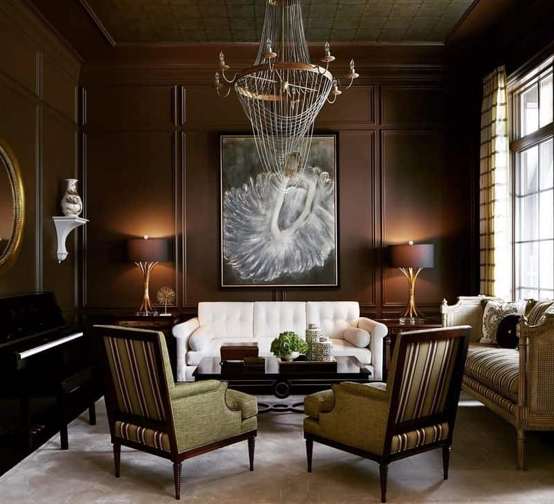
Chocolate brown provides warmth and comfort but can make a room feel small. Its deep tones absorb light and reduce space.
To counteract, mix with lighter colors or use it on a single wall. Accentuate with soft lighting to enhance depth without overwhelming.
This cozy color works well in larger spaces, ensuring warmth without sacrificing the perception of size.
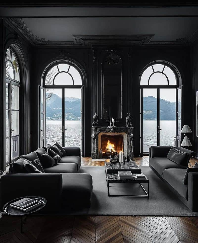
5. Charcoal Black
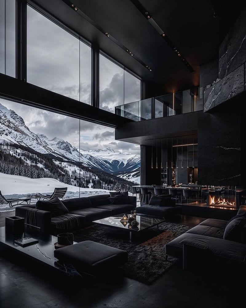
Charcoal black adds drama and elegance but significantly reduces perceived space. Its depth can make any room feel smaller.
To counteract this, incorporate reflective surfaces and bright decor elements. Charcoal’s boldness demands careful use, best reserved for accents.
Natural light can offset its strong impact, enhancing openness while maintaining its chic aesthetic. Keep balance in mind when integrating this striking color.
6. Teal
Teal offers a unique touch but can make spaces feel compact. It absorbs light, contributing to a confined vibe. Use in areas with ample natural light to balance its richness.
Mixing with lighter tones or metallics can enhance openness. Teal’s calming effect complements creative spaces, but moderation ensures it doesn’t overwhelm.
Thoughtful placement keeps the interior inviting and airy.
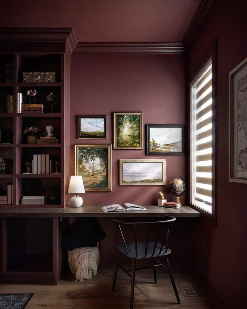
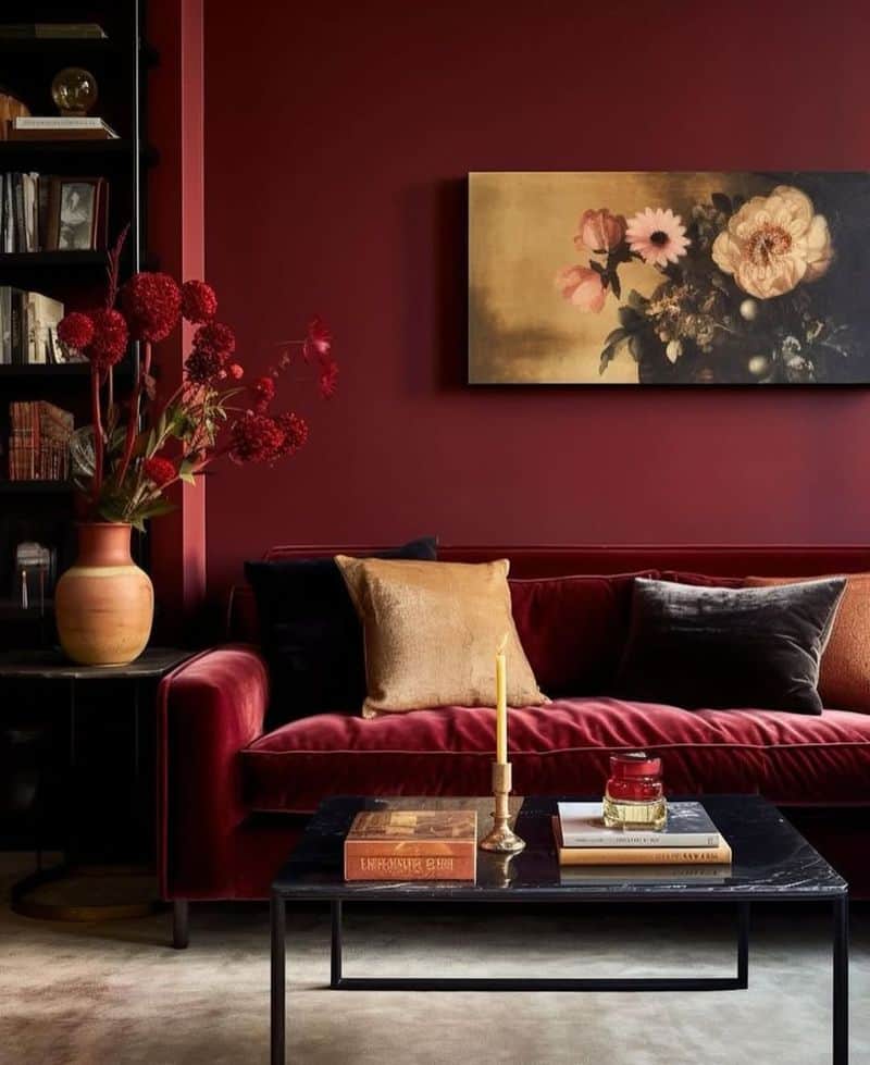
7. Burgundy
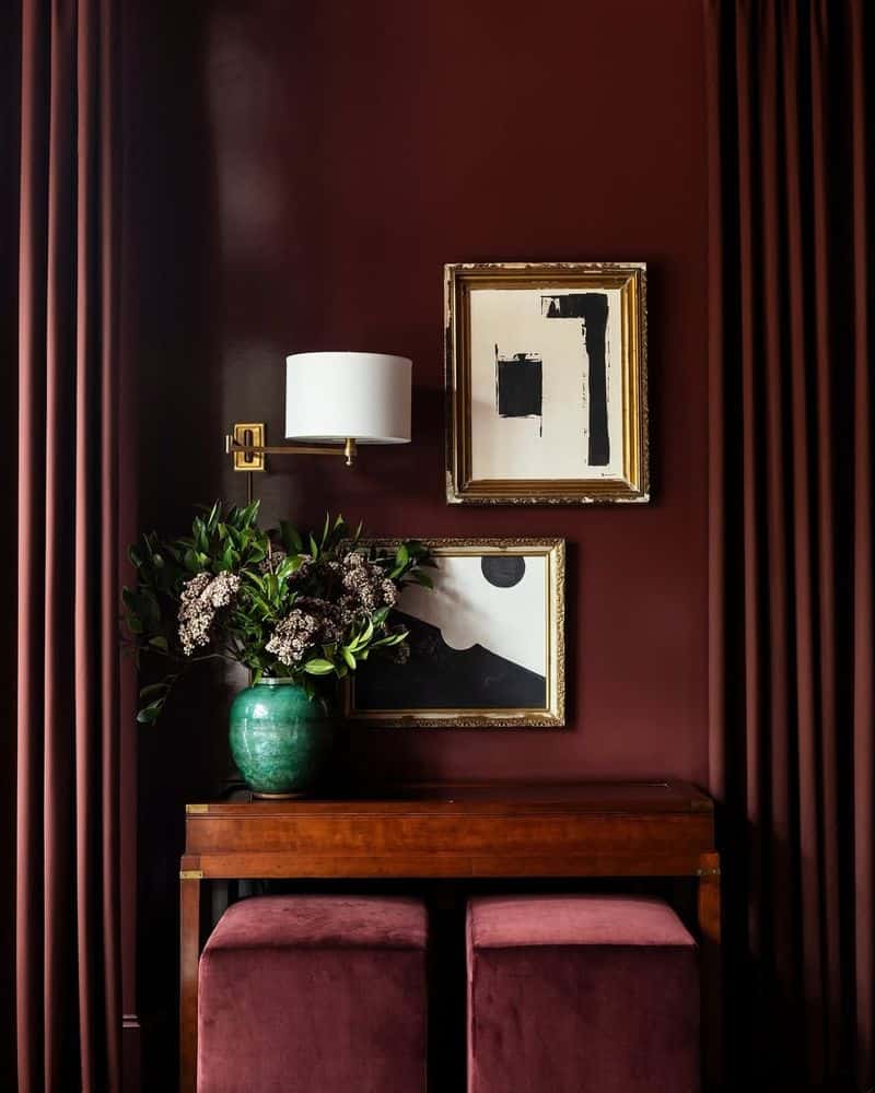
Burgundy exudes luxury and warmth but can stifle small spaces. Its rich hue can make a room feel enclosed. To enjoy its elegance without sacrificing space, use it sparingly.
Burgundy pairs beautifully with neutral tones, which can help mitigate its dense appearance.
Consider using it for accent pieces or trim, maintaining a feeling of opulence without reducing the room’s visual boundaries.
8. Plum Purple
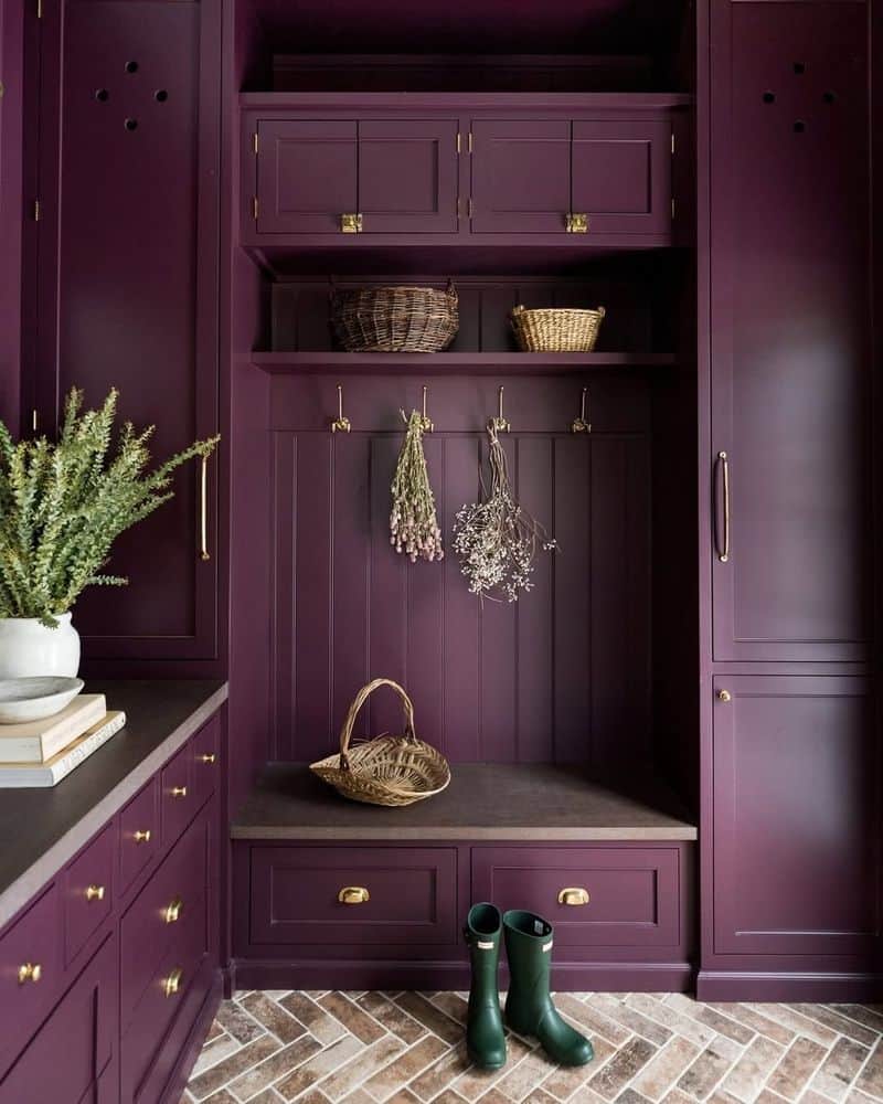
Plum purple offers a regal touch but can shrink spaces by absorbing light. To prevent a boxed-in feel, limit its use to one or two walls.
It pairs well with metallic accents, adding brightness. Use in rooms with plenty of natural light to balance its depth.
This color can create a luxurious ambiance, but moderation is key to preserving a sense of openness.
9. Navy Blue
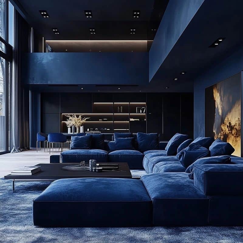
Navy blue offers sophistication but can confine spaces, especially if the room lacks natural light. It tends to absorb rather than reflect light, intensifying the feeling of enclosure.
Use it in well-lit areas or as an accent alongside lighter hues. This balance helps maintain depth without minimizing the room.
Navy blue pairs well with whites or creams to enhance space.
10. Maroon
Maroon offers depth and richness but can reduce space perception. Its dark tone can make rooms feel smaller and more intimate.
To counter, use it as an accent with brighter colors. Maroon complements gold or cream, adding elegance without compromising openness.
Enhance natural light to balance its intensity, ensuring the room remains spacious and inviting despite its bold hue.
11. Olive Green
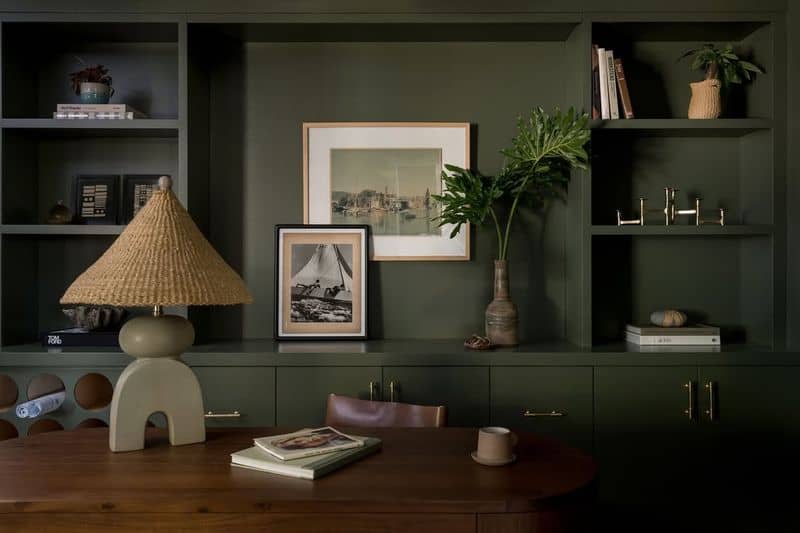
Olive green brings a touch of nature indoors, however, it can dominate a room’s palette. Its muted tone can feel heavy, particularly in small spaces.
To alleviate this, combine with whites or creams that uplift the room’s spirit. Use olive as an accent to maintain a fresh ambiance.
Strategic placement and lighting enhance its natural appeal without enclosing the room.
12. Deep Red
Deep red exudes warmth and coziness but can also overwhelm small spaces. Its intensity can make walls feel closer than they are.
To avoid feeling boxed in, use deep red as a feature rather than a dominant color. Pairing it with lighter shades can balance the effect.
Accents in gold or cream may enhance its richness without compromising space perception.