
Beige and cream might seem like a safe choice for home decor, but overdoing it can lead to a dull and uninspired space.
Let’s explore the common pitfalls of using these neutral colors and how to avoid them.
1. No Contrast
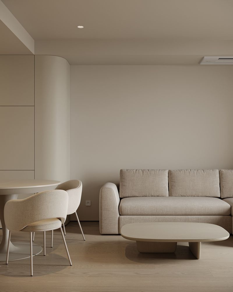
Imagine a beige wonderland where everything blends together like a forgotten latte. Without contrast, your home turns into a monochrome desert. The key to avoiding this blunder is to introduce contrasting elements.
Consider adding darker shades like charcoal or navy to break the monotony. A contrasting throw blanket or cushions can work wonders, creating visual interest and depth.
Remember, it’s about balance, not beige domination!
2. Decorating with Outdated Furniture
Nothing screams dull like hanging onto outdated furniture that belongs in a museum. A cream-colored couch from the 1980s is a prime culprit. Such pieces make your space look frozen in time.
Swap them for more modern pieces or reupholster them to breathe new life into your decor. Mix in contemporary designs to bridge the gap between past and present.
Your home should reflect today, not yesterday’s trends!
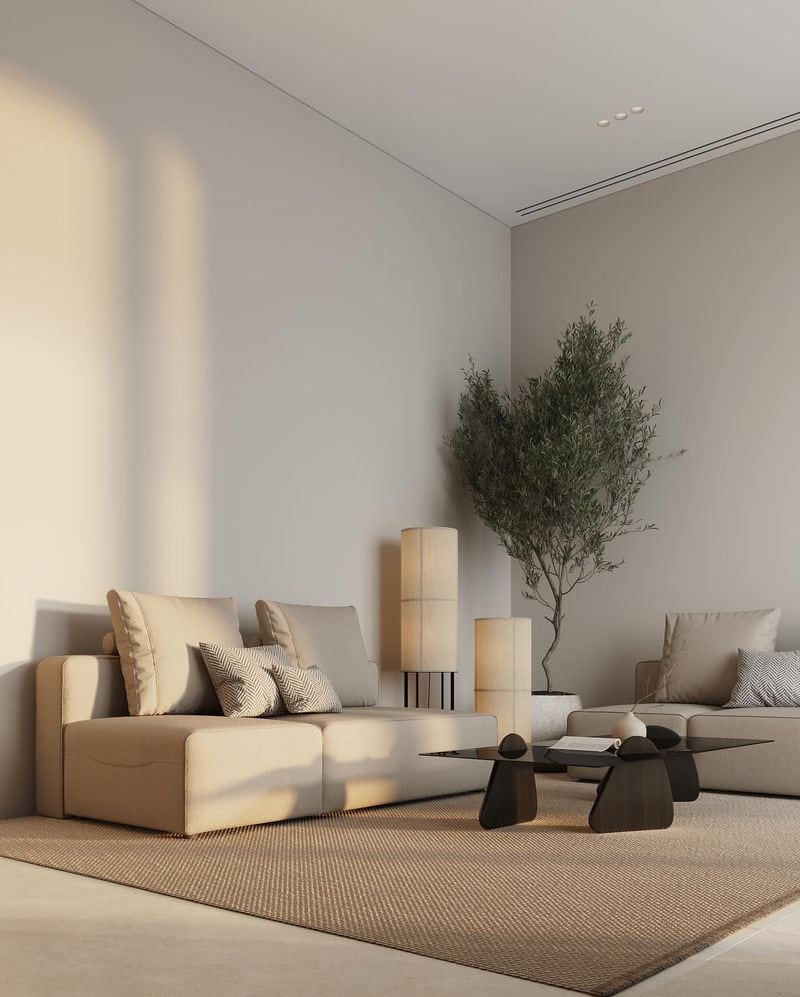
3. You Don’t Bring In Texture
A room without texture is like toast without butter—dry and unappealing. Texture brings warmth and interest to your beige and cream space. Consider textiles like plush rugs, knitted throws, or textured cushions.
Adding texture doesn’t just bring coziness; it invites people to touch and feel. Don’t let your home be a flat landscape; let it be a feast for the senses!
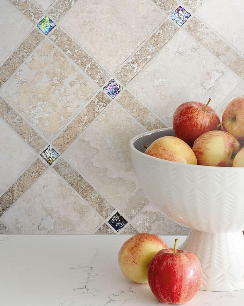
4. No Difference in Hue
Using the same hue of cream everywhere might seem coordinated, but it can flatten your space into oblivion. The trick is to vary shades and tones.
Introduce different hues of cream and beige to create layers. This can make your room feel more dynamic and visually interesting. Embrace variety; after all, life isn’t just one shade!
5. You Use Outdated Patterns
Outdated patterns are like fashion faux pas for your home. That floral pattern might have been trendy once, but now it whispers ‘out of touch’. Replace outdated designs with fresh patterns.
Opt for geometric or abstract prints that complement your neutral tones. This swap can instantly modernize your space and lift the overall vibe.
Patterns should be a statement, not a whisper from the past!
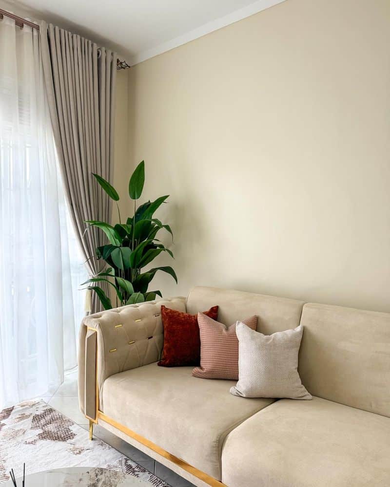
6. No Accent Colors
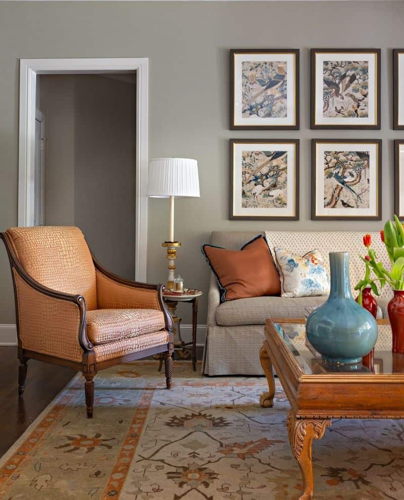
Without accent colors, your beige and cream space might look as exciting as watching paint dry. Accent colors bring life and energy. Consider adding vibrant cushions or artwork to break the monotony.
Choose colors that contrast but complement your base tones. It’s like adding spice to a dish—it transforms bland into grand!