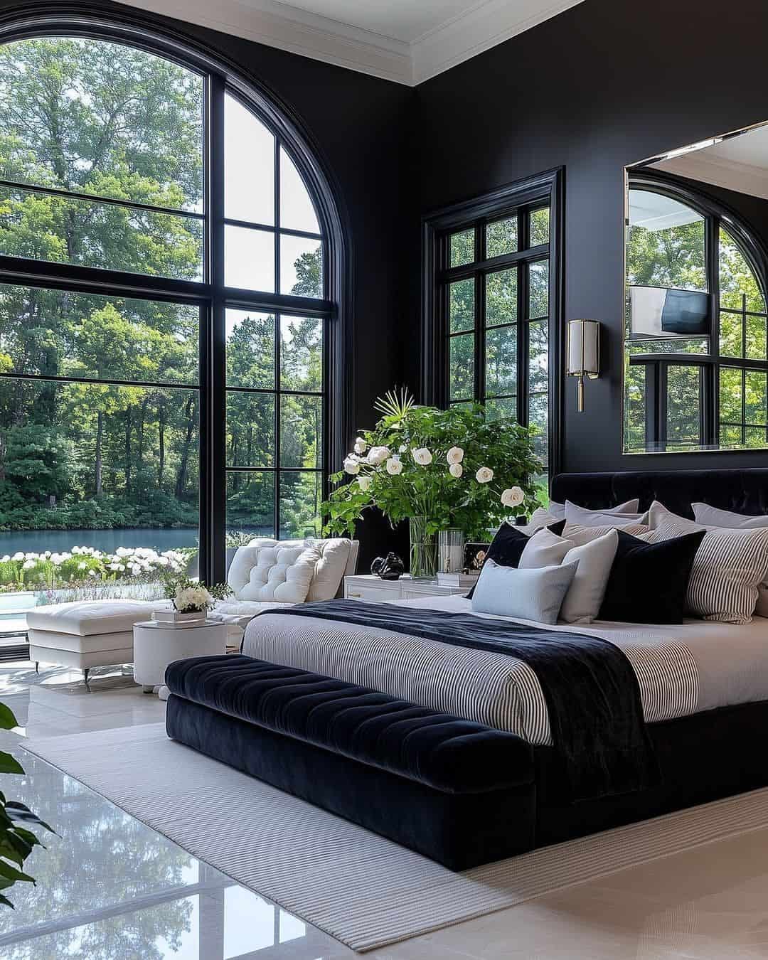
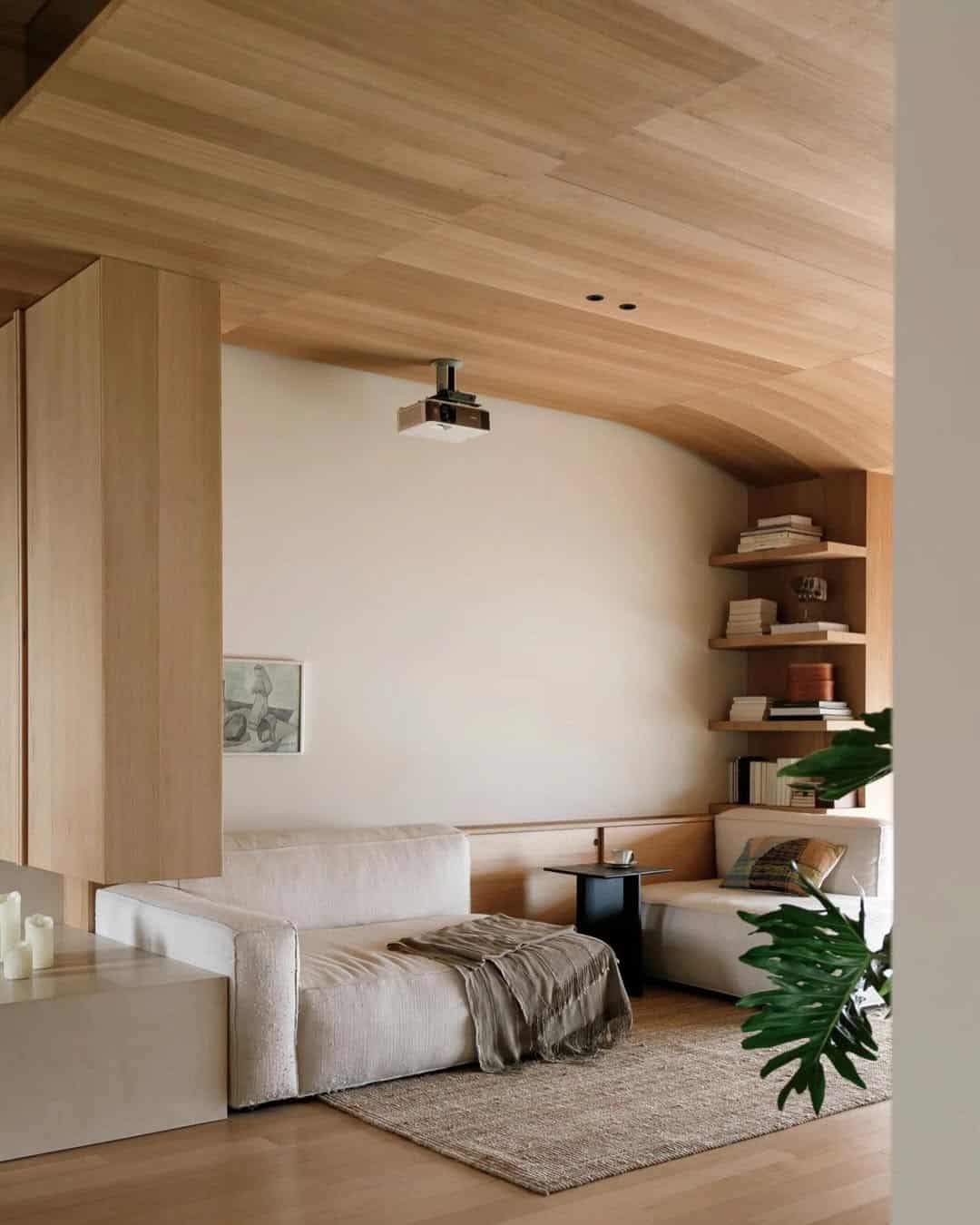
So, you’ve decided to give your space a makeover, but there’s just one tiny problem: picking a color. You stare at the paint chips, overwhelmed by the hundreds of shades.
What if you choose a color that’s too bold? What if it’s too dull? What if it doesn’t feel right?
You don’t want to end up with a neon green kitchen or a violet living room that looks like it belongs in a 90s sitcom. The answer? Well, it might be to avoid making a decision entirely—at least at first.
Fear not! We’ve put together a list of the best color palettes for the color-averse among us.
These color schemes are safe, stylish, and, most importantly, neutral enough to let you pretend you did pick a color without having to go all-in on a deep red accent wall.
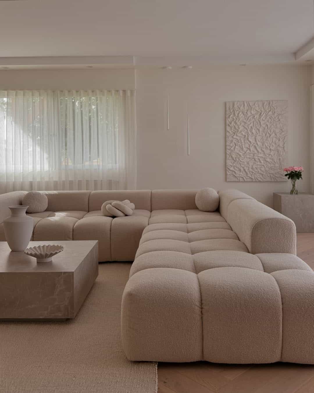
1. Shades of Beige: Because Who Needs Color Anyway?
Beige is the color equivalent of that reliable friend who always says “I’ll just go with whatever you decide.”
There’s no risk here. No drama. It’s the color of stability and subtlety, the paint equivalent of your favorite pair of sweatpants.
And yes, there are a million shades of beige—each more understated than the last. If you’re not sure which beige to go with, just pick the one that feels the most “sophisticated,” whatever that means.
2. White-on-White: Because Who Needs Variety?
If beige is a safe bet, white-on-white is its overachieving cousin.
The minimalism trend is great, but it does tend to make you wonder if you’ve entered an art museum where only monochrome rooms are allowed. But in all honesty, it’s hard to go wrong here.
Choose a soft, off-white hue for your walls and perhaps a slightly different shade for your trim. No one will know, and they’ll all think you’re so avant-garde.
Besides, white is basically just an absence of color, so you’re technically avoiding commitment while looking effortlessly chic.
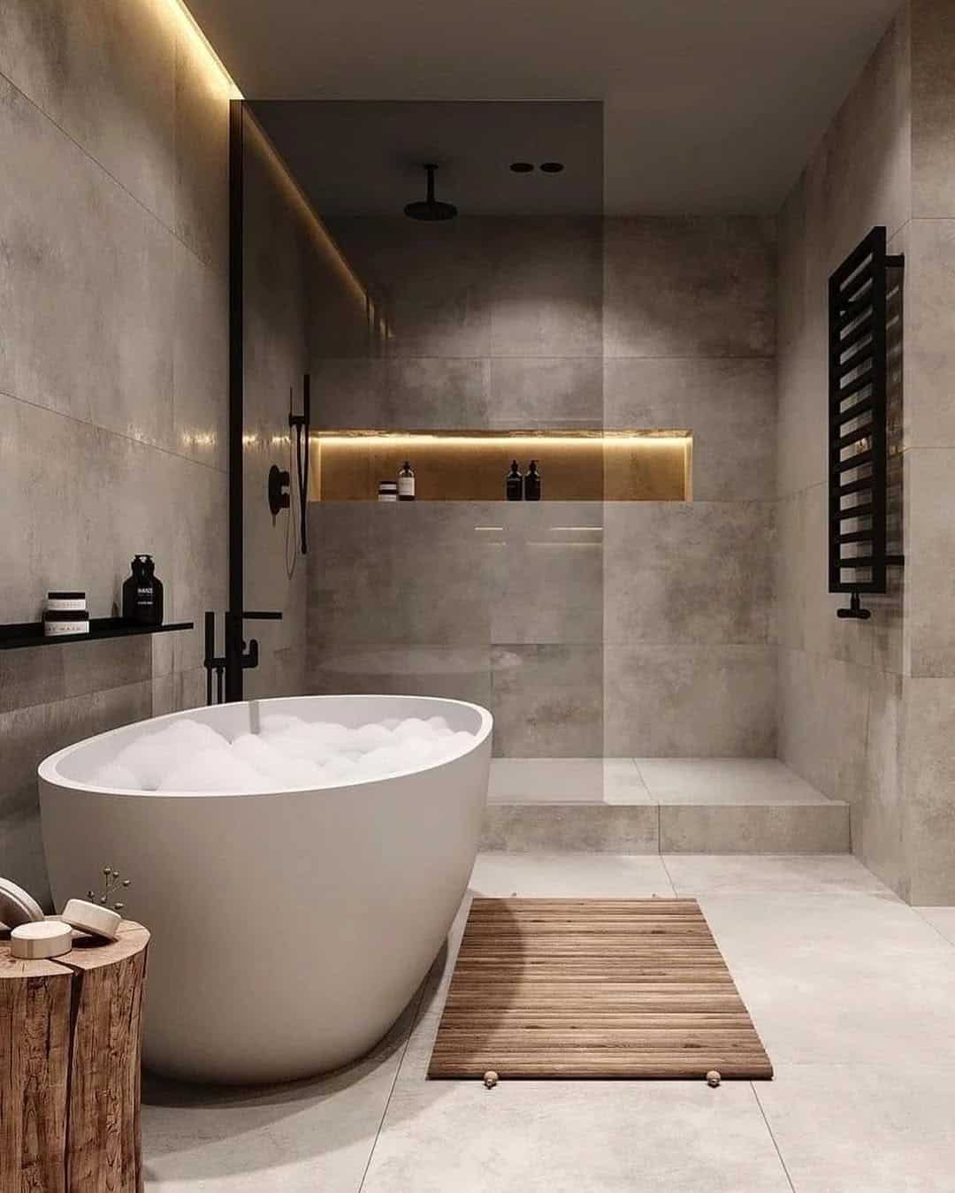
3. Gray, But Not Too Gray
Gray is often misunderstood. People think it’s boring, but it’s really the “I’m understated, but I know what I’m doing” of the color world. Light gray? It’s a cool breeze. Dark gray? It’s intense.
The great thing about gray is that you can go light, dark, or in-between and still feel like a design genius without actually trying.
Plus, gray pairs with literally everything, so you can always change your mind later without needing to repaint.
4. Greige: The Color You’ve Never Heard Of
Greige is the lovechild of grey and beige. It’s basically the perfect compromise for anyone who’s too afraid to choose between the two.
It’s neutral, it’s soothing, and best of all, it’s trendy without being loud about it.
The beauty of greige is that you get all the benefits of both grey and beige, but it’s a little more sophisticated and less, well, obvious.
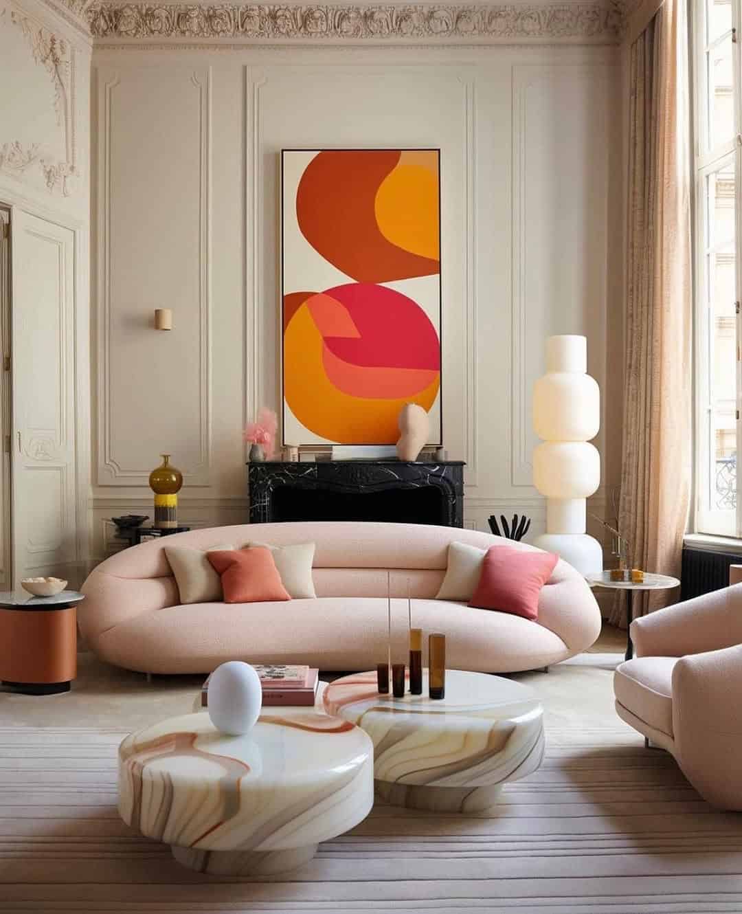
5. Pastel Heaven: Soft Enough to Be Safe
Pastels are like the baby steps of color. They’re gentle, soothing, and slightly more exciting than beige, but still far enough from the boldness of primary colors.
Soft blues, mint greens, blush pinks, and lavender tones are great for calming your nerves about color.
You get to enjoy some color without the terror of a bold red or neon yellow, and your home will still look warm and inviting.
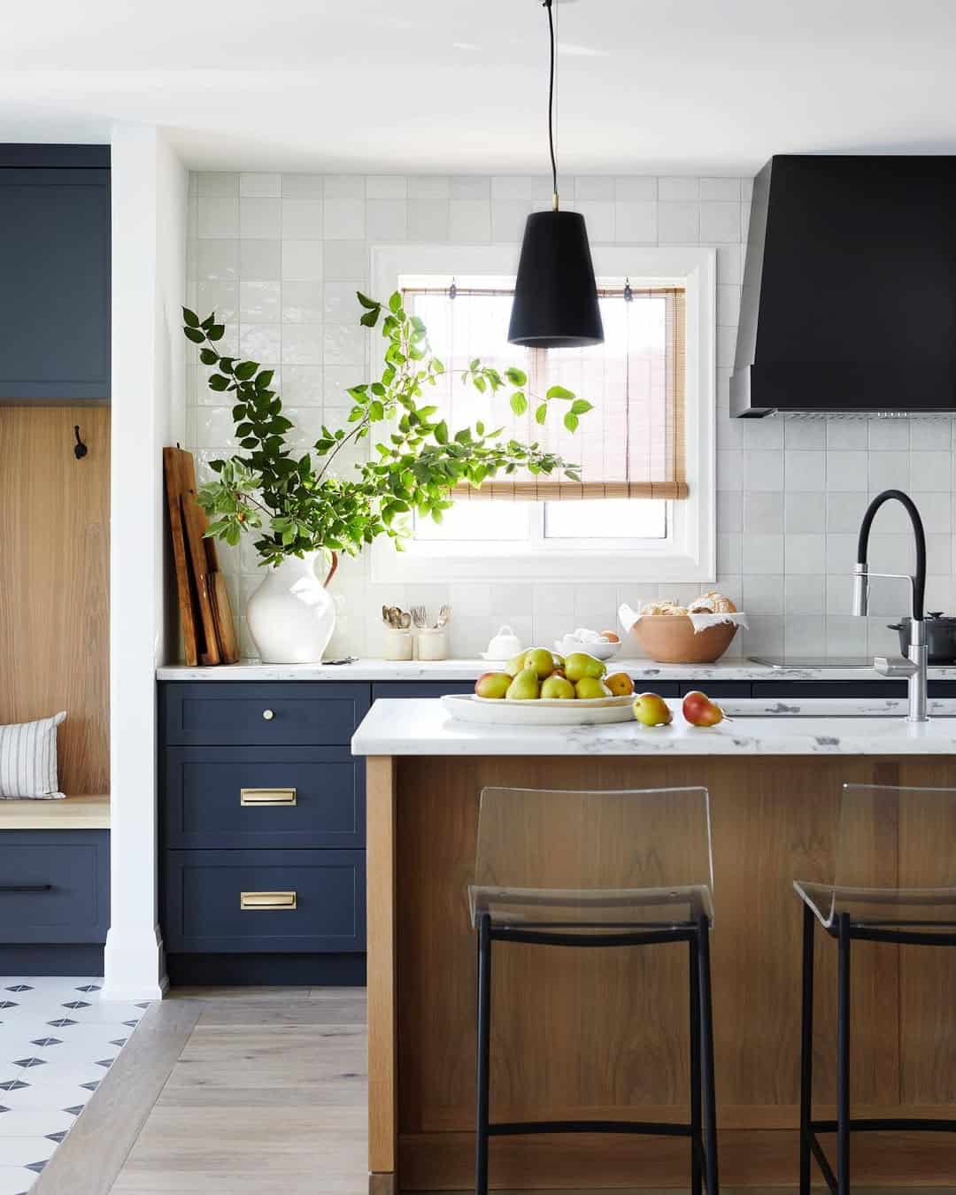
6. Navy and White: The Preppy Perfection
Navy and white are like a dynamic duo that never goes out of style. It’s the combination of timeless sophistication and nautical vibes, and it says, “I know what I’m doing” without shouting it.
Plus, navy is dark enough that it can make your space feel cozy without being too overwhelming, while white keeps things fresh and open.
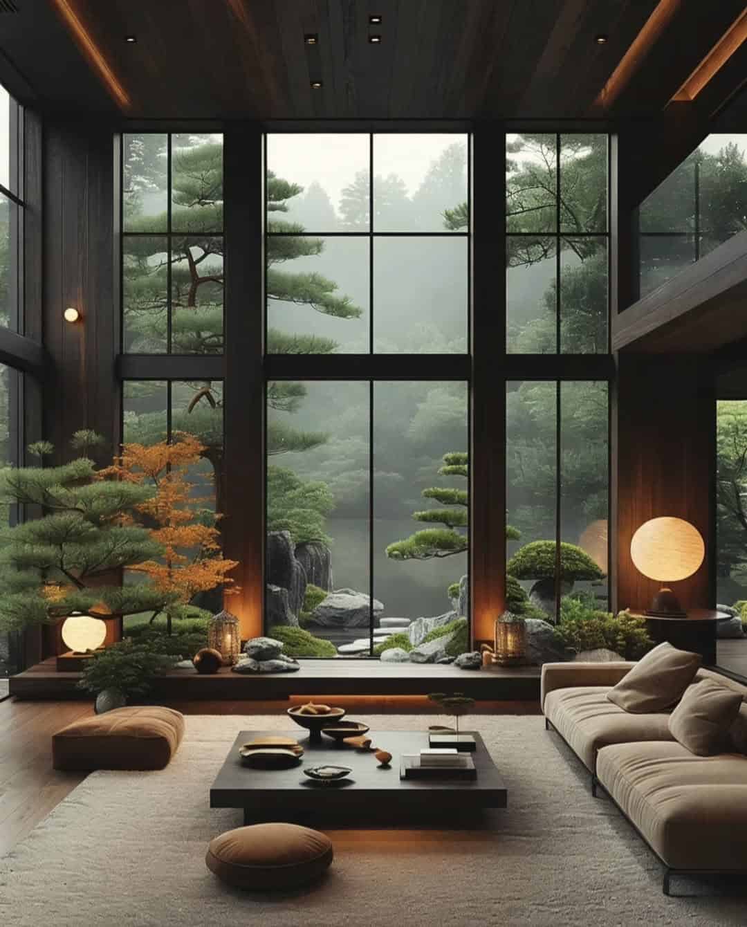
7. Earth Tones: The ‘I Love Nature’ Palette
Earth tones are your go-to if you want to incorporate color but avoid anything that could be described as “loud” or “in-your-face.” Think muted greens, soft browns, and terracotta oranges.
These colors will make you feel like you’ve created an oasis in your living room without ever having to commit to anything wild or daring. They’re like a cozy blanket for your walls—calming and inviting.
8. Black and White: The Boldest Choice, but Not Really
If you want to pretend you’re edgy without actually taking risks, the classic black-and-white combination is the answer.
This palette says you’re daring, but in reality, you’re just really good at following trends. It’s a surefire way to create a stylish, high-contrast space without ever truly stepping into the realm of color.
Plus, it’s perfect for a monochrome masterpiece that says “I’ve got my life together” without the need to make any actual decisions.
9. Wood Tones: The Natural Choice
Wood tones aren’t technically a color, so they’re the perfect choice for someone who’s too afraid to pick one.
They add texture, warmth, and a sense of coziness to your space, all while being completely neutral.
Whether you’re choosing light oak or dark walnut, wood tones are versatile and timeless, and they’ll help you feel like you’ve made a very sophisticated decision—even though it was, in fact, the easiest one.

