Choosing the right ceiling paint color is crucial for setting the tone and mood of a room. While it’s tempting to experiment with bold or trendy hues, some colors can lead to disappointing results.
Designers have weighed in on the shades they frequently see homeowners regret. To help you avoid these pitfalls, we’ve compiled a list of 8 ceiling paint colors you might want to think twice about.
1. Dark Brown
Dark brown ceilings can make a room feel smaller and more enclosed. This heavy color often absorbs light, leading to a cozy yet oppressive atmosphere. It may work well in large, open spaces with ample natural light.
However, in smaller rooms or those with limited lighting, it can make the space feel cavernous. Homeowners often find themselves repainting sooner than expected due to the overwhelming presence it creates.
If you’re considering dark brown, ensure the room is well-lit and balanced with light furnishings to prevent an overly gloomy effect.
2. Vibrant Red
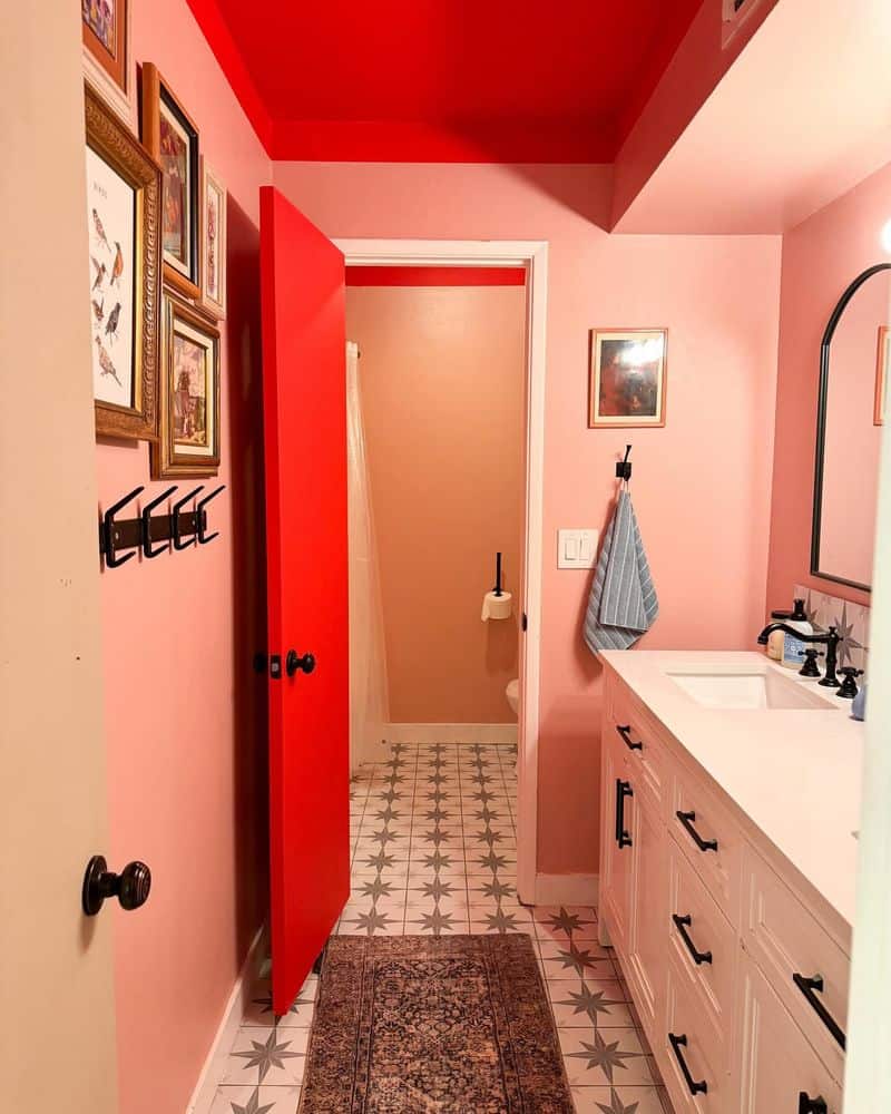
Vibrant red ceilings can be visually intense and overwhelming. While red is often associated with energy and passion, on a ceiling, it can feel aggressive and overpowering. It might overshadow other design elements, making it difficult to create a harmonious space.
This choice often leads to a restless ambiance, especially in areas meant for relaxation. Designers suggest using red as an accent rather than a dominant ceiling color.
If you love red, opt for muted shades or confine it to smaller sections to retain vibrancy without overpowering the space.
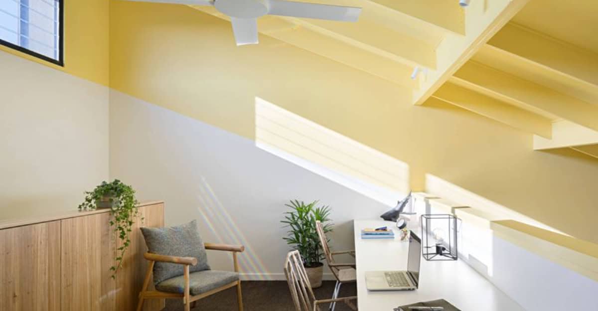
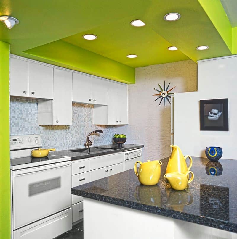
3. Bright Yellow
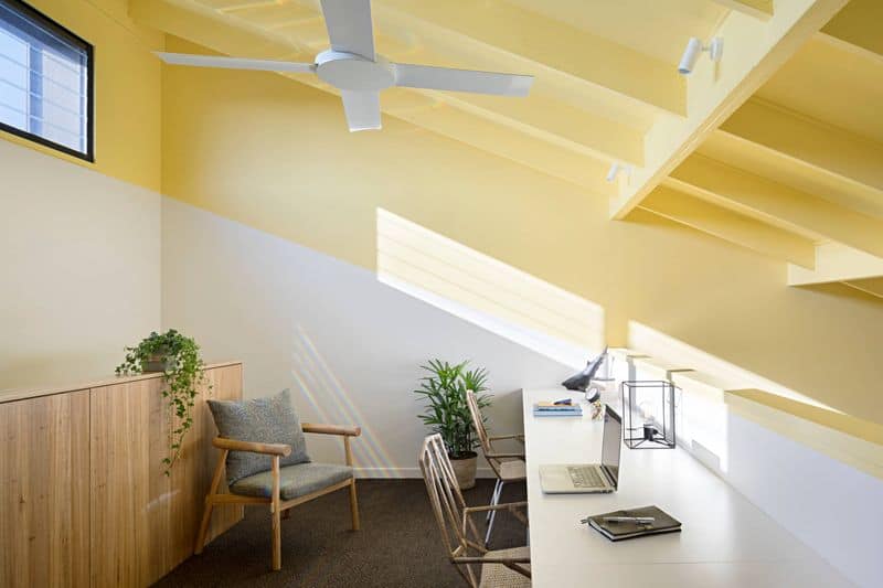
Bright yellow can be overly stimulating as a ceiling color. While it exudes cheerfulness and energy, it may not be the best choice for all spaces.
The stark contrast with typical ceiling whites can create a jarring effect. This brightness can also clash with other design elements, leading to visual dissonance.
Designers often advise using yellow cautiously as it might dominate the room’s aesthetic. To incorporate yellow without overwhelming, consider softer shades or limit it to accent areas, ensuring a balanced and pleasing appearance.
4. Deep Purple
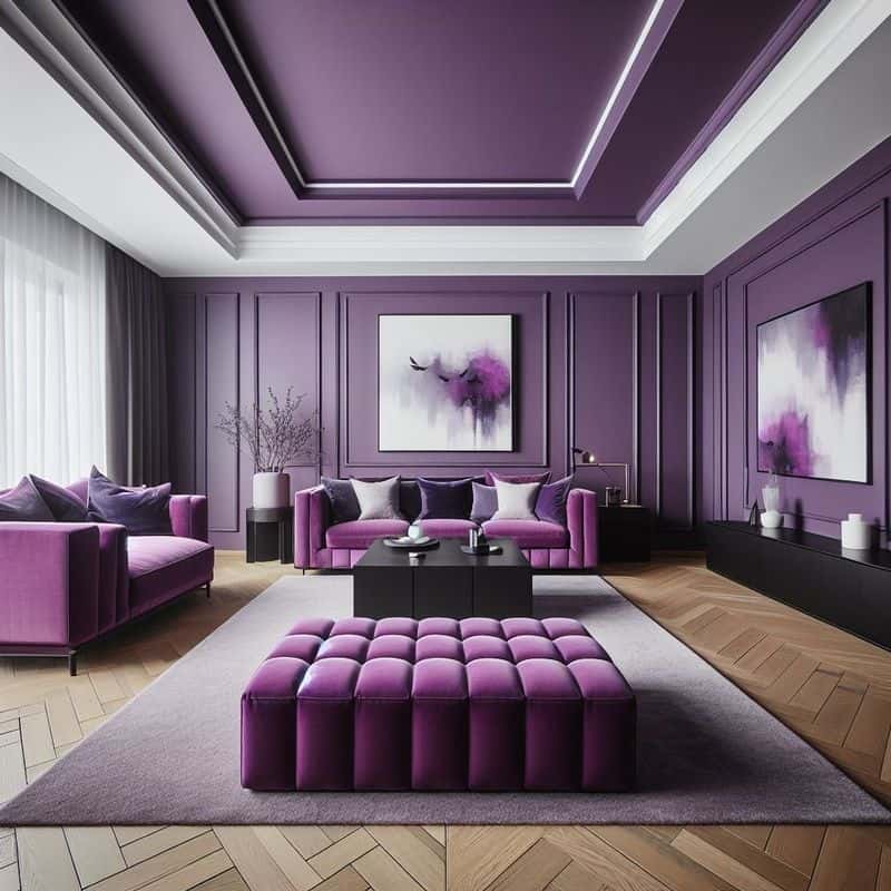
Deep purple ceilings can introduce a touch of luxury but often at the cost of a room’s openness. This color can make spaces feel smaller. Its ability to absorb light might not suit all settings, particularly those lacking natural light.
Homeowners frequently find it challenging to pair with existing decor without creating a clash. Consider the room’s size and lighting before opting for such a rich hue.
If you desire the elegance of deep purple, balance it with lighter walls and decor to maintain harmony.
5. Jet Black
Jet black ceilings are risky for most spaces. While they can add drama and sophistication, they also have the potential to make a room feel claustrophobic.
This striking contrast with lighter walls demands careful balance to prevent the space from feeling oppressive. Designers often recommend black for larger areas with high ceilings.
If you’re set on using black, ensure ample lighting and contrasting decor to offset its intensity. This will help maintain a modern and chic appearance without compromising comfort.
6. Neon Green
Neon green is a daring choice that can quickly become overwhelming. While it might appeal in playful settings like children’s rooms, it often proves too bold for general living spaces.
The intensity of neon green can overshadow other design elements, making the room’s aesthetics appear imbalanced. Homeowners report feeling fatigue from this high-energy color.
Designers suggest using neon shades sparingly and complementing them with muted tones. This approach maintains vibrancy while avoiding sensory overload and ensuring the space remains inviting and comfortable.
7. Bright Orange
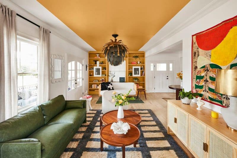
Bright orange ceilings might feel invigorating but often become overwhelming. This bold color can dominate a room, making it difficult to coordinate with other design elements.
While orange is associated with warmth and creativity, it can overshadow other details and lead to a chaotic aesthetic. Homeowners frequently reconsider orange ceilings due to their overpowering nature.
To enjoy the vibrancy of orange without regret, opt for muted tones or use it in small doses, ensuring it enhances rather than dominates your space.
8. Pastel Pink
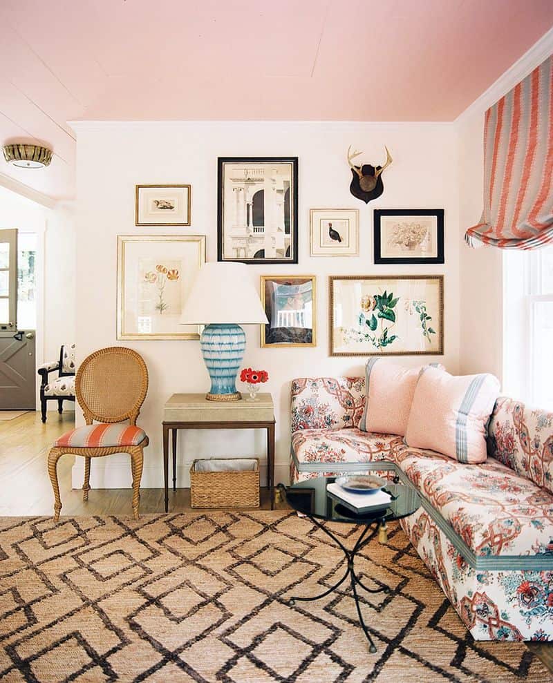
Pastel pink ceilings can appear overly sweet and juvenile, particularly in more mature settings. While this shade might work well in nurseries, it can feel out of place in other areas.
The softness of pastel pink might also clash with bolder design elements, leading to an unbalanced room. Homeowners often find themselves repainting as the novelty of pink wears off.
If you’re drawn to pink, consider using it as an accent color or in spaces where its gentle nature complements rather than conflicts with other elements.