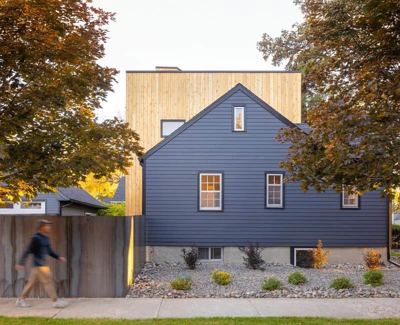
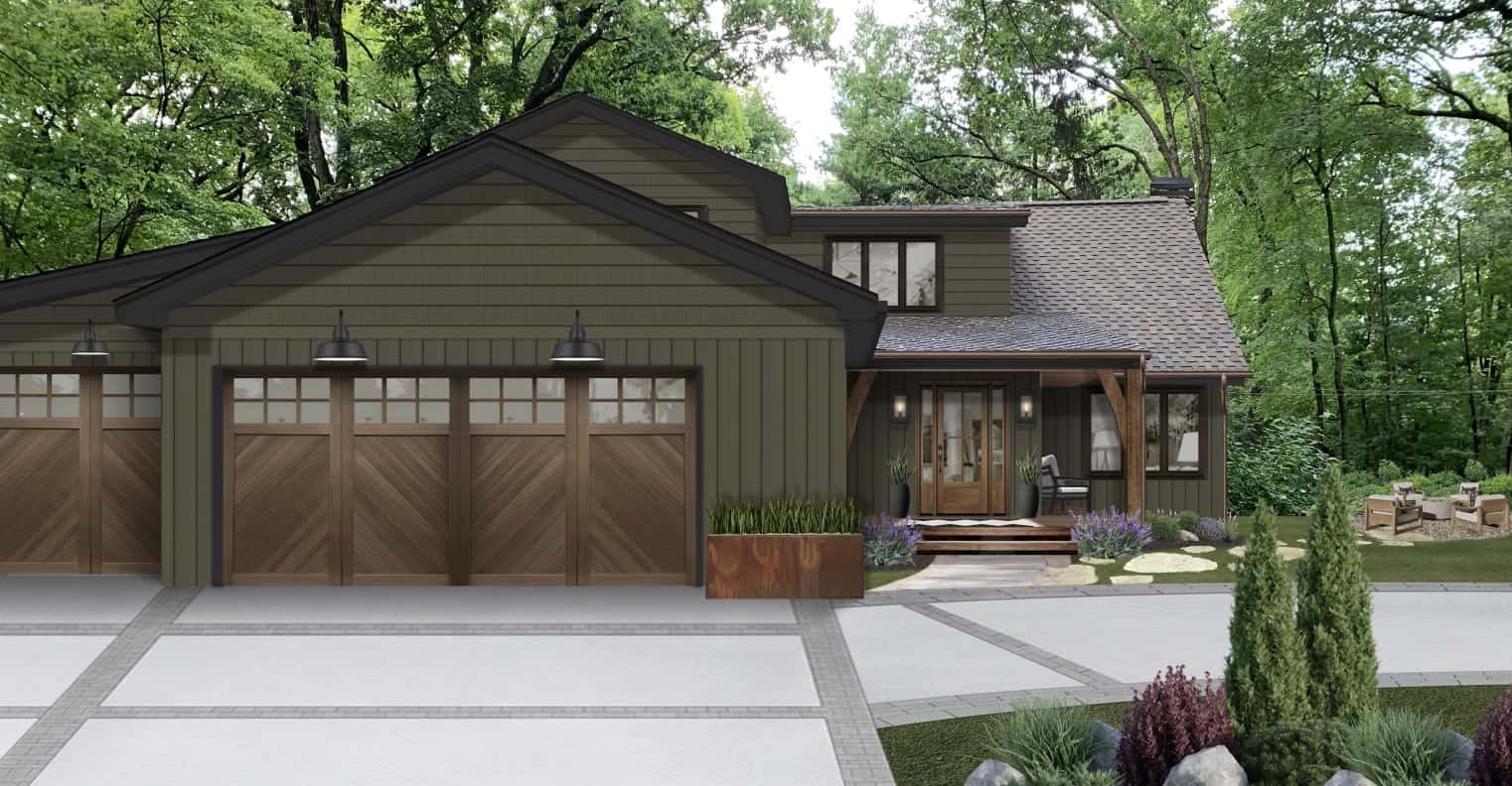
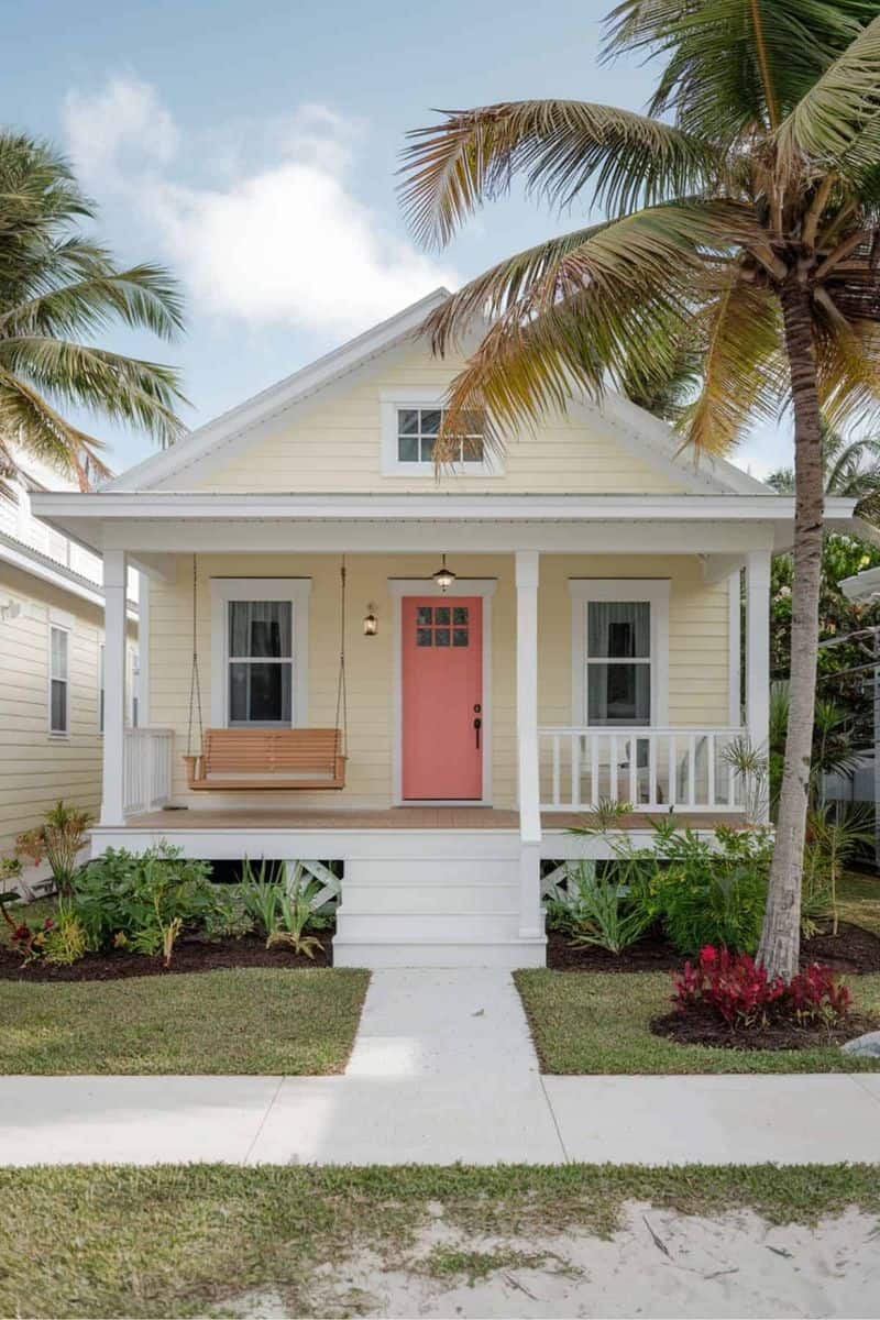
Choosing the right exterior color combo for your home is crucial.
The wrong choice can decrease its market value. Here are 11 color combinations that might not appeal to potential buyers.
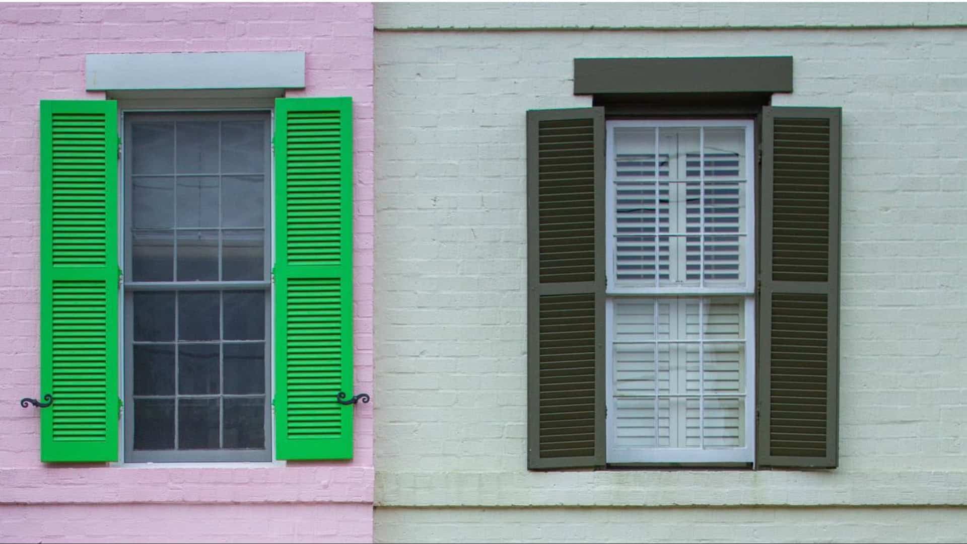
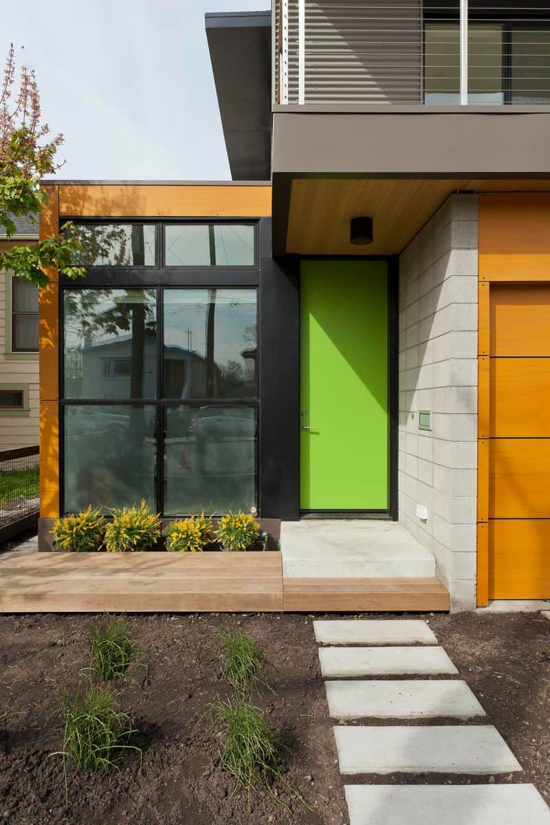
1. Neon Green and Hot Pink
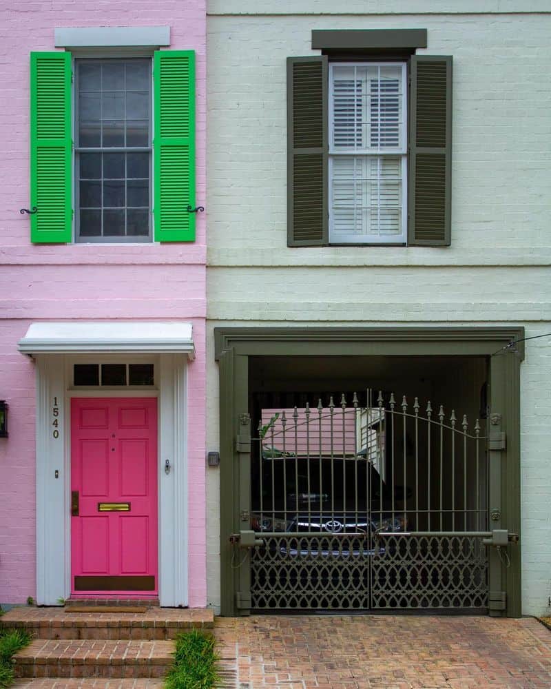
Imagine a house so bold, it’s blinding. Neon green walls paired with hot pink trim are more of an eyesore than an eye-catcher.
While this combo might have had its heyday in 1980s pop culture, today it screams ‘hard sell.’
Maintaining such vibrant colors is a constant battle against fading.
2. Black and Purple
A house cloaked in mystery, but not in marketability. Black and purple may suit a Halloween theme, but tend to turn potential buyers away.
Once trendy during the goth phase, this combo now feels outdated and hard to maintain. Fading and upkeep issues further deter buyers.
3. Red and Orange
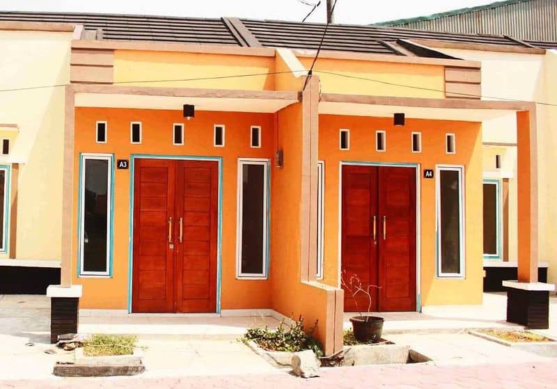
This fiery combination might heat things up, but not in the right way. Red and orange clash harshly, making homes appear aggressive.
Popular in the 1970s disco era, today it discourages buyers. The maintenance of such bright colors, especially in sun-struck areas, is challenging.
4. Pastel Blue and Yellow
Pastels can be serene, but this mix tends to whisper ‘old-fashioned.’ Once charming in the mid-20th century, pastel blue and yellow now feel aged.
Their soft tones demand frequent upkeep to preserve their delicate balance. Buyers often pass by, seeking something more modern.
5. Brown and Olive Green
Earth tones blend with nature, but this duo often blends into the background too much. Brown and olive green were popular in the 1970s, but today they lack appeal.
Maintenance is less about fading and more about standing out in a competitive market.
6. Pink and Yellow
A playful combo that turns heads, but not in admiration. Pink and yellow can overwhelm, making houses look like candy stores rather than homes.
Once part of the 1990s beach trends, maintaining such bright hues requires constant effort. Buyers often look for subtler options.
7. White and Gold
Luxury can sometimes lead to loss. White and gold exude opulence but are hard to keep pristine.
Popular in Gilded Age architecture, today they feel pretentious and high-maintenance.
The need for regular cleaning and upkeep deters many buyers looking for simplicity.
8. Orange and Lime Green
A jarring mix that shouts rather than sings. Orange and lime green attract attention but not bids. Once trendy in the psychedelic era, it now feels too loud for most buyers.
The maintenance of these vivid colors is as challenging as finding a buyer who appreciates them.
9. Gray and Red
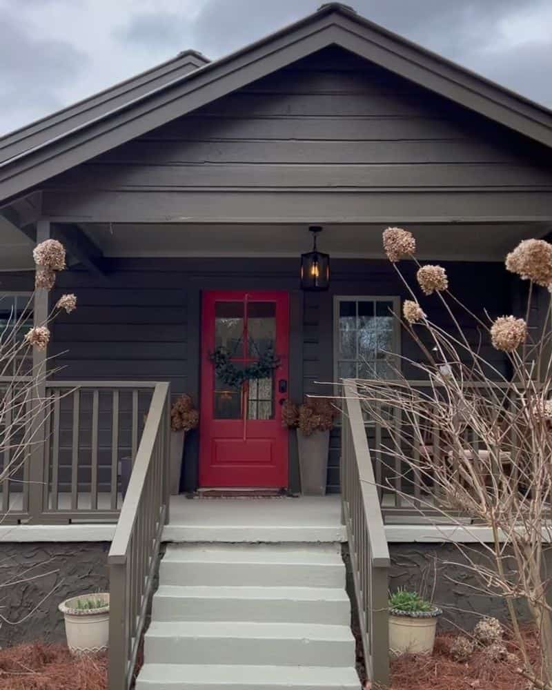
The stormy elegance of gray clashes with the boldness of red. This combination often feels disjointed rather than complementary.
Popular during industrial design trends, today it struggles to find favor with buyers. The upkeep of contrasting tones can be demanding.
10. Teal and Peach
Teal and peach, reminiscent of seaside retreats, may seem inviting, but often don’t translate well inland. Popular in retro seaside resorts, they can look out of place in urban settings.
The colors demand frequent updates to remain fresh, posing a challenge for sellers.
11. Purple and Yellow
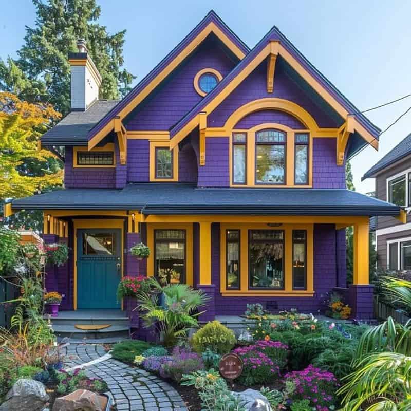
A regal touch gone awry. Purple and yellow vie for attention, causing visual discord. Once a symbol of royal jesters, today it feels misplaced in residential areas.
The maintenance of such a bold palette is formidable, deterring potential buyers seeking harmony.