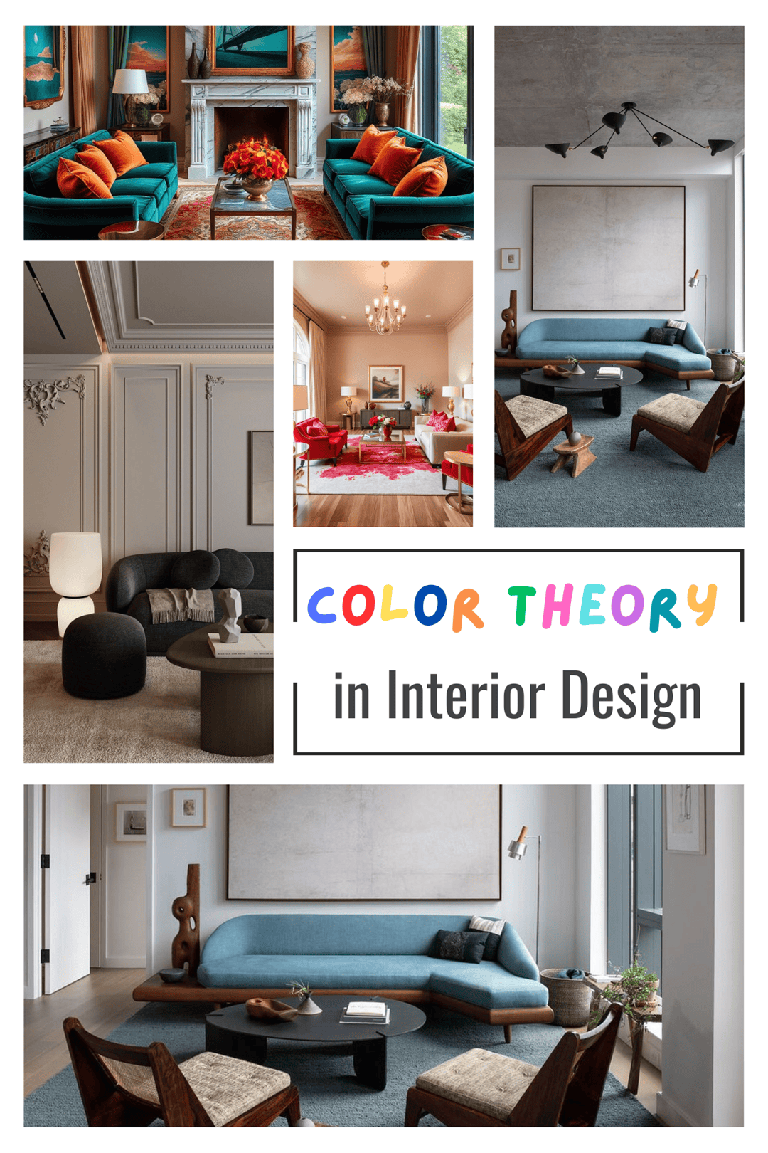
If you’re looking to learn how to use color theory for your interiors, we’ll need to start from the basics.
We’re sure that most of you know what color theory is, but for the ones that don’t: color theory is the study of how colors work together and how they impact our mood.
To understand color theory you must understand how colors work together to create harmony. You’ll also need to know how to use hues, intensity, and temperature when choosing colors.
When you combine all of these principles, you’ll get amazing interiors that evoke specific emotions or convey different messages.
Now, most people shy away from using color, not because they don’t like it, but because they don’t know how to use it. There’s a reason why children love colorful spaces!
Children don’t fear color because it evokes certain positive emotions in them. As we grow older we tend to draw color out of everything in our lives, from the closet to the home.
But fear not, today we’ll be tackling the ever-frightening notion of colors in our living spaces, and after reading, we hope that you’ll feel brave enough to paint that accent wall!
Why Is Color Theory Important in Interior Design?

Color theory plays a very important role in the world of interior design since designers use it constantly to create visually pleasing and cohesive spaces.
If they only stick with trusty old neutrals, all of our homes would look the same!
If you understand how color theory works and what effects its combinations have, you can use it to create balanced and harmonious spaces, or even create contrast in order to emphasize some elements!
How Can Color Theory Help?
Color theory is a very valuable asset to interior designers since they are able to create harmonious and dynamic spaces.
Those who understand the ways of color theory are able to play around with cool and warm tones without making the room look like a child’s coloring book!
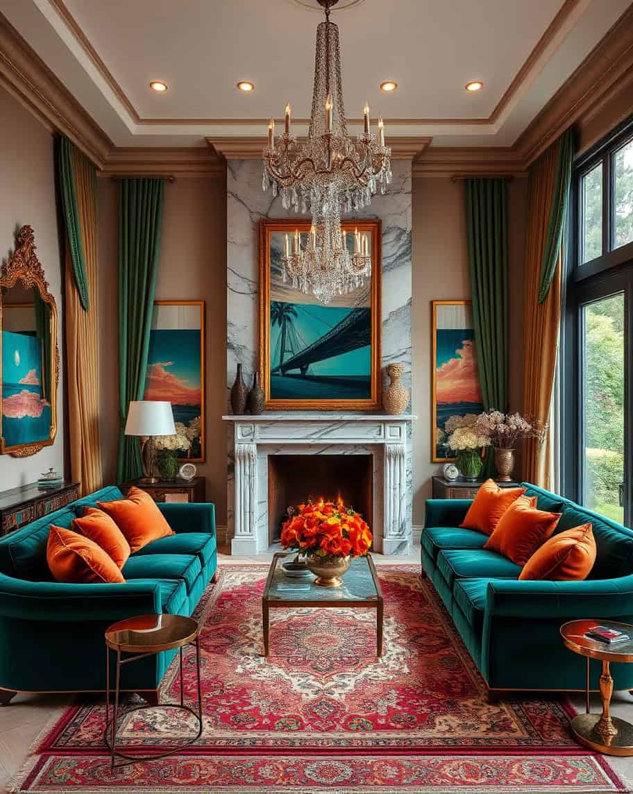
If you want to give your space some drama, give it a makeover with reds, yellows, and oranges, but if you want to create a serene space, opt for blues and greens!
The Basics of Color Theory
When you master the basics of color theory, you will be able to mix and match colors to achieve a certain desired effect.
By understanding color theory, you do not only understand how different colors work with each other, but how light interacts with those colors as well!
With color theory, you’ll be able to create a beautifully cohesive home!
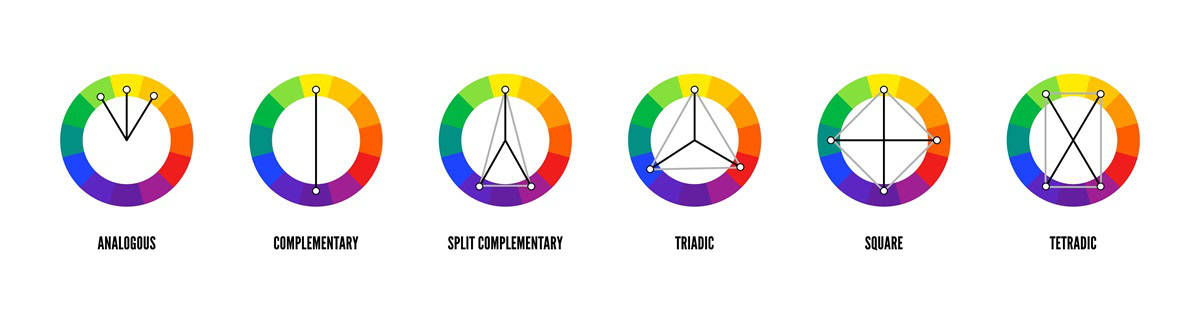
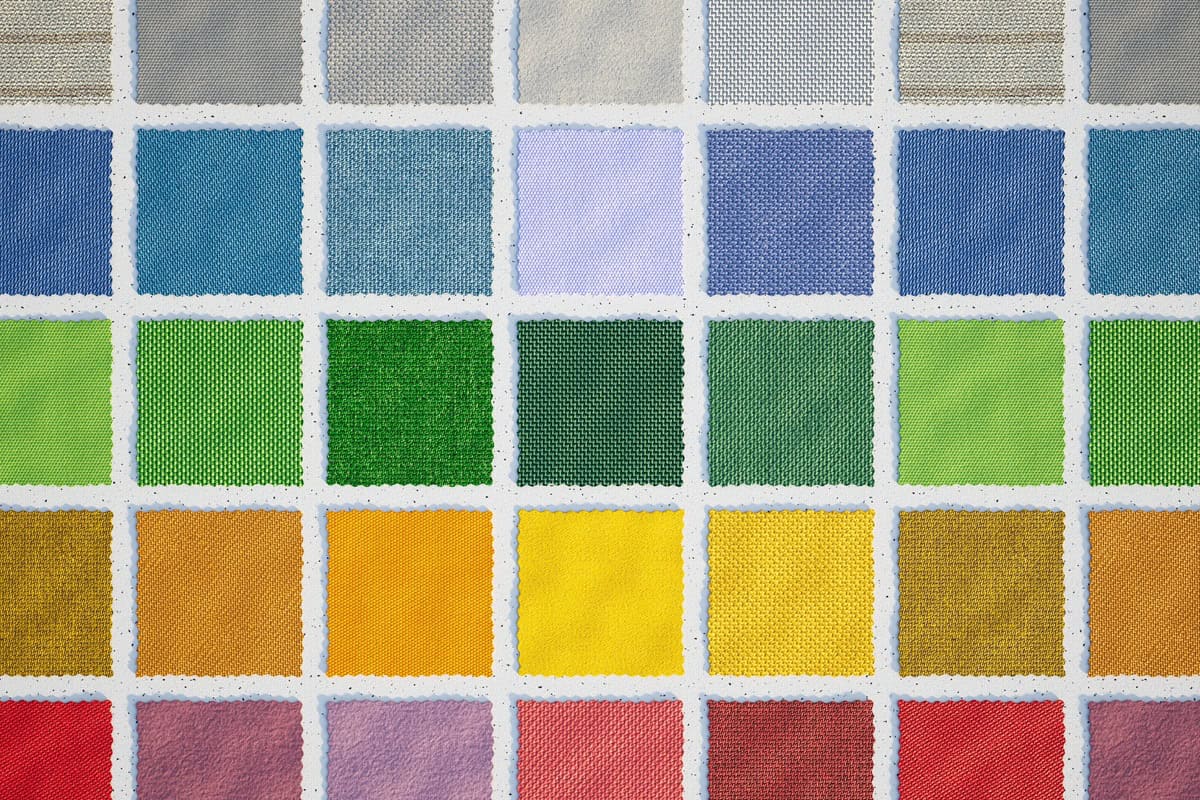
1. The Color Wheel
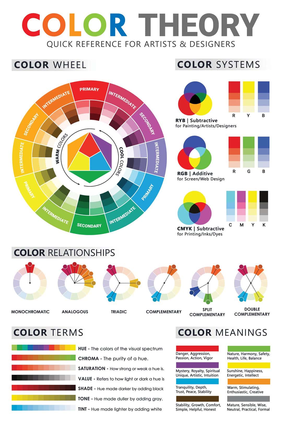
The color wheel is the most important part of color theory. It’s a visual representation of which colors work well together.
It is made up of 12 sections, where each one represents a basic hue. We have red, orange, yellow, blue, green, purple, and their shades.
The color wheel contains:
- Primary colors – red, yellow, and blue. These colors cannot be created by mixing other colors, but when you mix them together, you’ll get one of the secondary colors.
- Secondary colors – as we said, these colors can be achieved by mixing two primary colors, so you can get either orange, green or purple.
- Tertiary colors – these colors are achieved by mixing one primary and one secondary color.
- Complementary colors – these are colors that sit opposite each other on the color wheel and when paired together, they create a beautiful contrast.
- Split complementary colors – very similar to complementary colors, only these include two bonus hues on either side of a component (e.g. orange-yellow-blue)
- Analogous colors – these colors harmonize with each other and they include shades that are right next to each other on the color wheel.
- Monochrome colors – we all love a good monochrome moment, but your space can often feel flat when using one color. The trick is to use different tints and hues of the same color.
- Neutral colors – we are talking about color, but we can never forget our trusty neutrals. If you want to balance out your space go for white, beige, gray, or black.
2. Temperature
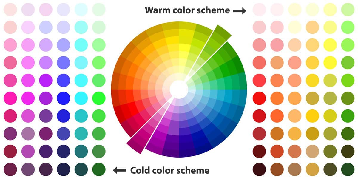
The temperature of your colors is a very important aspect of color theory, because, when you understand which shade evokes which emotions, you’ll be able to achieve the desired effect in your space.
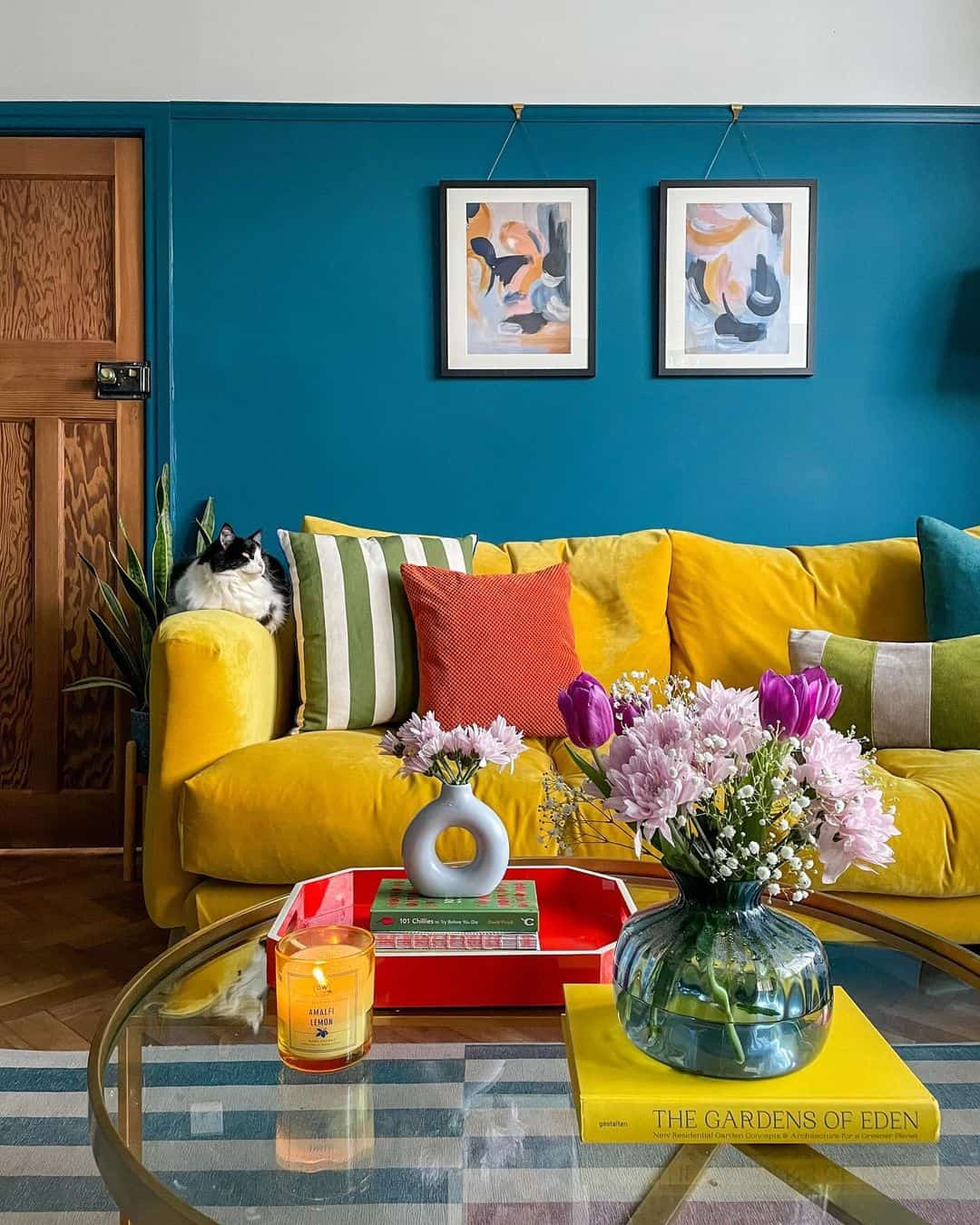
If you want a cool, calm space then go for colors that have cooler hues like blue, green, and purple. Yet, if you want a more energized, warm space, go for warmer tones like red, orange, and yellow!
Balance is always welcome, so if you want to create harmony between these two opposing temperatures, bring in a neutral shade!
3. Color Schemes
Like color temperatures, color schemes can elicit different emotions.
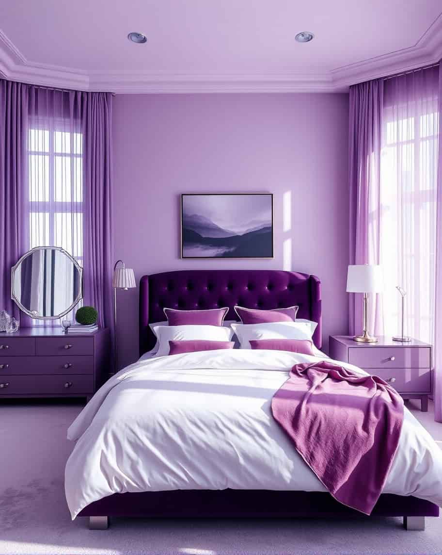
For example, a monochrome color scheme uses one color in different shades and hues. It’s perfect if you want to create a uniform, yet timeless look in your home.
Apart from using one color in your whole space, the analogous color scheme promotes using three colors similar in hue that are placed next to each other on the color wheel.
The most popular one might just be the square color scheme. This means that you’re using four colors equally spaced out from each other on the color wheel.
This means that all of your colors are complementary and you’ll be able to draw attention to some aspects of your space while still having balance.
4. Color Combos
When we talk about color combinations, it’s mostly about colors with opposite undertones (cool and warm).
When you pair up yellow and blue for example, you get some visual interest and vibrancy in your space!
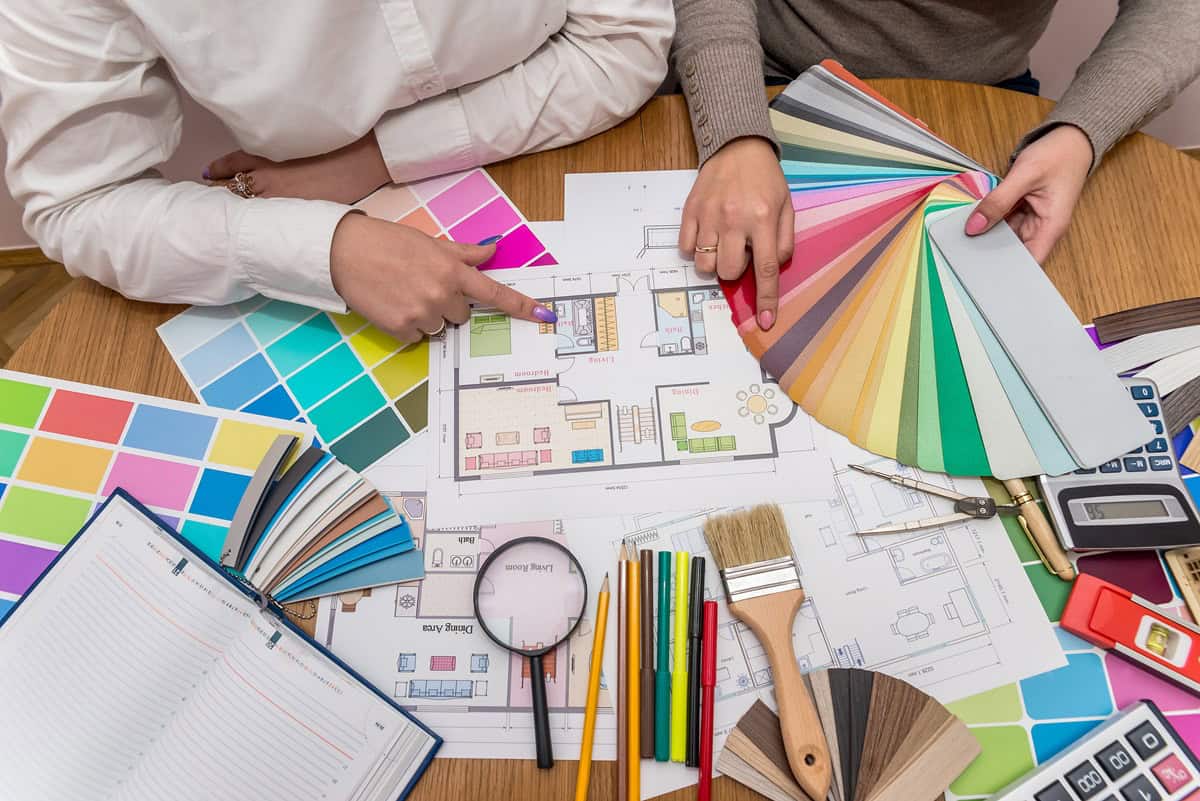
How to Use Color Theory in Interior Design
Now that we have the basics down, we can move on to actually incorporating this newfound knowledge into your home!
1. Use the Color Wheel
AI-Generated Image
If this one wasn’t obvious enough, let us tell you, the color wheel is your best friend. With the color wheel, you’ll be able to figure out which colors are complimentary or analogous.
By using the color wheel to determine the color scheme of your home, you’ll achieve a coordinated space where all colors dance harmoniously together!
2. Understand Tints and Shades
This one is fairly easy. If you want to create a lighter hue of a certain color, just add white! Opposite of that, if you want to create a shade, add black!
3. Carefully Pick out Colors
This is where the size of the room comes into question. You need to pick out your colors carefully depending on the effect you want them to have!
If you want a room to seem smaller and cozier, go for darker colors. If you want it open and bright, opt for lighter colors!
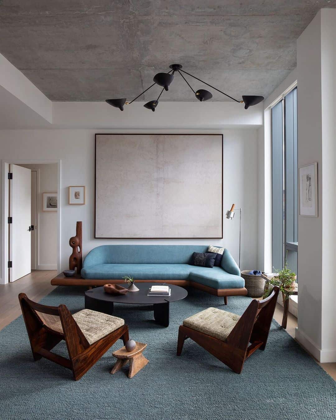
4. Go Monochrome
AI-Generated Image
A monochromatic color scheme is probably the best-known one and it’s pretty easy to achieve. Using varying tints or shades of the same color will give you a cohesive look.
5. Harmonize Primary and Secondary Colors
If you want to create a visually interesting space, combine and harmonize primary and secondary colors!
6. Proportion of Colors
Unless you’re going for a monochrome look, too much of any shade will overpower your space. Make sure you create a power balance between colors so that they are equally distributed in the room.
7. Mind the Lighting
Lighting can play a very crucial role in your interior, especially in regard to color theory. Lighting can change the appearance of your hues.
Keep this in mind when you’re choosing colors and lamps for your interior!
8. Don’t Throw Away the Neutrals
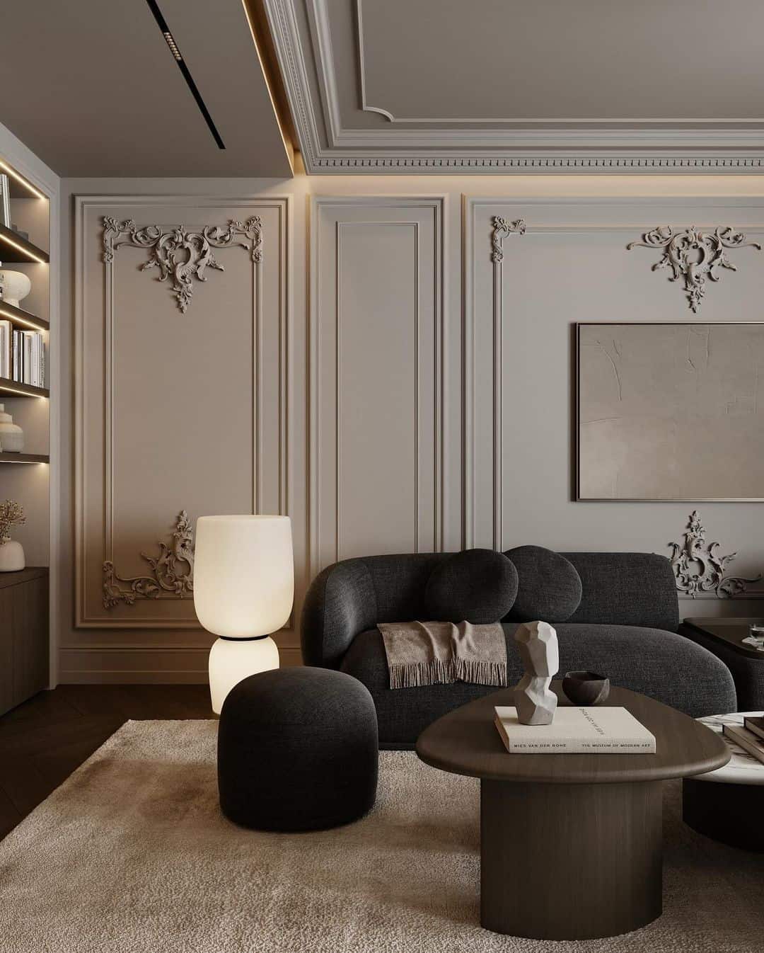
Trusty neutrals go well with all colors, beige, white, black, and gray will never disappoint you!
Use neutrals as accents to balance out other colors used in the space, or just go all out and make them the focal point of your space.
It all depends on what you prefer and want to achieve!
9. Use the 60 30 10 Decorating Rule
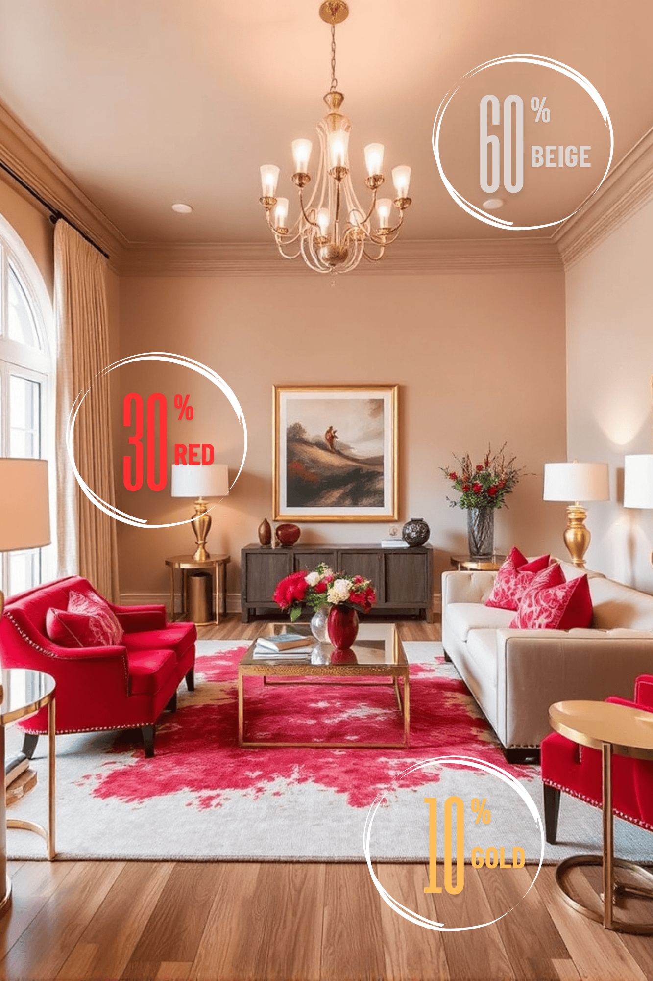
AI-Generated Image
This rule will help you create balanced interiors by suggesting that 60% of the space should be one color, 30 % of the space should be a secondary color, and 10% an accent color!
This rule creates a nice contrast in the space while also balancing out different elements in the room!
10. Experiment!
Lastly, your style is your own, and sure, you can turn to a guide from time to time to look for inspiration, but ultimately you’ll never find what works for you if you don’t experiment!
If you’re stuck in a beige funk, begin by incorporating color through smaller things in your home, and eventually you’ll end up painting your whole living room red!
Conclusion
Color theory can be a very useful tool in interior design. It’s helpful to designers, but also to regular people who just want to give their space a little bit of pizzazz.
When you understand the color wheel, you’ll understand how to create color combinations that can work in any space!
Apart from the visual effect, color theory can help you elicit certain emotions when you enter the room, from calming you down to giving you energy!
Color theory is a valuable asset in anyone’s arsenal if they want to bring their living spaces to life!
Now that you have taken a closer look into color theory, you’re ready to go off on your own and use the knowledge you have acquired here today!