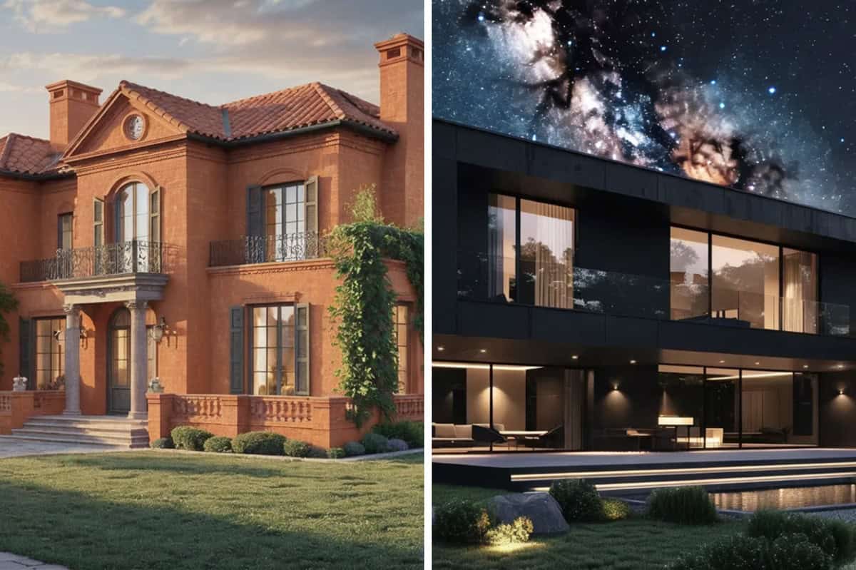
Let’s face it: we’ve all scrolled through Instagram or flipped through glossy home decor magazines and thought, “Why doesn’t my house look like that?”
Well, good news! It’s not because you lack taste—it’s because you haven’t discovered the magical powers of the right paint colors.
But don’t worry, I’m here to guide you through the six colors that will transform your humble abode into something that could rival the pages of Architectural Digest.
Ready to take notes? Let’s get rolling!
1. Greige (aka “Gray’s Trendier Cousin”)
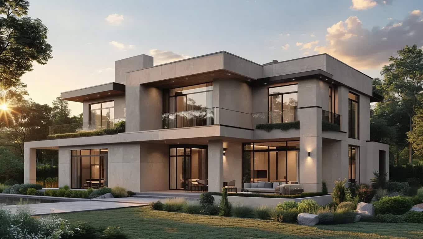
Is it gray? Is it beige? No one knows, and that’s the beauty of it.
Greige is the Switzerland of paint colors—it’s neutral, it’s sophisticated, and it’s so versatile it’ll match anything from your grandmother’s antique dresser to that neon beanbag you “accidentally” bought during a late-night online shopping spree.
Bonus: saying you painted your walls “greige” instantly makes you sound like you know what you’re doing.
2. Soft Blues

No, this isn’t about your Spotify playlist. Soft, light blues like sky blue or cerulean are all the rage.
They’re cute, they’re bold, and they’re basically the paint equivalent of wearing a tailored suit to a party.
Pair them with gold or brass accents, and suddenly your living room has the regal vibes of a British period drama. Just don’t let Mr. Darcy outshine your new decor.
3. Terracotta (But Make It Chic)
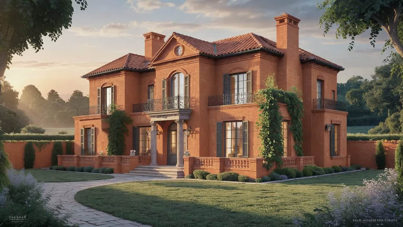
Terracotta is no longer confined to pots and desert-themed Airbnb rentals. This earthy, sun-kissed hue has been making waves as the go-to color for injecting warmth and personality into a space.
Use it on an accent wall or even in a small powder room, and you’ll feel like you’ve been transported to a Tuscan villa.
Pro tip: throw in a cactus or two for added drama (and to distract guests from your uneven paint job).
4. Forest Green

If you’ve been craving a connection to nature but don’t feel like giving up your weekends to hike, forest green is your answer.
This lush, deep shade brings the outside in, creating a calming environment that says, “I’m sophisticated, and I occasionally recycle.”
Pair it with natural wood tones or crisp whites, and suddenly your space looks like it was curated by an eco-chic interior designer who charges more than your monthly rent.
5. Blush Pink (Yes, Seriously)
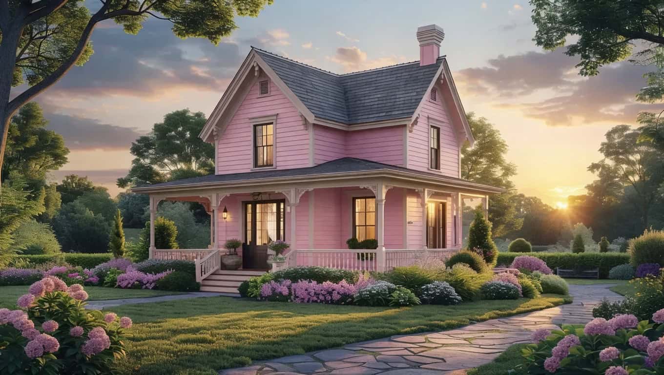
Before you roll your eyes, hear me out. Blush pink isn’t just for nursery rooms and bubblegum commercials anymore.
It’s soft, it’s sophisticated, and—when done right—it’s the interior design equivalent of a warm hug. Pair it with darker, contrasting shades like charcoal or navy to keep it from looking too saccharine.
Bonus points if you can drop the term “millennial pink” into casual conversation.
6. Bold Black
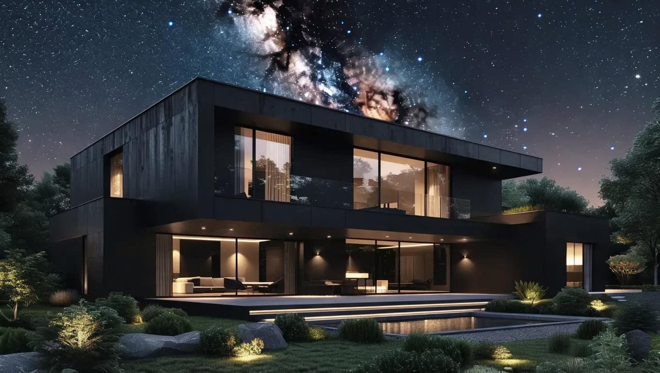
Yes, black. On your walls. Trust me, it’s not as crazy as it sounds. Done correctly, black can make a space feel cozy, dramatic, and outrageously chic all at the same time.
Plus, it’s the ultimate backdrop for your Instagram-worthy selfies!

