Ah, furniture layouts. They’re the unsung heroes of interior design—just like that one friend who swears they’re good at Tetris but still can’t figure out how to load the dishwasher correctly.
Getting your furniture arrangement right can mean the difference between “Wow, this space is so open and inviting!” and “I’m trapped between the coffee table and the couch—send help.”
If your home feels more chaotic than harmonious, fear not.
Here are 9 furniture layouts that will give your space a much-needed refresh while keeping things functional and fun.
1. The “Symmetrical Sanctuary”
Perfect for: People who alphabetize their spice rack and get a little too excited about grid paper.
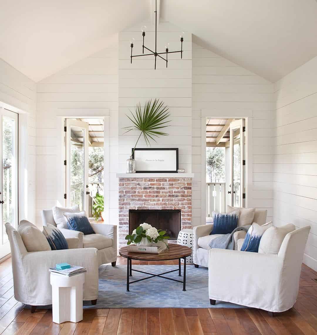
Symmetry is calming—think matching armchairs flanking a sofa, end tables on both sides and lamps that could moonlight as twins.
This layout is like feng shui’s Type-A cousin: balanced, polished, and completely judgment-free when it comes to your throw pillow addiction.
2. The “Asymmetrical Adventure”
Perfect for: Those who can never decide between chaos and creativity.
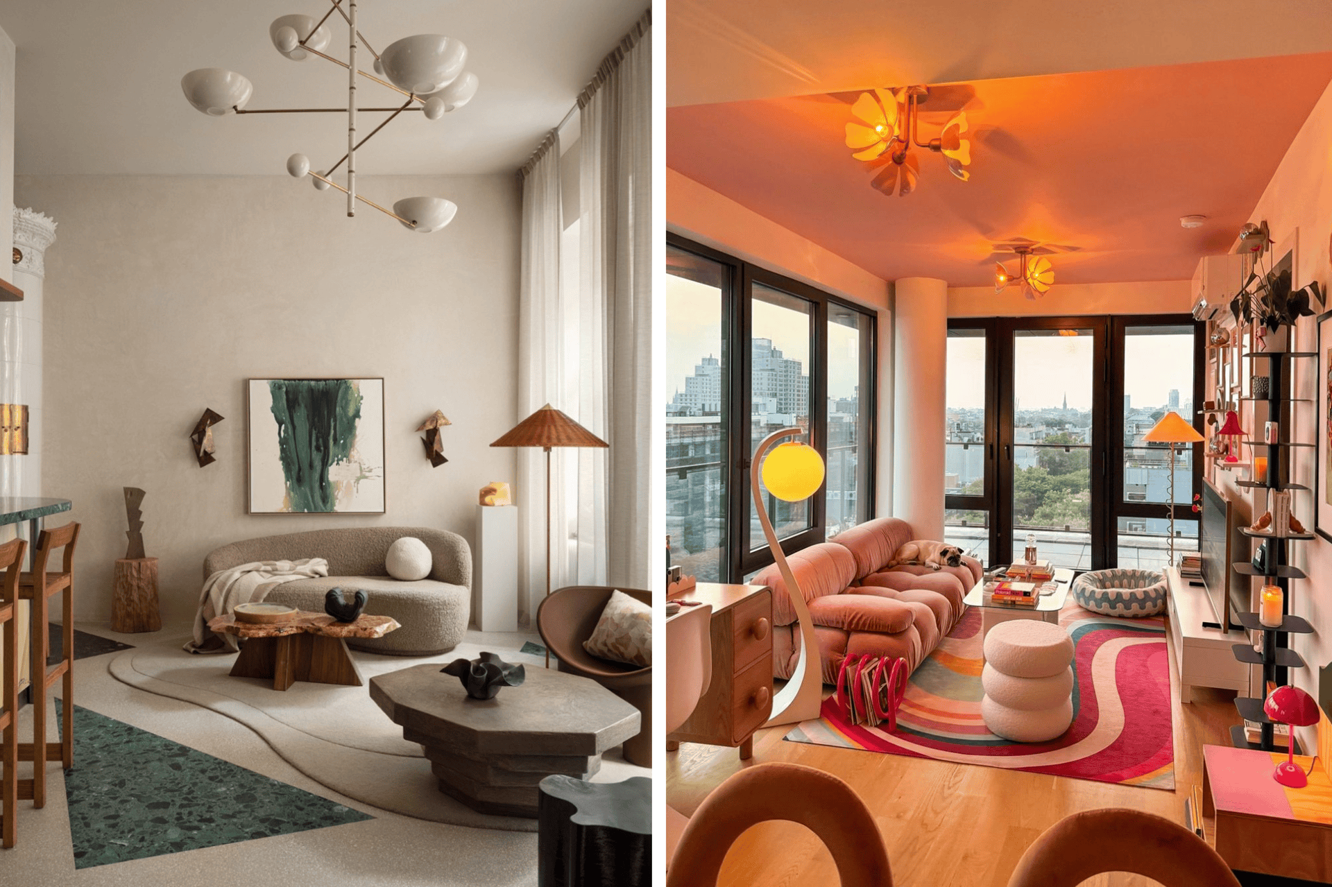
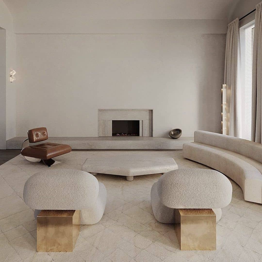
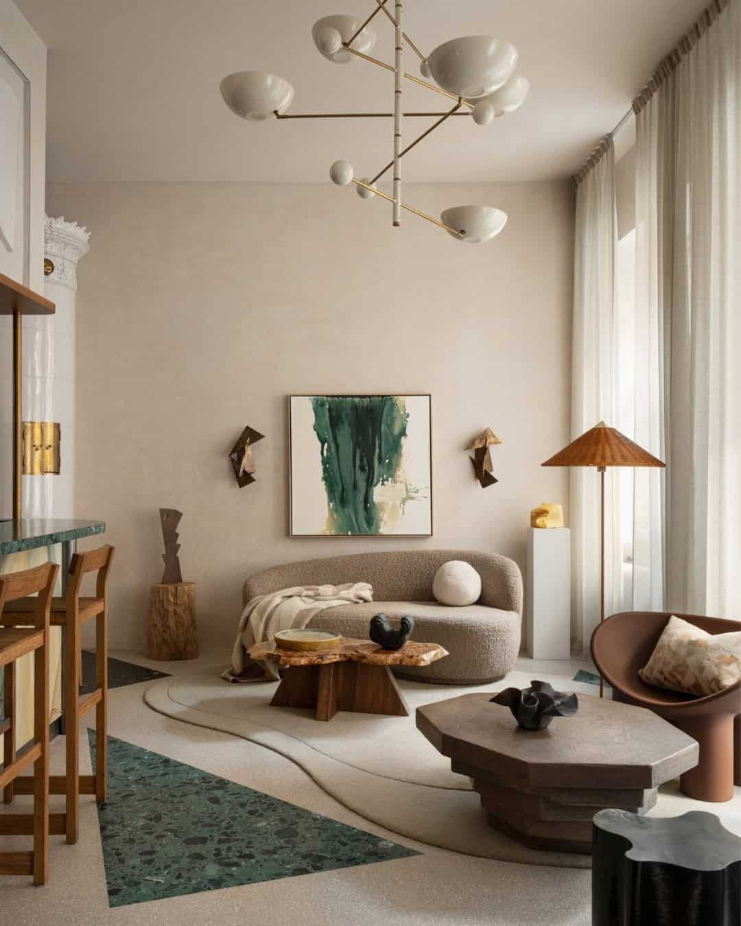
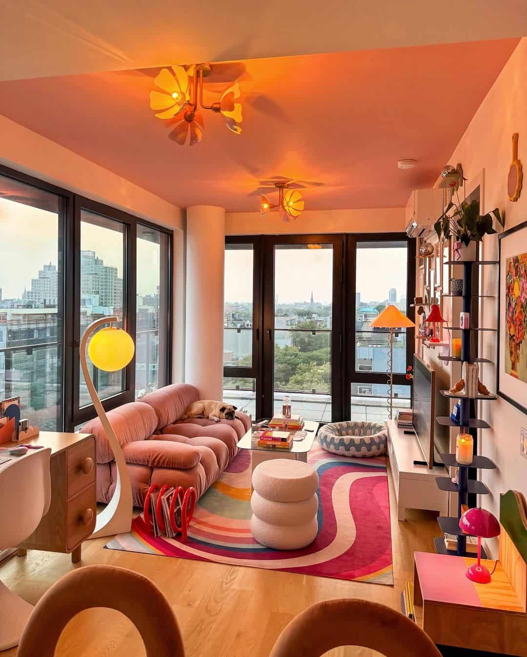
Move over, symmetry—there’s a new sheriff in town, and they love a quirky vibe. Pair a large sectional with a statement chair at an angle, or place an off-center coffee table for an artsy touch.
Sure, it’s unconventional, but so was Picasso. (Just, maybe avoid abstract furniture art. No one needs a chair they can’t sit on.)
3. The “Conversation Starter”
Perfect for: Serial hosts who love to say, “Oh, this old thing? I got it on sale!”
Create a layout that encourages actual eye contact (gasp!) by placing chairs and sofas to face each other.
Toss in a statement coffee table in the middle, and suddenly you’re hosting the chicest roundtable discussions this side of your neighborhood book club. Bonus: no awkward TV glares in this setup.
4. The “Open Concept Hero”
Perfect for: People who use “airy” as an actual compliment.
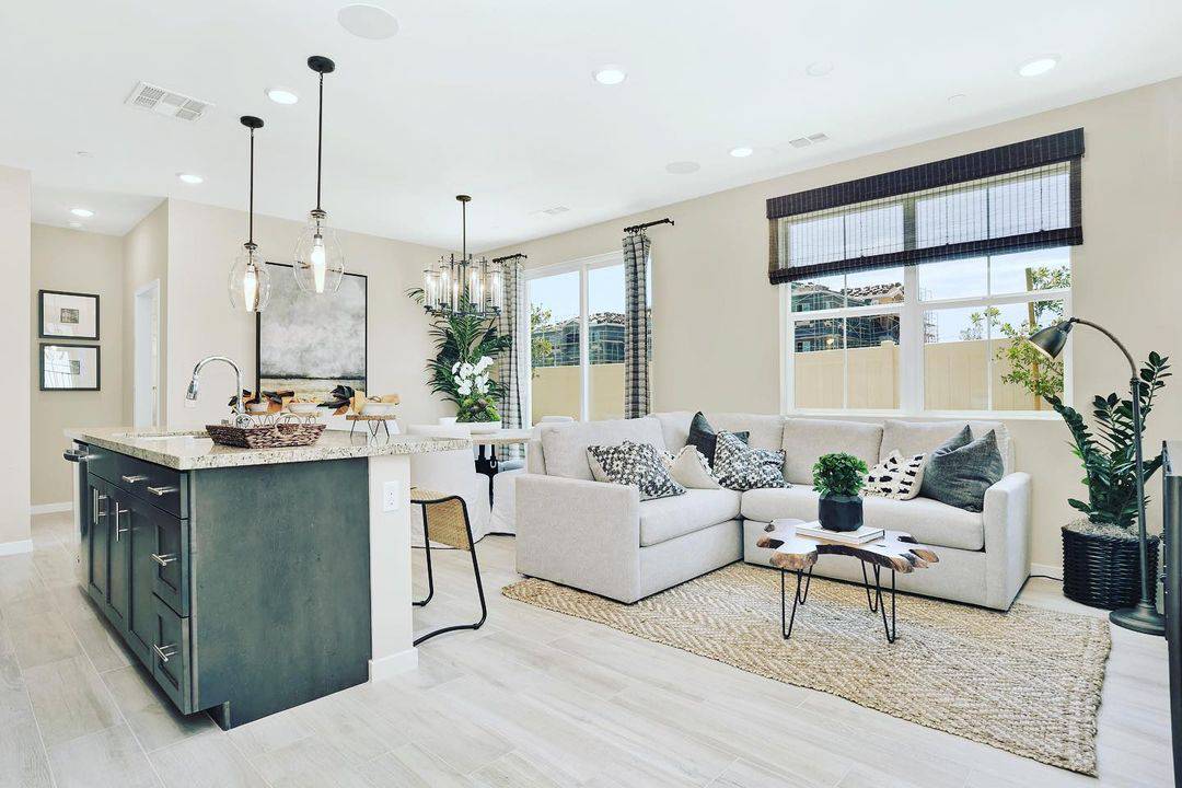
If your space flows like a poorly written soap opera, it’s time to break out the rugs. Use them to define zones—dining here, lounging there.
Arrange your furniture to create distinct spaces without walls. Pro tip: don’t let the dining table encroach on the couch zone, unless you enjoy crumbs as decor.
5. The “Netflix and Chill Command Center”
Perfect for: Couch potatoes and proud of it.
The sofa is the star of the show here, ideally facing the TV (or projector if you’re feeling fancy). Add a chunky coffee table for snacks and a cozy rug that says, “No, I don’t need to get up today.”
Optional: a recliner for that one friend who takes “relaxing” too literally.
6. The “Cozy Corner Hangout”
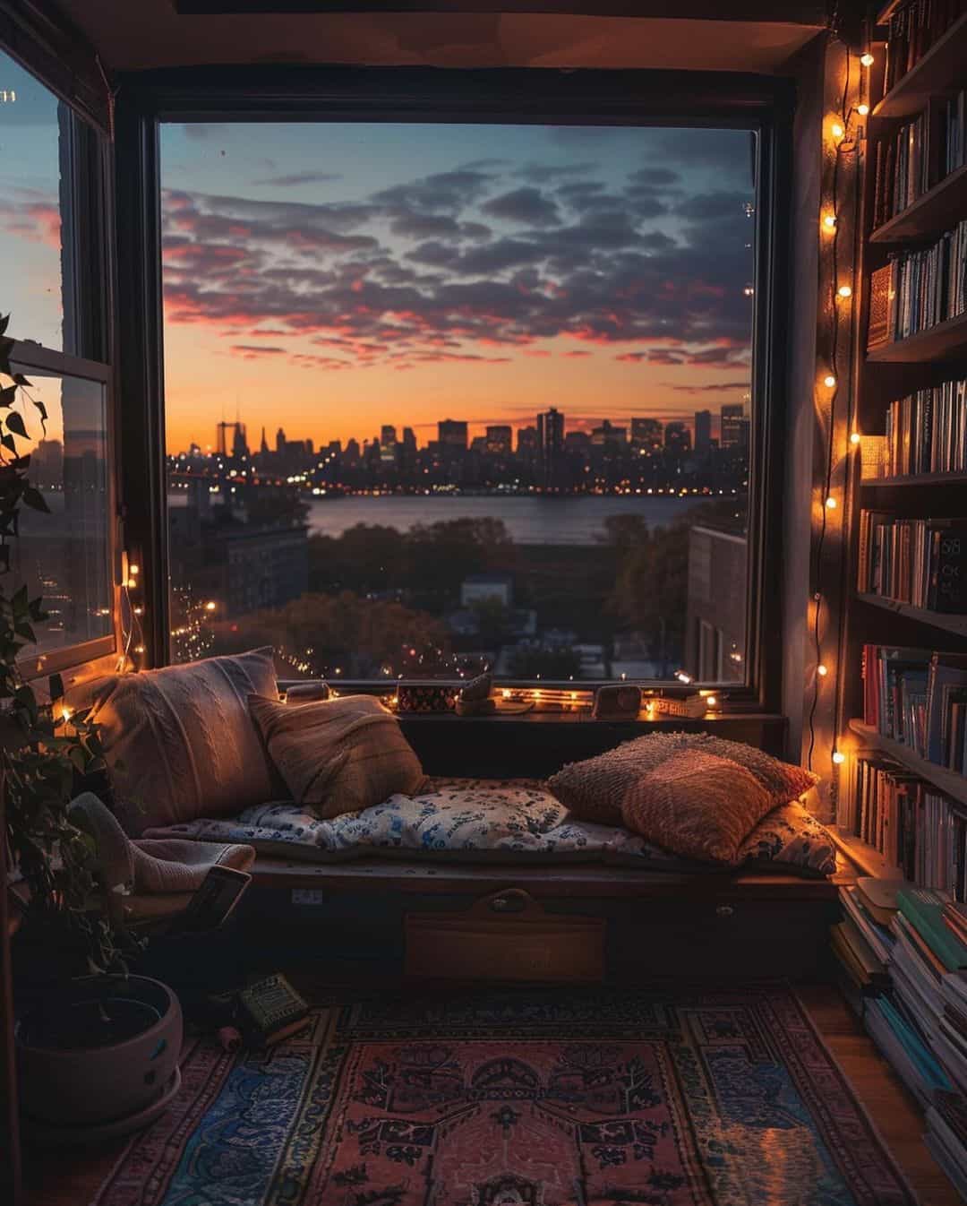
Perfect for: People who like their reading nooks with a side of drama.
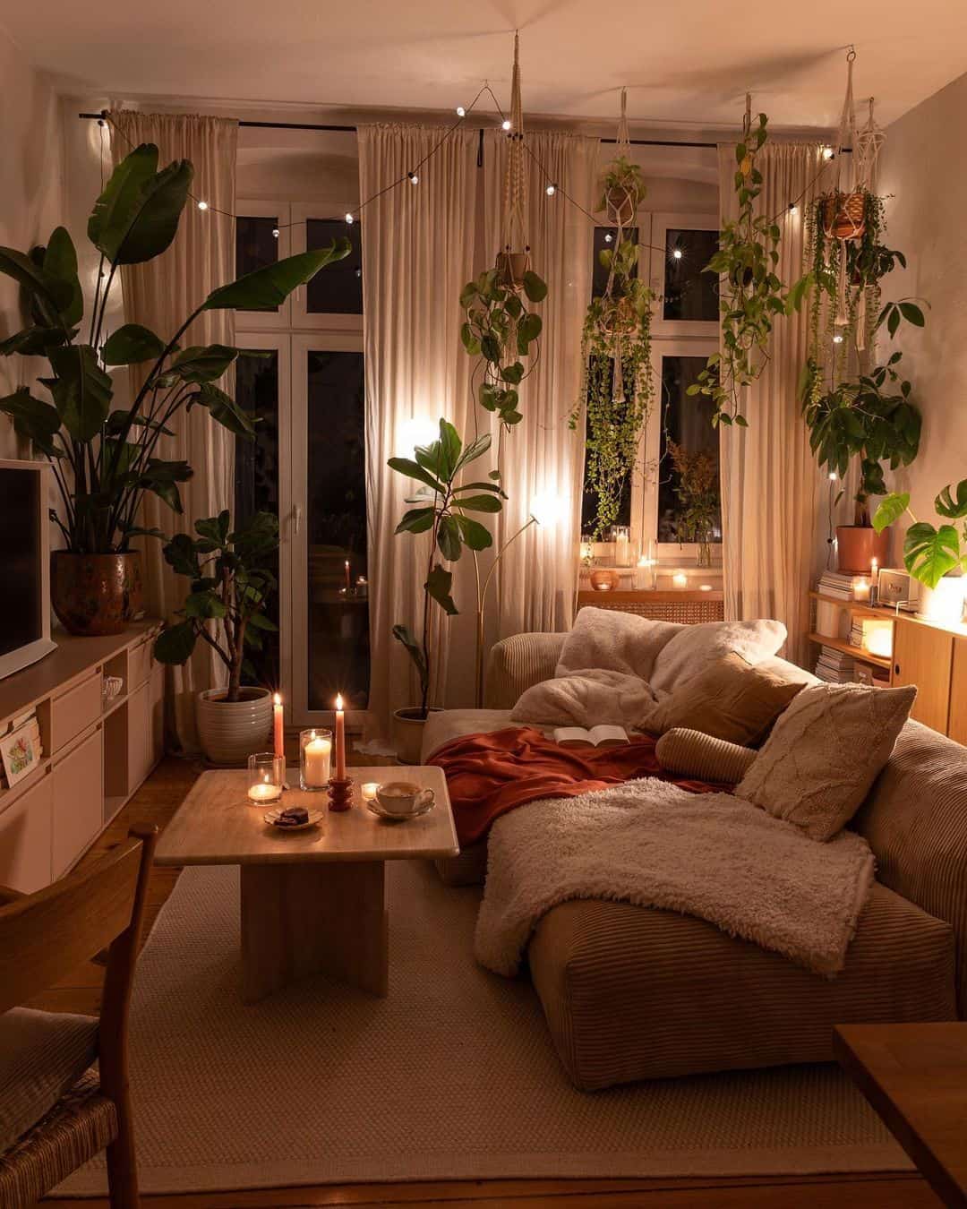
This layout is all about embracing the corners. Push a sectional or L-shaped sofa snugly into one, then flank it with a tall lamp or a leafy plant.
Add an ottoman and a basket of blankets, and you’ve created a vortex of coziness that no one will ever want to leave.
7. The “Dining Meets Lounging Mash-Up”
Perfect for: Tiny apartment dwellers and multitaskers.
Combine your living and dining spaces with a layout that multitasks as well as you do. Position a sleek dining table near the sofa and let the chairs double as extra seating for guests.
Just make sure to remove the salad bowls before kicking back with a movie.
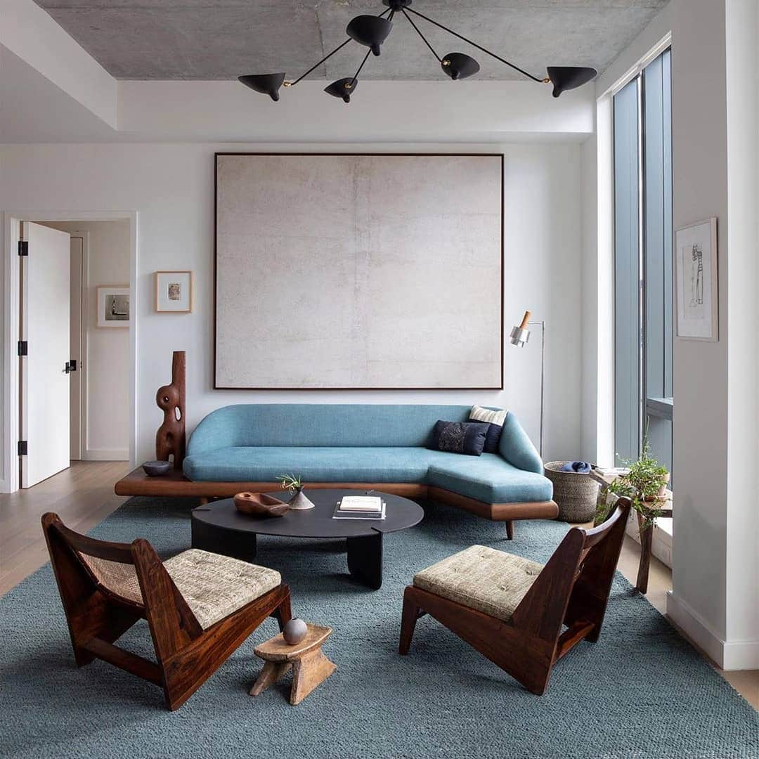
8. Mid-Century Modern Style
You can always take a classic layout and implement any style you want! No TV? No problem! TVs generally take center stage nowadays, but with older styles, they’re not necessary!
Shift the focus somewhere else and prioritize the flow of the room, along with seating!
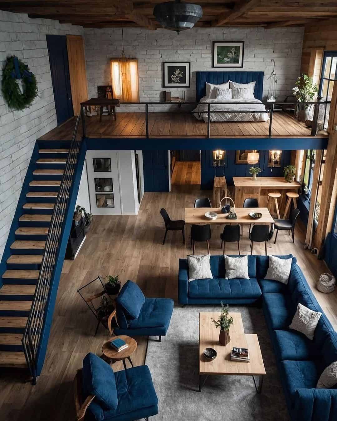
9. Loft Apartment Layout
Loft apartments are infamous for their innovative and funky layouts! The stairs definitely take center stage and you can’t really go around that!
However, you can build your layout around them! The bedroom goes upstairs, along with the office (maybe?), while your living area goes downstairs!

