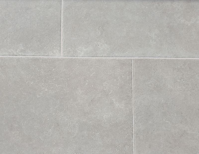
Choosing the right grout color is crucial for enhancing your tile design. The wrong choice can disrupt the aesthetic, causing unwelcome visual distractions.
This article explores 10 common grout color mistakes that can ruin your beautiful tile work.
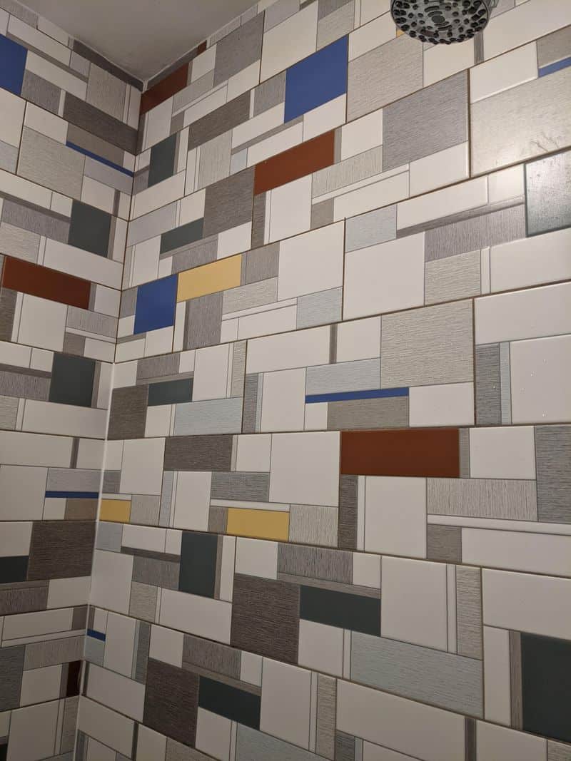
1. Mismatch with Tile Color
Grout that vastly contrasts with tile can be jarring. Imagine pristine white tiles with dark, overpowering grout. This mismatch often distracts from the tile’s elegance.
Choosing grout that complements or subtly contrasts ensures harmony. Consider your tile’s undertones when selecting grout for a cohesive look.
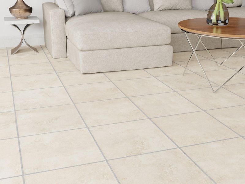
2. Too Light Grout
Light grout on tiles may initially look clean but can easily discolor. Over time, dirt and stains become more visible, requiring frequent cleaning.
Opting for a slightly darker shade hides grime better. Balance between aesthetics and practicality is key for maintaining clean, appealing grout.
3. Too Dark Grout
Dark grout might seem modern, but it can overpower delicate tile patterns. When used with light tiles, it draws attention away from intricate designs.
Choosing a mid-tone grout might enhance the tile’s pattern without taking center stage. Strive for a balance that highlights your design’s true beauty.
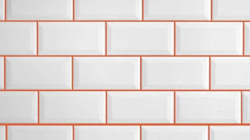
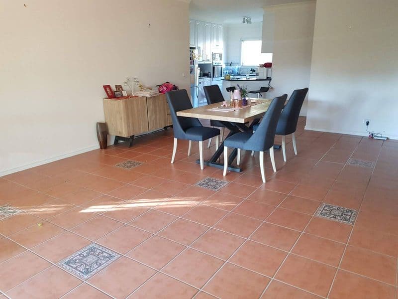
4. Clashing Undertones
Grout with clashing undertones creates discord in your design. Warm tiles with cool grout, or vice versa, disrupt visual flow. Matching undertones between grout and tile is crucial.
This harmony ensures a seamless look that elevates your space, allowing the tile to shine without distractions.
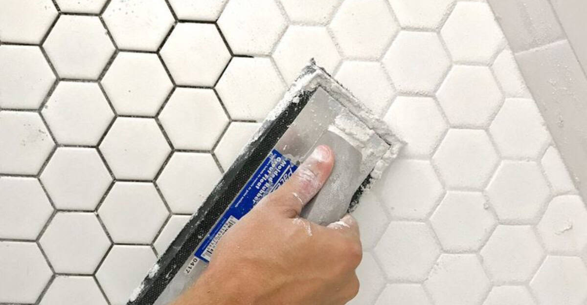
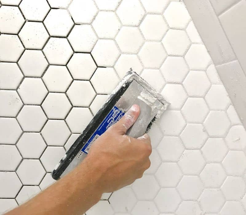
5. Inconsistent Grout Color
Inconsistent grout color appears unprofessional and detracts from the design. Variations may arise from improper mixing or uneven application.
Ensure thorough mixing and uniform application for consistent results. Testing a small area first can prevent this common issue, ensuring a professional and appealing finish.
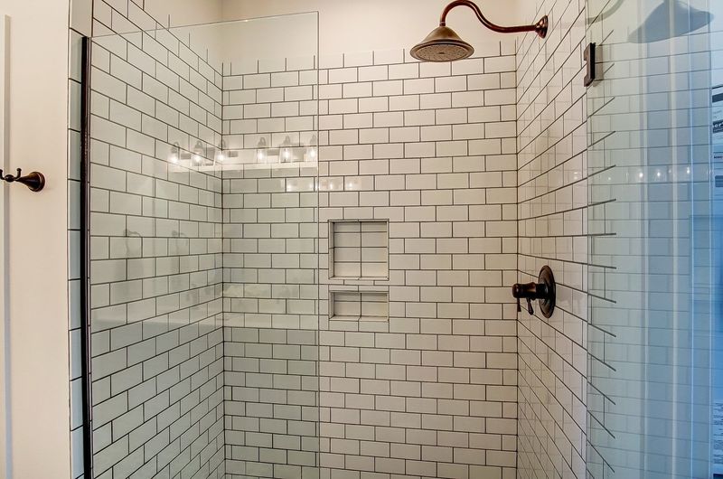
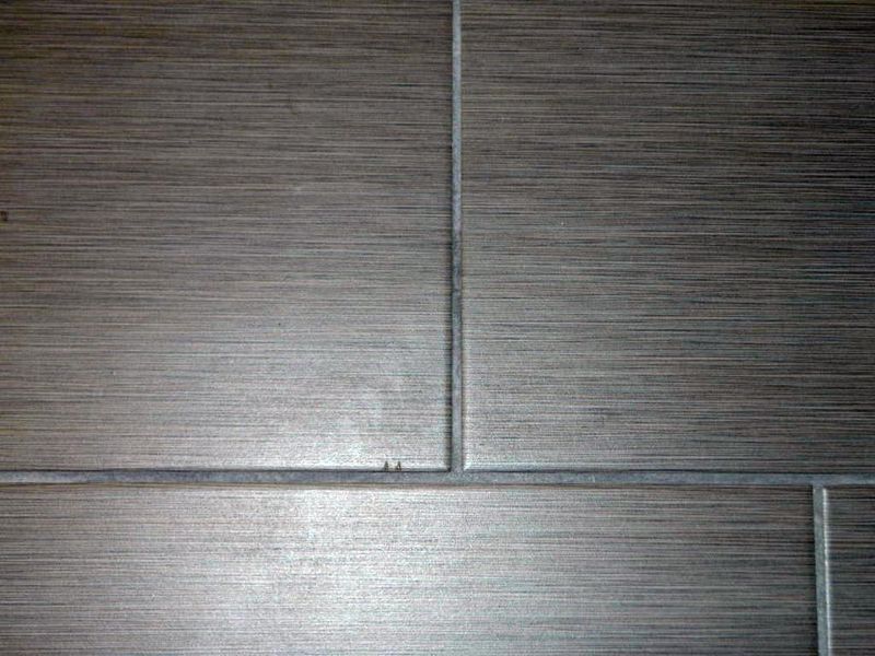
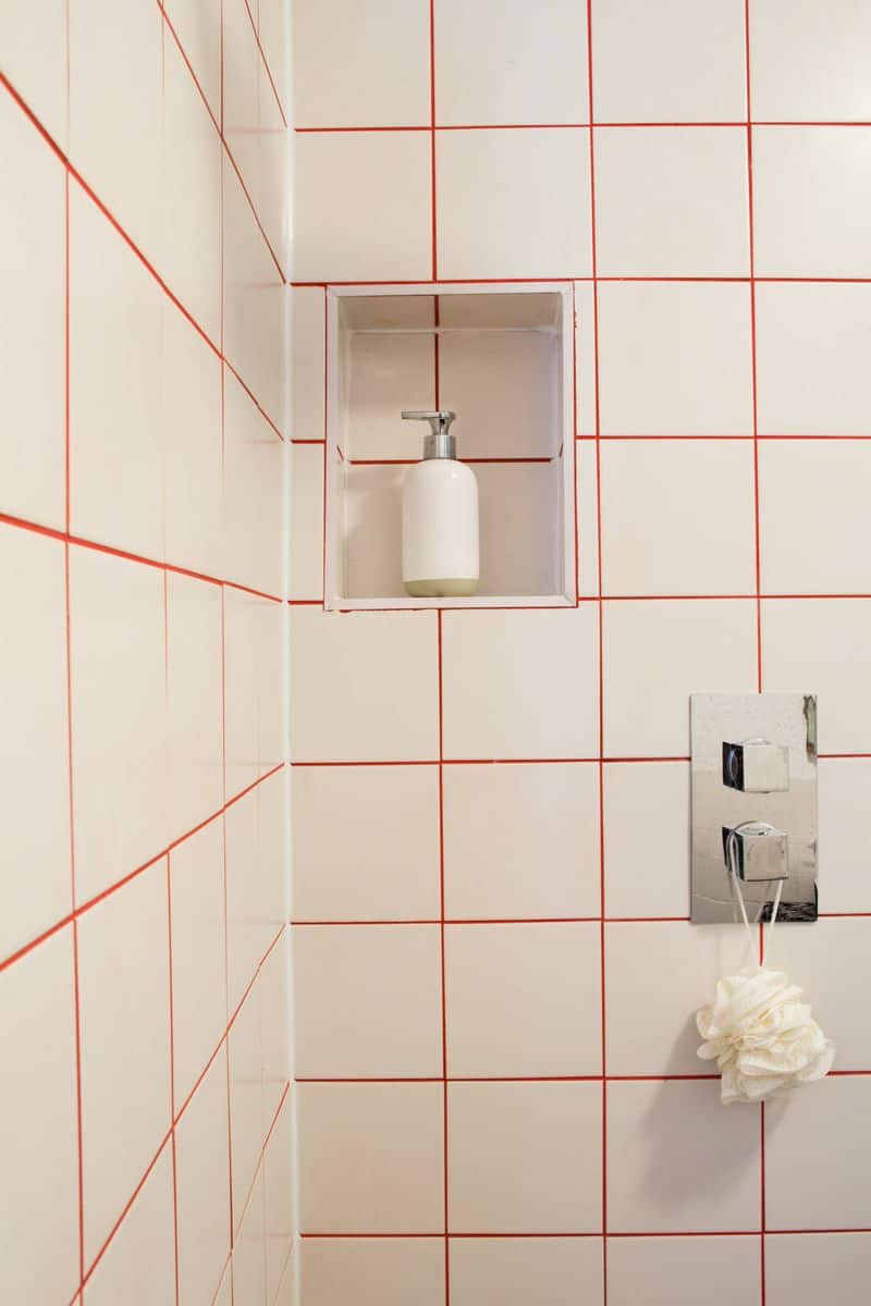
6. Stark Lines
Excessively bold grout lines create stark divisions in your tile design. They can make the space feel smaller and busier. Opt for thinner lines or colors that blend with the tile for a seamless look.
Balance is key in making sure grout complements rather than competes with your tiles.
7. Ignoring Room Lighting
Room lighting affects how the grout color appears. A shade perfect in store might look off at home. Test grout samples in your actual lighting to ensure consistency.
Different lighting conditions dramatically impact color perception, so consider natural and artificial light when choosing grout for any space.
8. Neglecting Tile Pattern
Intricate tile patterns demand careful grout color selection. Wrong choices overshadow these designs, losing their appeal. Neutral grout often enhances patterns, allowing tiles to take focus.
Evaluate your tile’s complexity and choose a grout that amplifies rather than detracts from its beauty.
9. Trend-Driven Grout Choices
Trendy grout colors may quickly become outdated. While fashionable choices might appeal now, consider longevity.
Timeless grout shades ensure your design remains stylish over time. Choose classic colors that adapt to evolving tastes, ensuring lasting satisfaction and avoiding frequent renovations.
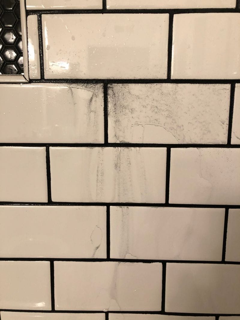
10. Ignoring Maintenance Needs
Ignoring grout maintenance needs leads to long-term issues. Colors susceptible to stains require more upkeep. Opt for stain-resistant grout types to minimize maintenance.
Consider the area’s usage when choosing color and type, ensuring practicality without sacrificing aesthetics. Proper care prolongs grout’s beauty and function.