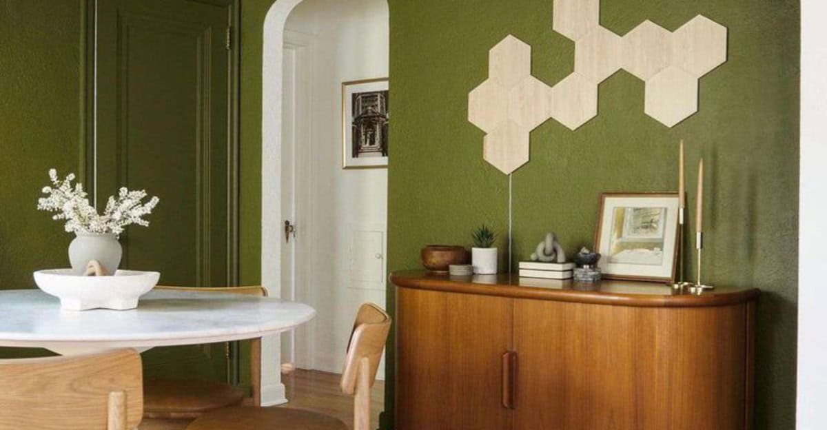
The ‘in-between’ color trend is redefining interior spaces with its unique blend of shades. These transitional colors, which sit comfortably between traditional hues, offer a fresh and sophisticated look for any room.
By embracing this trend, you can create a versatile design that feels both modern and timeless.
Whether you’re looking to refresh your living space or completely revamp your home, these 7 strategies highlight how you can effectively incorporate the ‘in-between’ color trend into your decor.
1. Muted Terracotta Elegance
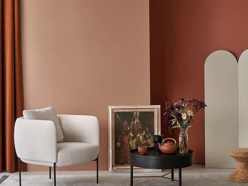
Muted terracotta brings warmth without overpowering a space. This color sits between traditional orange and brown, providing a subtle earthiness that adds depth. Pair it with mid-century modern furniture for a retro yet contemporary feel.
Natural light enhances its rich undertones, creating a cozy environment ideal for social gatherings or quiet evenings. Accessories like soft cushions and throws in similar shades can enhance this harmonious blend.
The versatility of muted terracotta makes it perfect for living rooms, offering a stylish backdrop that complements various textures and finishes.
2. Dusky Olive Green
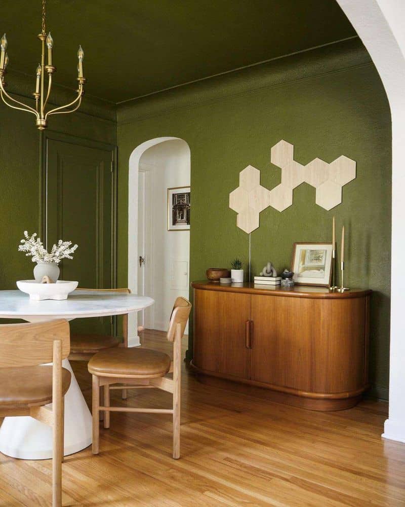
Dusky olive green is an elegant, subdued hue that adds sophistication to kitchens. It bridges the gap between vibrant greens and neutral tones, making it versatile. When paired with brass fixtures and natural wood accents, it elevates the kitchen’s aesthetic.
This color can make cabinetry feel fresh while grounding the space with its calming nature. It’s perfect for those who desire a traditional yet modern look.
The balance of dusky olive green allows it to serve as either a focal point or a complementary backdrop, making kitchens warm and inviting.
3. Soft Slate Blue
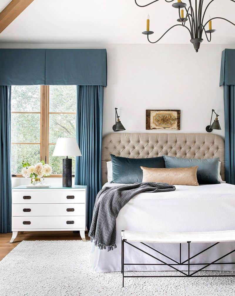
Soft slate blue introduces tranquility to bedrooms, straddling the line between blue and gray. This ‘in-between’ shade cultivates a serene atmosphere, ideal for rest. Its soothing qualities make it perfect for minimalistic decor styles.
A large window can highlight its subtle tones, inviting relaxation and peace. Pair with white linens and simple furniture to maintain a clean look.
This color is ideal for those seeking a calming environment, offering elegance without overwhelming the senses, ensuring your bedroom becomes a restful sanctuary.
4. Pale Blush Neutral
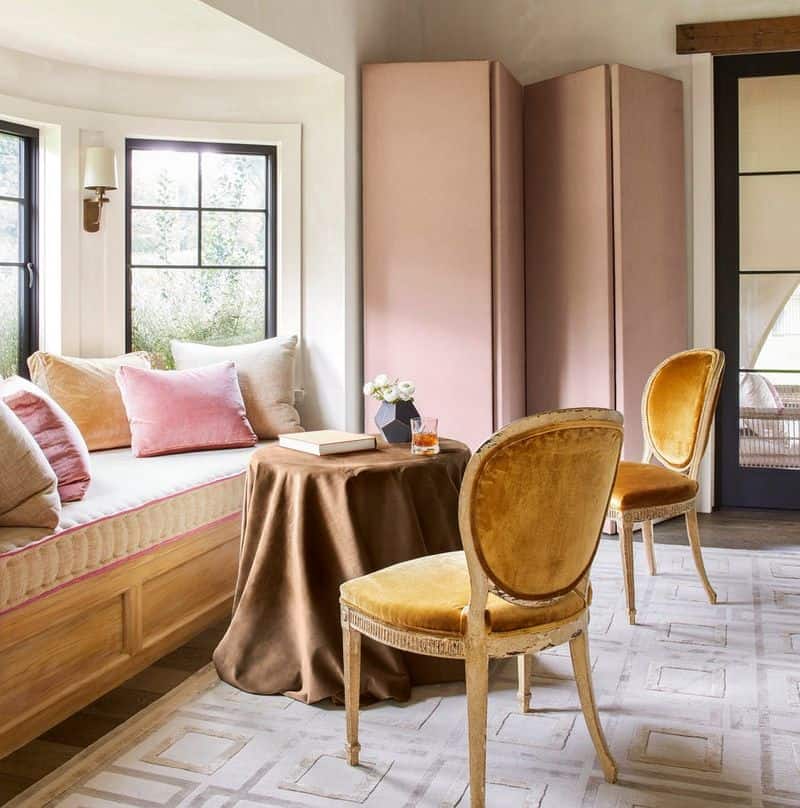
Pale blush offers a gentle touch of warmth to bathrooms, sitting between beige and soft pink. It creates a fresh, inviting ambiance. This hue pairs beautifully with white ceramics and greenery, adding a touch of nature.
It works exceptionally well in modern spaces seeking a hint of color without straying from a neutral palette. The softness of pale blush enhances natural light, making bathrooms feel spacious and serene.
Its understated elegance provides a versatile backdrop that complements various bathroom styles and accessories.
5. Warm Greige Balance
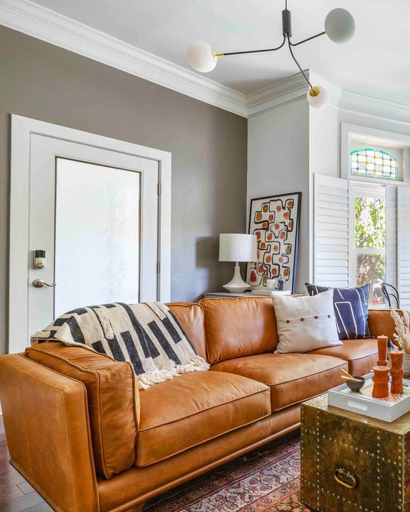
Warm greige, combining gray and beige, is perfect for home offices. This color fosters productivity while maintaining comfort, striking a balance between cool and warm tones. It pairs well with sleek black furniture, adding sophistication to the workspace.
Abstract art can infuse creativity, complementing the greige backdrop. This hue’s neutrality makes it adaptable to various design schemes, whether minimalist or eclectic.
Warm greige is ideal for creating an inspiring yet calming environment, helping you stay focused and motivated while working from home.
6. Sandy Taupe Accents
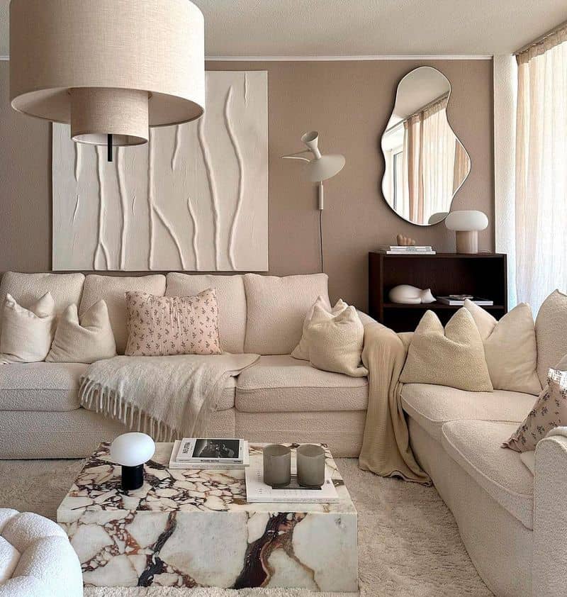
Sandy taupe, positioned between beige and light brown, brings warmth to reading nooks. This ‘in-between’ shade provides a comforting atmosphere, perfect for relaxation. Pair it with a plush armchair and soft lighting for a cozy retreat.
Its versatility allows it to blend seamlessly with various textures, from wool throws to wooden bookshelves. Sandy taupe’s subtle charm makes it suitable for both traditional and modern settings.
This color creates an inviting nook, encouraging you to unwind with a good book or enjoy a quiet moment.
7. Dusty Lavender Touch
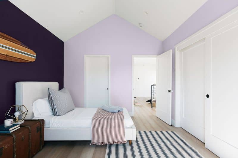
Dusty lavender adds a chic touch to dining rooms, balancing warmth and subtlety. This color fits snugly between purple and gray, offering a unique elegance. Gold accents and a vintage dining set enhance its sophistication.
It’s perfect for creating an inviting dining experience, where conversation flows easily against a stylish backdrop. The depth of dusty lavender can make any dining space feel luxurious yet approachable.
This shade’s ability to adapt to both contemporary and classic styles makes it a versatile choice for any home.

