Choosing the right color palette for your kitchen can be as crucial as selecting the perfect recipe for a special dinner.
The right blend of hues sets the mood, enhances your kitchen’s features, and might even improve your culinary skills.
We explore 10 delightful kitchen color combinations that promise to make your heart sing and three that might make you lose your appetite.
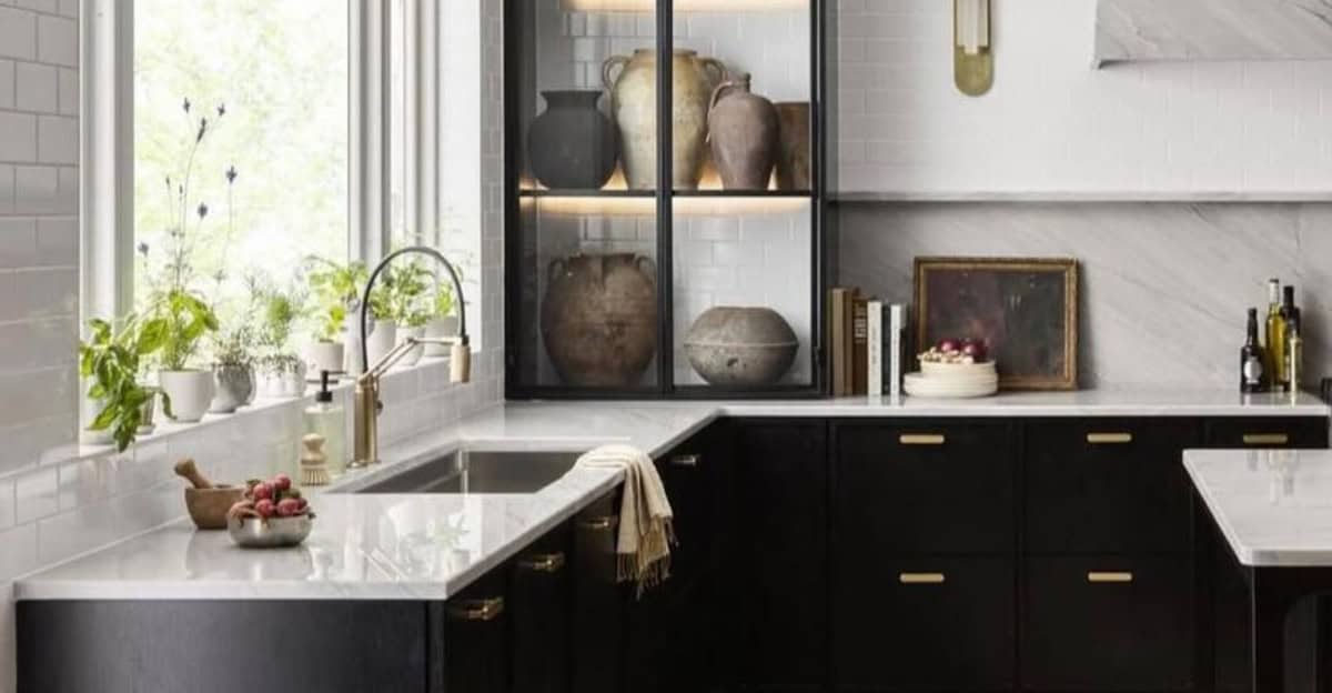
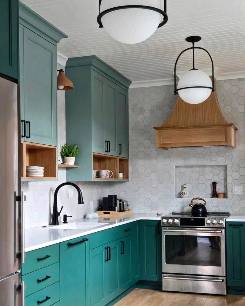
1. Olive Green, Black, and Rustic Wood
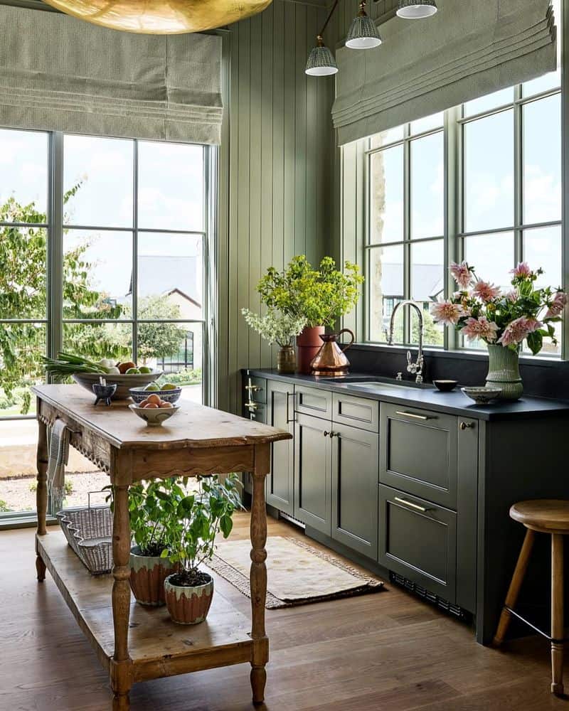
Embrace nature with olive green cabinets paired with black countertops and rustic wood accents. This combination brings the outdoors in, creating a warm and inviting space.
The dark tones add sophistication, while the wood’s texture adds warmth and comfort.
Perfect for those who love a natural vibe, it suits both modern and traditional kitchens. Add some hanging plants to complete the look, and you’ll have a kitchen that’s both stylish and calming.
2. Blue and White
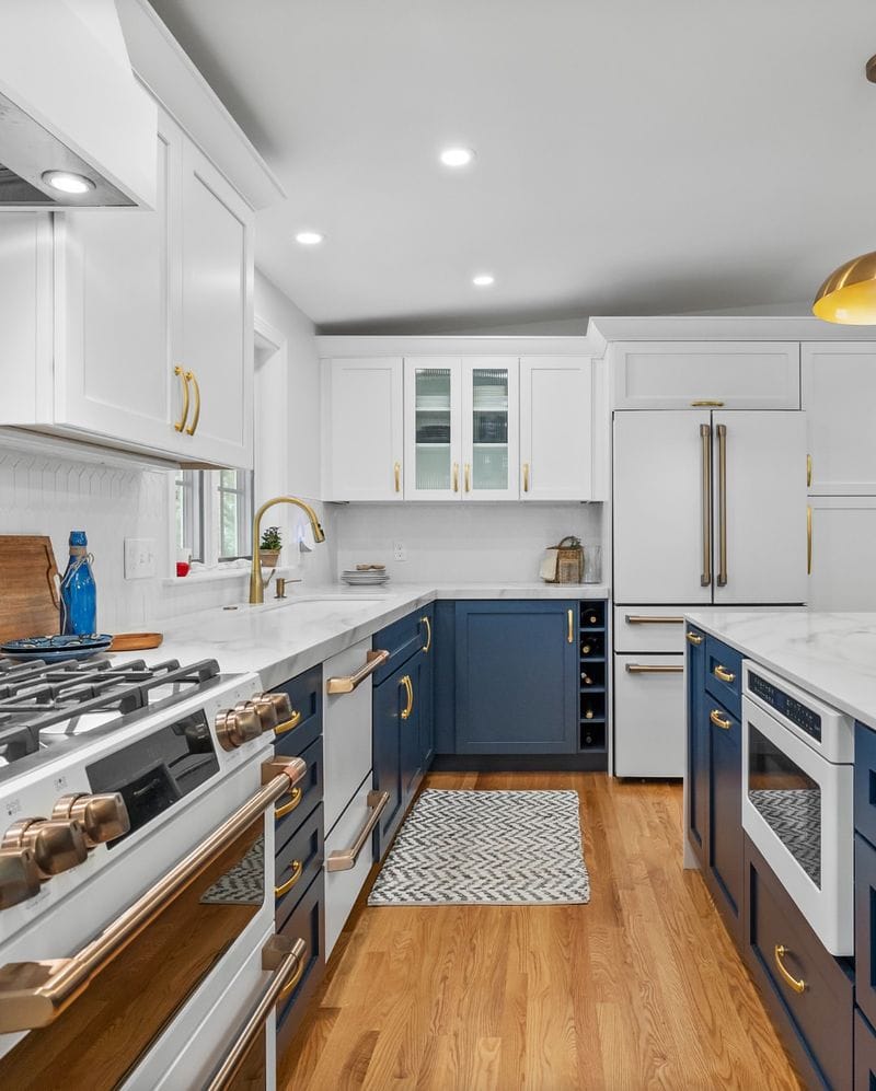
Blue and white create a fresh and breezy atmosphere reminiscent of coastal living. The coolness of blue paired with crisp white evokes serenity and cleanliness.
This combo works well in both small and large kitchens, offering a spacious feel. Consider blue tiles for a splashback and white fixtures to tie it all together.
The result? A delightful kitchen that feels like a breath of fresh air, inviting both relaxation and creativity.
3. Rich Plum, White, and Gold Accents
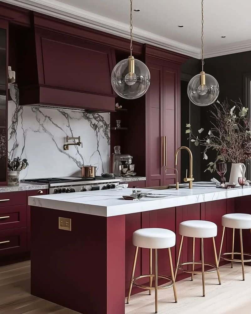
For those with a taste for luxury, rich plum combined with white and gold accents creates an opulent atmosphere. The deep plum color adds depth and elegance, while white counters offer a clean contrast.
Gold handles and fixtures provide a touch of glamour, making this palette ideal for anyone looking to impress.
Perfect for entertaining, this combination speaks of sophistication and class. It’s a kitchen fit for royalty, where cooking becomes an art form.
4. Mint Green and White
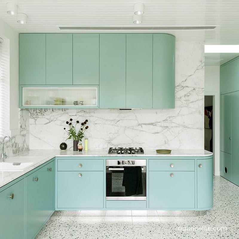
Mint green and white bring a sense of freshness and vitality to any kitchen. This combination is lively yet calming, perfect for those who enjoy a splash of color without overwhelming the senses.
The mint hue adds a playful touch, while white keeps everything grounded and clean.
Try mint green walls with white cabinetry for a refreshing look that stimulates creativity and joy. It’s a palette that feels both youthful and timeless.
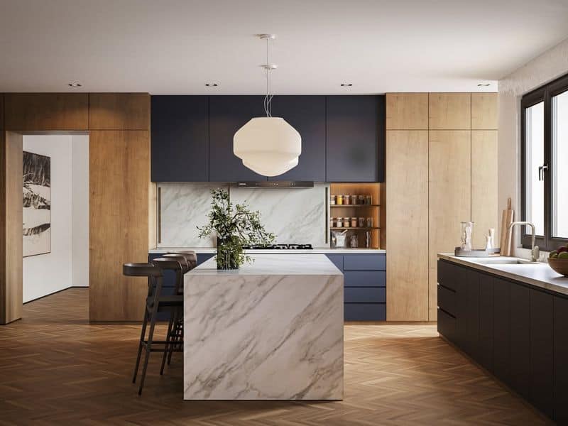
5. Navy Blue and Brass
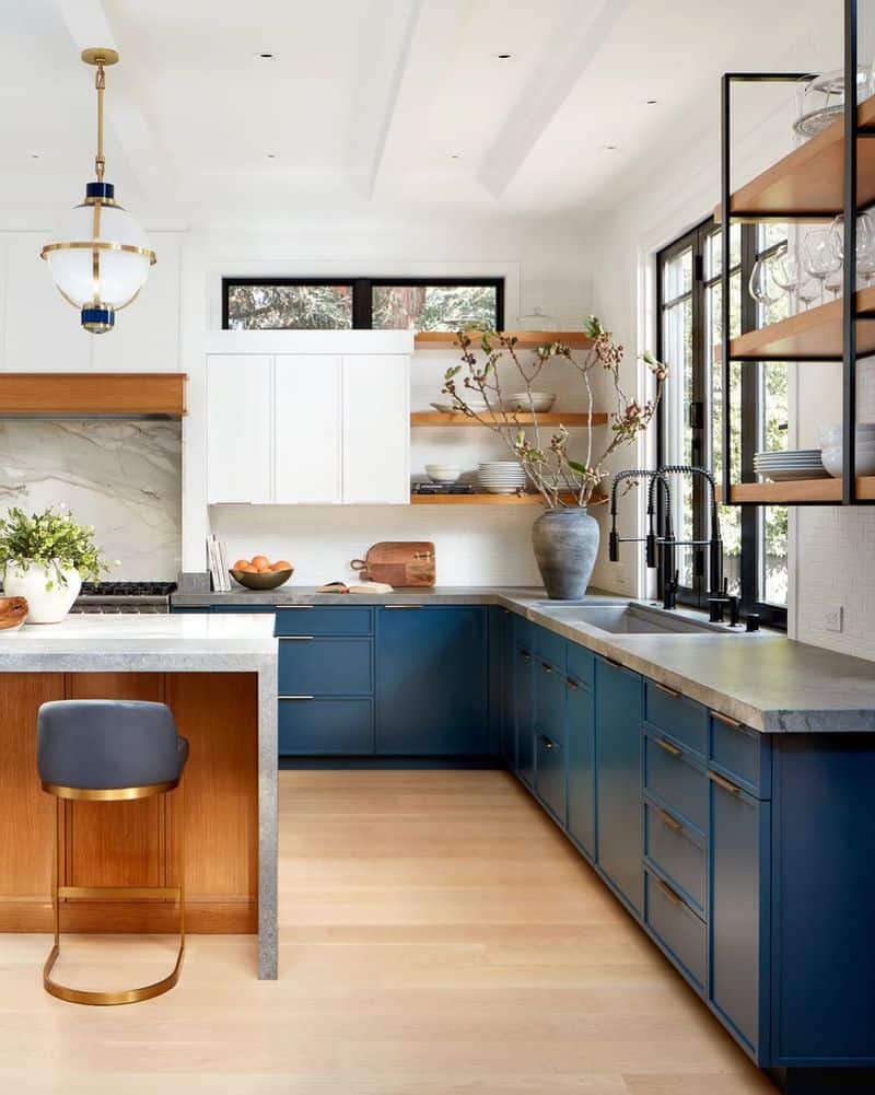
Navy blue and brass make a bold statement, combining strength with elegance. The deep navy hue provides a dramatic backdrop, while brass accents add a luxurious touch.
This palette is perfect for those who want their kitchen to stand out, offering a sense of grandeur and style.
Pairing these colors with sleek lines and modern design elements transforms the kitchen into a sophisticated haven, perfect for culinary exploration and entertainment.
6. Gray and White
Gray and white offer a timeless and versatile combination that suits any kitchen style. This neutral palette creates a sleek and clean look, perfect for minimalists.
Gray adds depth without being overpowering, while white provides a fresh and airy feel.
Consider gray cabinets with white countertops for a balanced and harmonious look. This palette allows for endless customization with textures and accessories, making it a favorite among designers.
7. Soft Yellow and Cream
Soft yellow paired with cream creates a warm and inviting kitchen space. These gentle hues evoke sunshine and happiness, perfect for a cozy, welcoming atmosphere.
Yellow brings energy and brightness, while cream adds a touch of elegance and warmth.
This combination is ideal for country-style kitchens or anyone wanting a cheerful environment that feels like a hug from the morning sun.
8. Teal and White
Teal and white form a vibrant and refreshing palette that energizes any kitchen. The boldness of teal is softened by the crispness of white, creating a balanced and lively space.
This combination is perfect for those who love a splash of color without going overboard.
Teal cabinets with white accents offer a playful yet sophisticated look, ideal for creative cooks who thrive in a dynamic environment.
9. Charcoal and Light Wood
Charcoal and light wood create a striking contrast, combining modern sophistication with natural warmth. The dark charcoal provides a dramatic backdrop, while light wood offers a fresh, organic touch.
This palette is perfect for those who enjoy a sleek but inviting kitchen atmosphere.
Consider charcoal cabinets with light wood countertops or shelving for a harmonious blend of materials that feels both chic and cozy.
10. Black and White
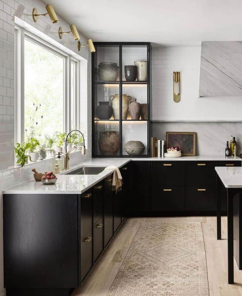
Black and white is a classic and timeless combination that never goes out of style. The contrast between these two colors creates a clean and elegant look, perfect for any kitchen.
Black adds drama and sophistication, while white keeps everything fresh and bright.
This palette allows for creativity in accessories and textures, making it a versatile choice for both modern and traditional homes.
11. Pink and Green
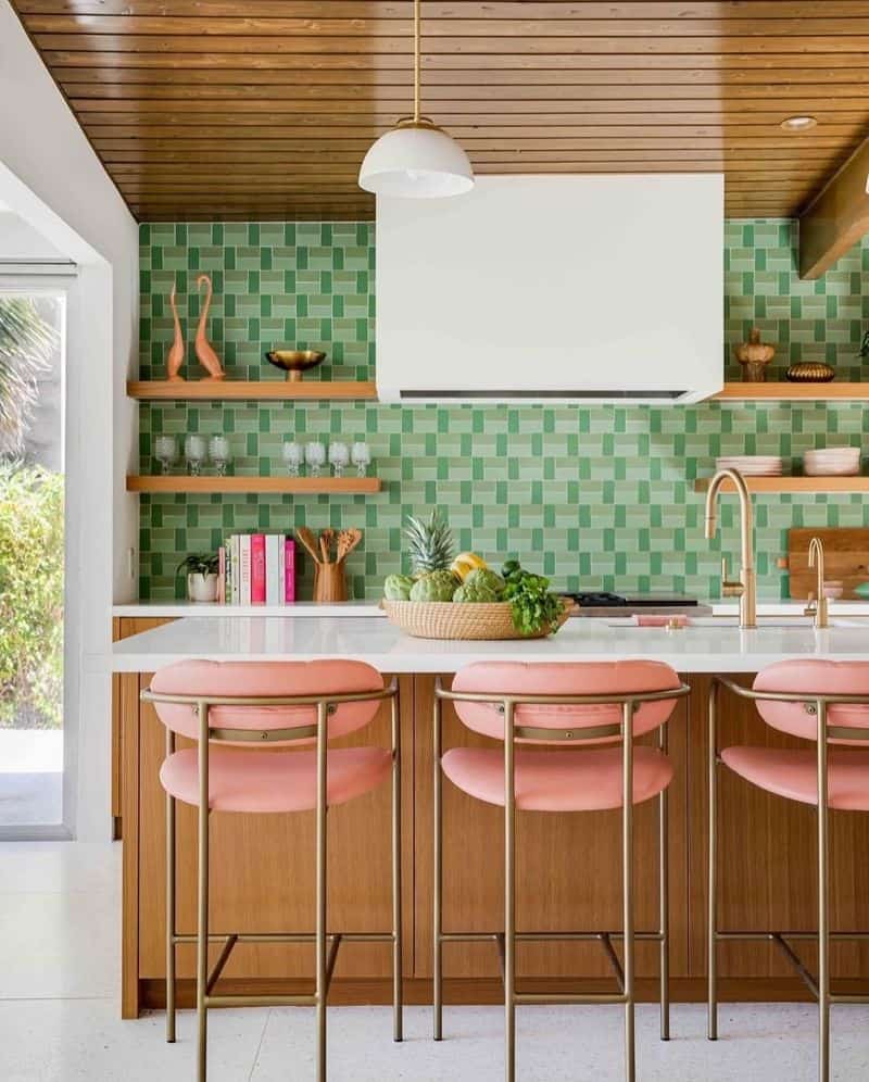
Pink and green may be fun at a party, but in a kitchen, they can quickly become overwhelming. These bold colors clash, creating a jarring and chaotic atmosphere.
The intensity can make it hard to relax and focus on cooking. While fun for the adventurous, it’s a risky choice that might lead to regret.
Unless you’re aiming for a retro diner look, it might be best to avoid this combination in favor of something more harmonious.
12. Orange and Purple
Orange and purple create a vibrant yet conflicting palette that can overwhelm the senses in a kitchen setting. The contrasting colors can lead to a chaotic and disjointed feel.
While each color has its merits, together, they compete for attention, creating visual noise.
This combination might work for a youth center or art space, but for a kitchen, it risks turning mealtime into a dizzying experience. Proceed with caution if you choose this daring duo.
13. Red and Yellow
Red and yellow are bold and energetic, but in a kitchen, they can be too much of a good thing. These intense colors can overstimulate, leading to discomfort during meal preparation.
While they might work for a fast-food chain, at home, they may feel overwhelming and stressful.
For those who enjoy a vibrant kitchen, consider using these colors as accents rather than the main palette to maintain a more balanced and pleasant environment.