In the world of design, monochromatic color schemes are the epitome of sophistication. By utilizing varying shades of a single hue, these schemes create harmony and cohesion.
While some may see monochrome as limited, design enthusiasts know that it offers endless creativity. Each of the 10 schemes here showcases how minimalism can lead to dramatic and stunning results.
Through subtle variations and careful attention to detail, these monochromatic palettes prove that less truly is more.
Let’s explore how these color choices can transform spaces and captivate the eye with their understated elegance.
1. Serene Blue Tones
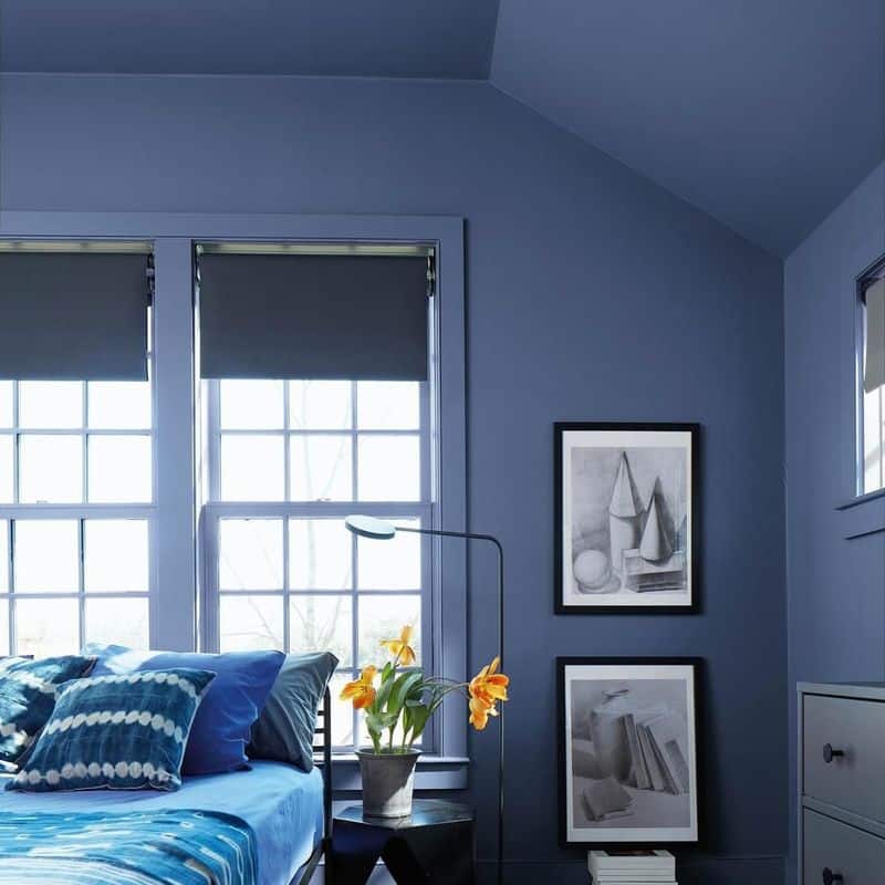
Blue tends to evoke feelings of calm and tranquility, making it a favorite in interior design. Imagine a room bathed in gentle blue hues, each shade harmonizing to create a peaceful retreat.
The secret is in balancing light with dark tones. Consider combining soft pastel blues with deeper navy accents. This contrast adds depth while maintaining serenity.
Perfect for bedrooms or study areas, this palette promotes relaxation and focus.
Remember to play with textures—think plush cushions and sleek furnishings—to enhance the soothing blue ambiance.
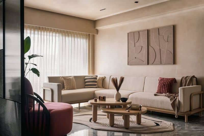
2. Warm Beige Palette
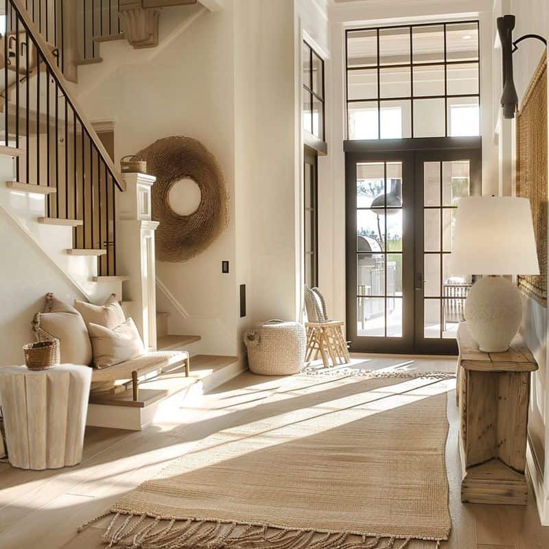
Beige isn’t just a background color; it’s a statement in warmth and subtlety. Picture a living space where every hue whispers comfort, inviting you to unwind.
The key lies in layering different shades of beige. Mix creamy ivories with rich camel tones to add dimension without overpowering the senses. This approach suits any space where comfort is paramount.
Incorporate natural materials like wood and wool to amplify the welcoming vibe, ensuring your beige palette feels anything but bland.
3. Elegant Gray Shades
Gray is the unsung hero of monochrome, embodying elegance and versatility. Picture an office space swathed in varying grays that exude professionalism.
From pale silver to deep charcoal, each shade offers its unique charm. This palette is ideal for creating a sophisticated yet neutral backdrop. Consider pairing with metallic accents for added glamour.
Whether for work or leisure, gray provides a timeless canvas that adapts to any style.
4. Vibrant Green Accents
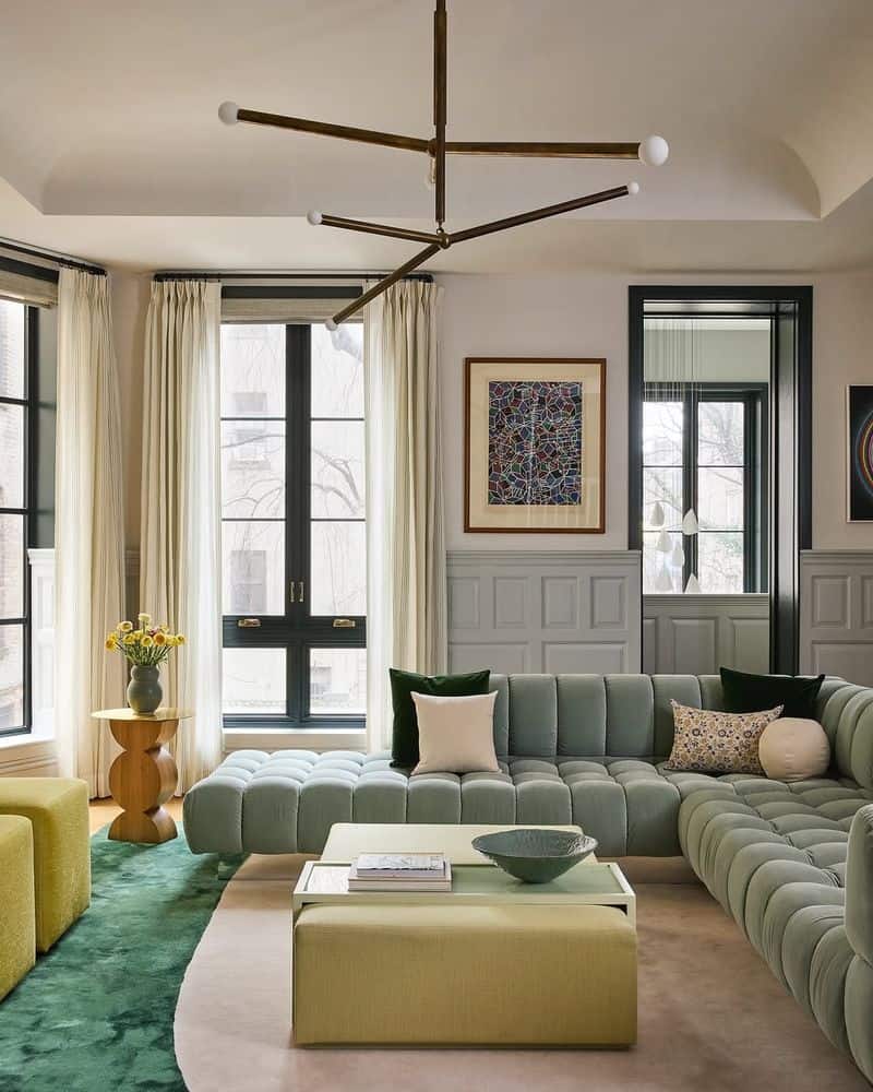
Green breathes life into spaces, making it perfect for those seeking vibrant energy. A monochromatic green palette can transform even the dullest corner into an inviting oasis.
Play with shades from olive to emerald, creating a lush environment teeming with vitality. This palette is especially refreshing in outdoor areas or sunlit rooms.
Add plant life and nature-inspired textures to complete the look, ensuring your space feels alive and rejuvenating.
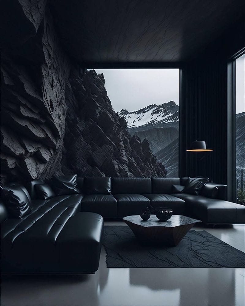
5. Sophisticated Black and White
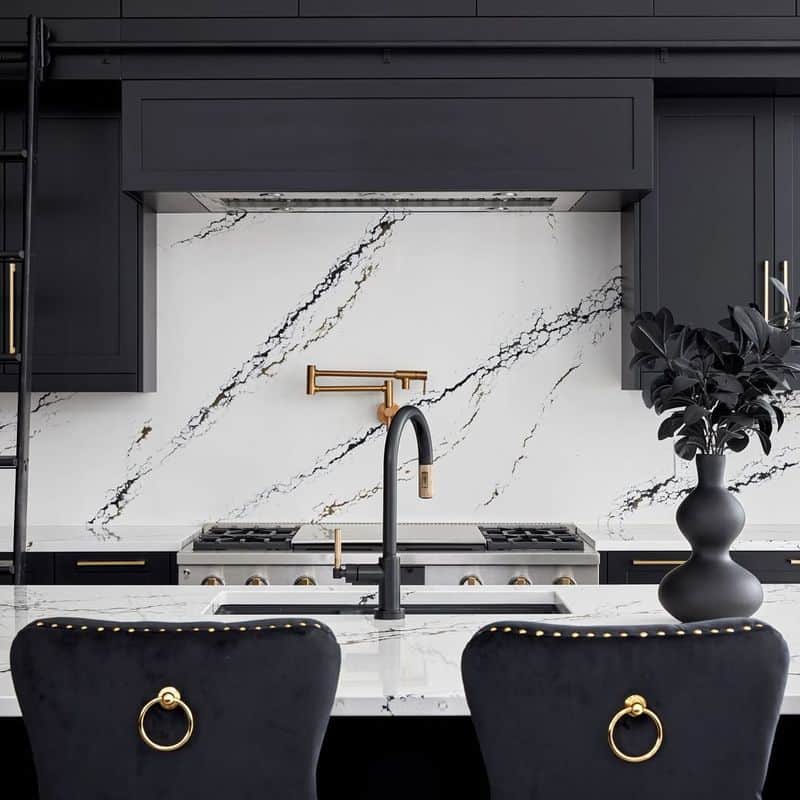
Black and white is the epitome of contrast and sophistication. Imagine a room where these two powerful tones dance together in harmony.
This timeless palette works in any setting, from sleek modern apartments to classic homes. The secret lies in balancing the stark contrast with thoughtful details.
Incorporate patterns and textures to add interest, ensuring this monochrome duo never feels flat or mundane.
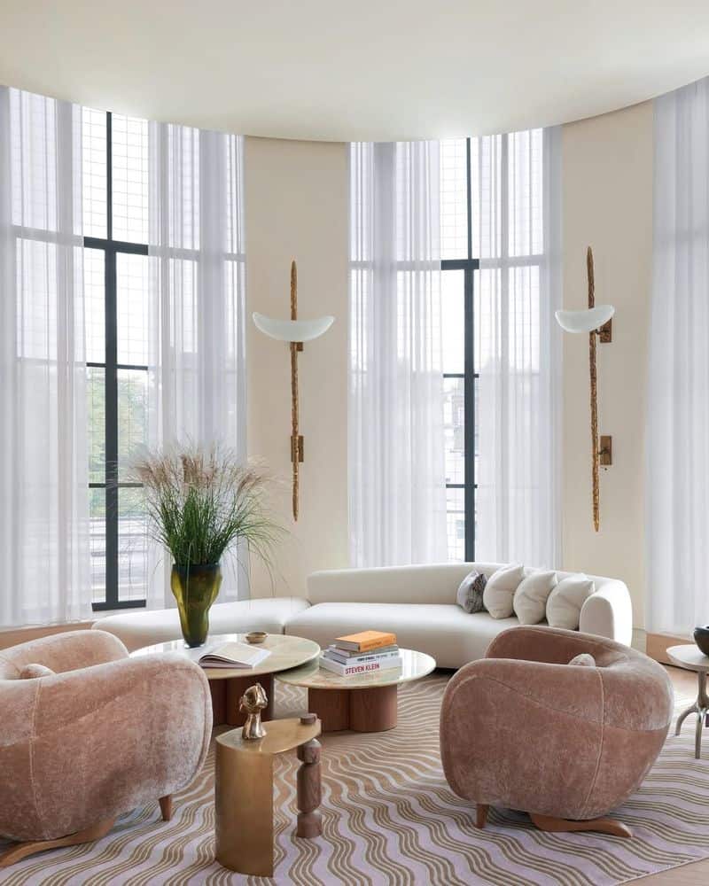
6. Soft Pink Ambiance
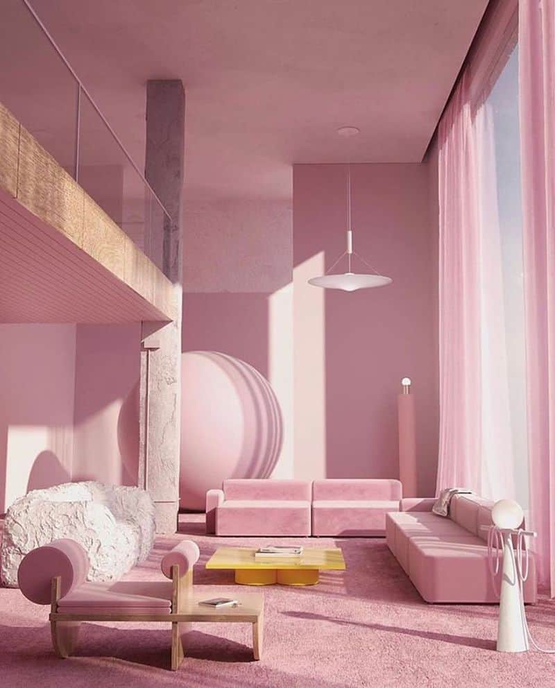
Pink isn’t just for little girls’ rooms; it’s a versatile color that can exude sophistication and charm. Envision a space enveloped in soft pink hues that radiate warmth and comfort.
Mix blush with dusty rose for a gentle, cohesive look. This palette is perfect for creating a serene atmosphere in bedrooms or lounges.
Don’t forget to add luxurious fabrics and subtle lighting to enhance the romantic, inviting ambiance.
7. Muted Earthy Tones
Earthy tones bring nature indoors, offering a sense of grounding and balance. Think of a dining area where muted browns and ochres create a cozy, welcoming atmosphere.
By blending sienna with muted greens and grays, you can achieve a harmonious, nature-inspired palette. This approach suits any space aiming for comfort and warmth.
Use natural textures like stone or clay to heighten the organic feel, making your earthy monochrome palette truly stand out.
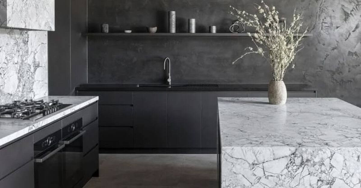
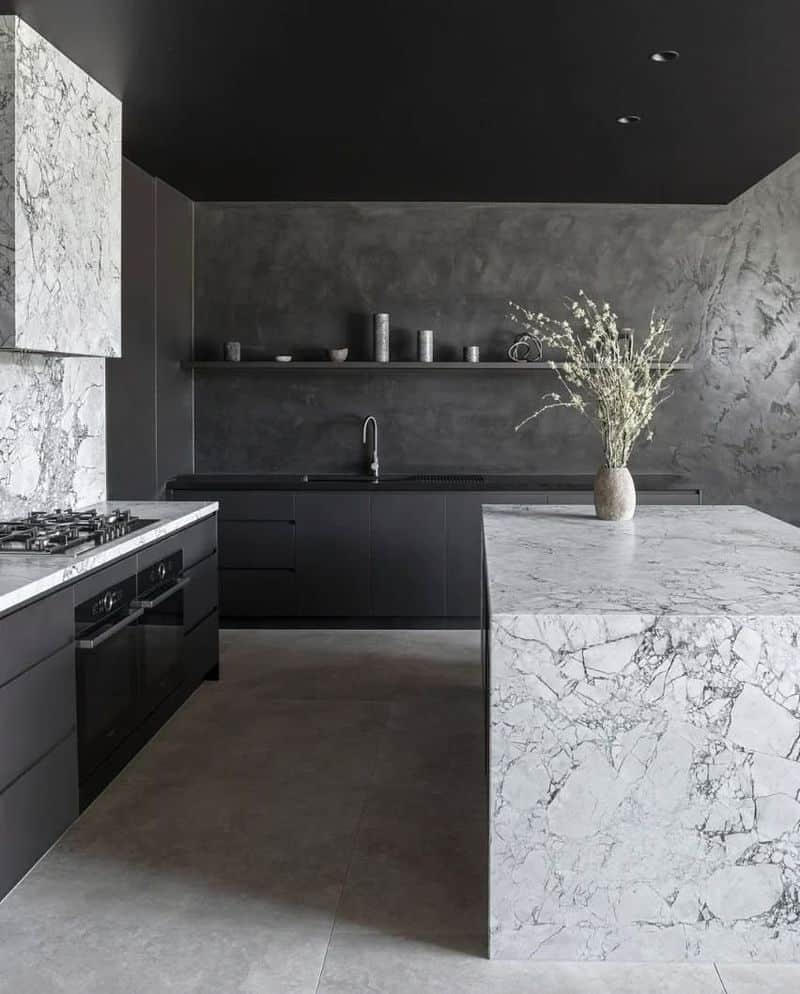
8. Cool Monochrome
Cool monochromes are perfect for creating a modern, crisp environment. Imagine a space dominated by cool blues and grays, offering a refreshing escape.
Pair icy blues with frosty grays to create a sleek, contemporary look. This palette is ideal for open spaces like living rooms or modern kitchens.
Incorporate metallic elements to add shine, ensuring your cool monochrome scheme is both stylish and dynamic.
9. Neutral Transitional Style
Neutral tones offer flexibility, making them ideal for transitional styles that bridge traditional and contemporary designs. Visualize a bedroom where taupe and beige harmonize effortlessly.
The key is in subtlety, using these tones to create a serene, adaptable space. This palette suits any home looking to blend different design elements.
Enhance the calming effect with minimalist decor and soft lighting, ensuring your neutral scheme feels both timeless and modern.
10. Le Corbusier’s Architectural Polychromy
Le Corbusier’s polychromy revolutionized architectural design with bold color statements. Envision a space where vibrant color blocks define the architecture.
This approach is perfect for adding drama and interest to otherwise minimalistic spaces. Pair bold hues like primary reds and blues for a striking contrast.
Accentuate with simple, functional furniture to keep the focus on the architectural details, creating a space that’s both artistic and practical.