Painting a room white might seem like the ultimate design hack for a bright, clean space, but there are times when it might not be the best choice.
From moody atmospheres to practical concerns, here are 10 places where white just won’t do.
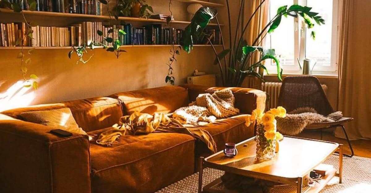
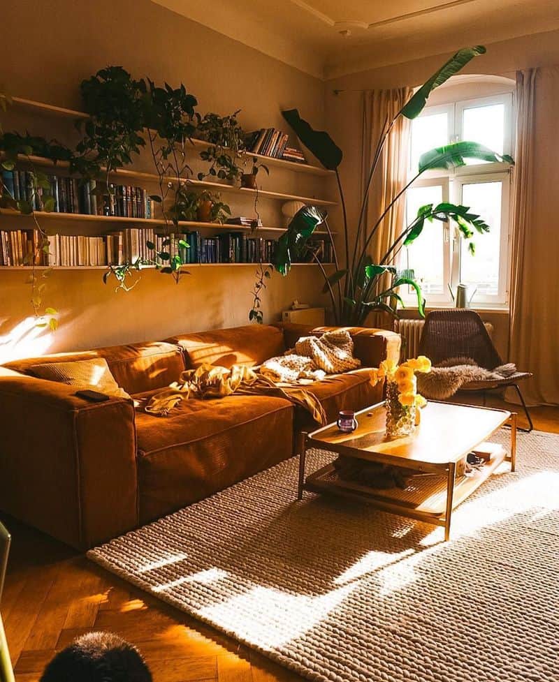
1. Rooms with Limited Natural Light
White paint can dull a room that already struggles with natural light. In such spaces, white walls can appear gray and lifeless. Instead, opt for warmer tones to bring a sense of coziness.
Imagine a snug reading nook with deep greens or warm rusts that highlight the little light available. These colors absorb shadows and reflect warmth, transforming a gloomy corner into an inviting retreat.
Consider how a soft amber glow from a lamp can enhance this warmth, creating a sanctuary from the outside world. Embrace the dimness; let it wrap around you like a comforting hug.
2. Spaces Facing Greenery
Painting a room white when it overlooks a garden can make the interior seem cold against the vibrant greens outside.
The stark contrast can clash, making the room feel disconnected from its natural surroundings. Instead, use soft earth tones to blur the line between inside and out.
Visualize the calming effect of sage or a muted terracotta that complements the garden view. These colors create harmony, drawing the lush exterior indoors.
It’s like inviting nature to play a more prominent role in your space, making you feel part of the landscape rather than observing it from afar.
3. High-Traffic Areas
White paint in areas like hallways or kitchens is risky; scuffs and fingerprints become glaringly obvious. In these high-traffic zones, durability is key.
Imagine a hallway bustling with life—kids, pets, guests—each leaving their mark. Here, rich, forgiving colors like deep blues or charcoals can hide the inevitable wear and tear.
These shades maintain their appearance longer, requiring fewer touch-ups. Consider the ease of cleaning these robust hues compared to pristine white.
The choice is practical yet stylish, ensuring that your walls can withstand the hustle and bustle of daily life without looking worn.
4. Rooms Requiring Warmth and Coziness
White walls can feel stark and clinical, the antithesis of the warmth you might crave in a cozy room.
Envision a snug living area with plush, soft furnishings surrounded by warm, inviting colors like deep red or a rich ochre.
These hues envelop the room in a comforting embrace, perfect for relaxing evenings by the fire. The warmth radiates from the walls, creating an atmosphere of intimacy and relaxation.
Imagine the sensation of sinking into a soft sofa, the room aglow with a gentle firelight that dances across the richly colored walls, wrapping you in a sense of homely comfort.
5. Industrial or Clinical Aesthetics
Sometimes, white adds too much of an industrial or clinical vibe to a room.
In spaces where warmth is needed, such as a home office or dining room, stark white can make the environment feel unfriendly and sterile.
Picture a space where metallic finishes and white walls make it seem more like a hospital than a home. Using warmer grays or soft blues can soften the industrial edge, adding a subtle warmth.
These hues make the space feel lived-in and welcoming while maintaining a modern aesthetic. Think of it as adding a whisper of warmth to counterbalance the harshness.
6. Open-Plan Layouts
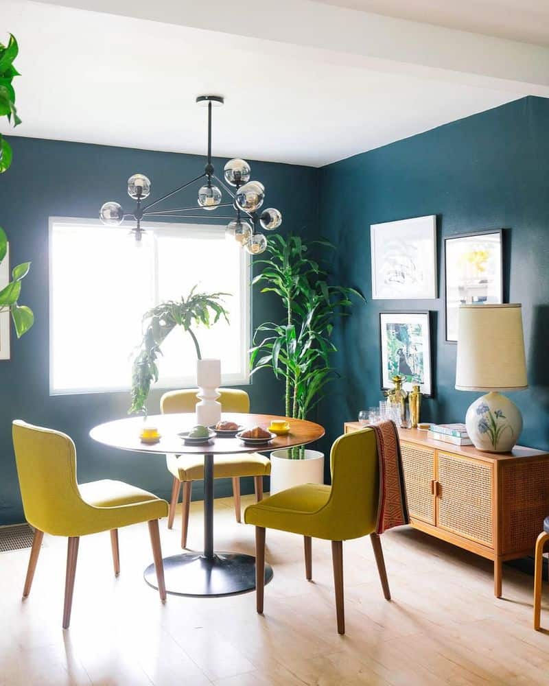
In an open-plan layout, painting everything white can result in a bland and undefined space. These areas benefit from color to delineate different zones.
Envision an open kitchen and living room where varied hues create distinct yet harmonious areas. A splash of color on one wall might signify the dining area, while another shade marks the lounging space.
This approach adds personality and functionality, guiding the flow of the space seamlessly. It’s like organizing an open book, where each chapter stands on its own yet contributes to the whole story.
Color becomes an essential design tool here.
7. Rooms with White Ceilings
Pairing white walls with white ceilings can make a room feel flat and uninspired. Instead, use color on the walls to create visual interest and depth.
Consider a bedroom where muted lavender or cool teal adds dimension against a white ceiling. This subtle contrast draws the eye upward, giving the illusion of height and spaciousness.
The room feels more dynamic, each wall playing its own role in the overall design.
It’s like the difference between a black-and-white sketch and a colored painting; the latter offers richness and allure that the former simply can’t match.
8. Spaces with Existing White Decor
In a room already brimming with white furniture and accents, white walls can lead to a monotonous look. Instead, consider introducing color to create contrast and interest.
Imagine a lounge with white sofas, where a backdrop of warm olive or gentle coral provides a striking contrast. This pop of color invigorates the space, making each white piece stand out.
It’s like framing a painting, the color setting the scene and adding context.
The room feels curated, each element purposefully placed to highlight its best features, ensuring the space is lively and engaging rather than one-dimensional.
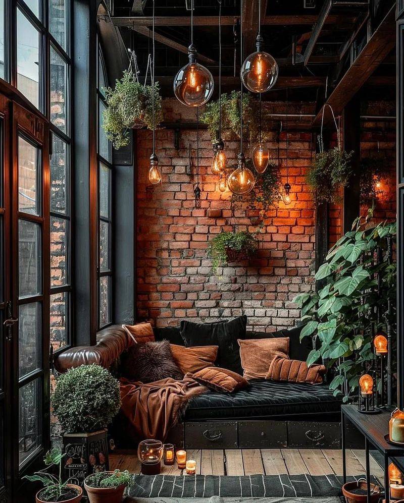
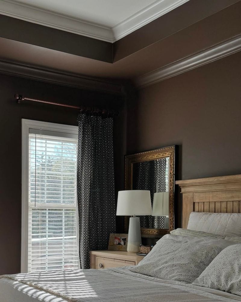
9. Rooms Prone to Shadows
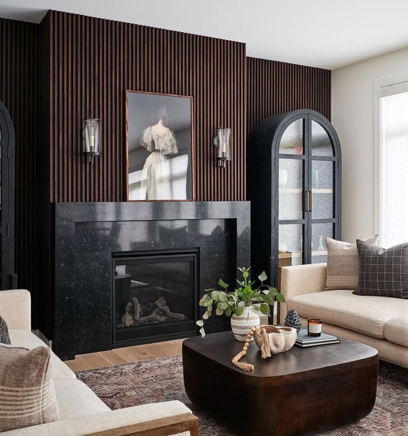
In rooms prone to shadows, white walls can amplify the darkness, creating a cold and unwelcoming environment. Instead, embrace the shadowy nature with deep, dramatic tones.
Picture a dining room where charcoal or navy walls turn shadows into features, adding layers and texture.
These rich colors create a mood of sophistication and mystery, transforming shadows into intriguing elements of the design. Lighting becomes an ally, highlighting and softening as needed.
This approach turns a potentially dreary space into one of elegance and intrigue, where every shadow plays its part in the atmospheric drama.
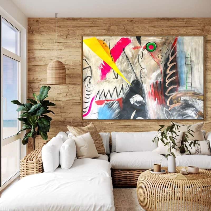
10. Personal Preference for Color
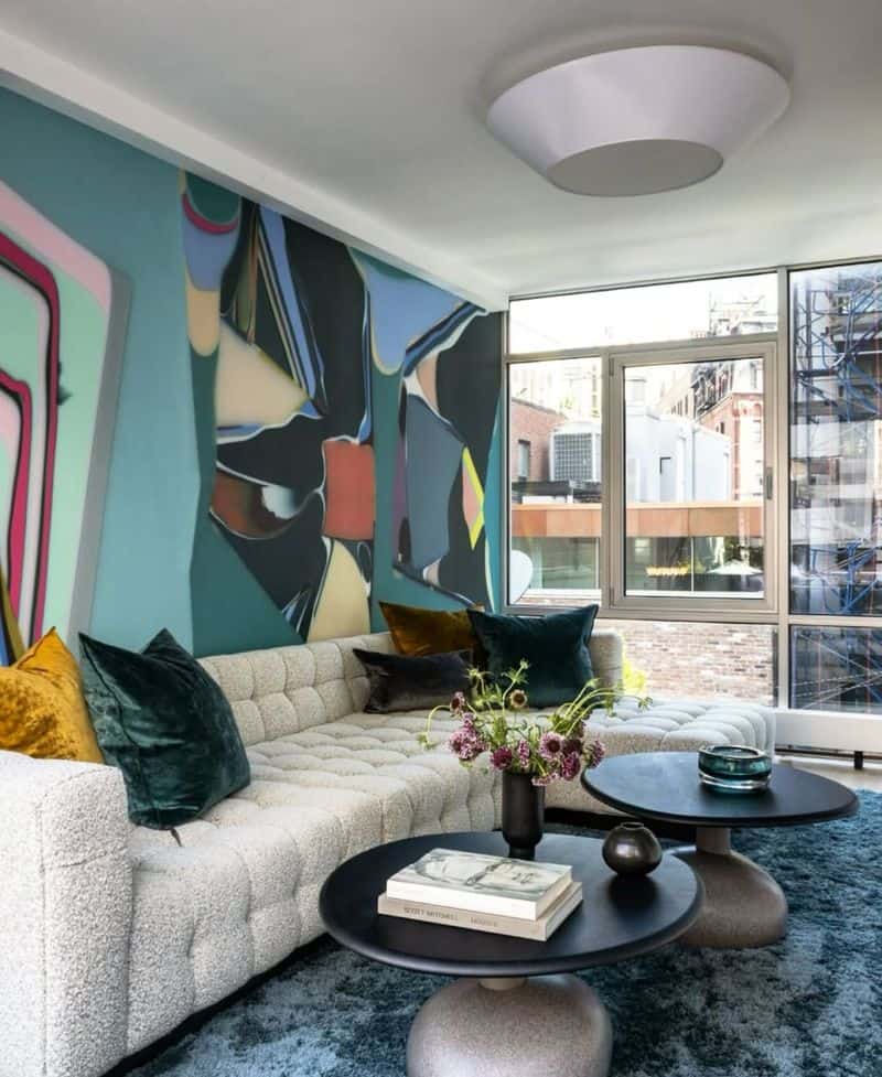
Sometimes, a white room simply doesn’t align with personal taste. For those who thrive in vibrant environments, color is an expression of personality.
Imagine a creative studio splashed with sunshine yellows and bold purples, each wall narrating a story or emotion. This explosion of color fosters creativity and energy, making the space uniquely yours.
It’s a canvas where personal tastes reign supreme, every shade and hue a reflection of individuality.
Such a room is not just for living but for experiencing, where every glance around inspires joy and a sense of belonging in one’s own colorful world.