Choosing the right floor color is crucial for your home’s aesthetic. The wrong hue can clash horribly with decor and ruin the ambiance you aim to create.
Here’s a detailed look at 10 floor colors you might want to avoid if you’re seeking a harmonious living space.
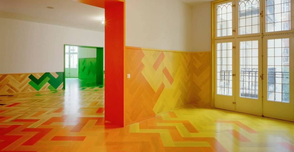
1. Bright Orange
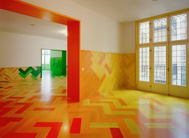
Bright orange flooring can overpower a room’s design. It’s bold but doesn’t blend well with many color schemes.
This vibrant shade often clashes with cooler tones, leading to an unsettling environment. For those who prefer a calm and cohesive look, bright orange is a risky choice.
2. Hot Pink
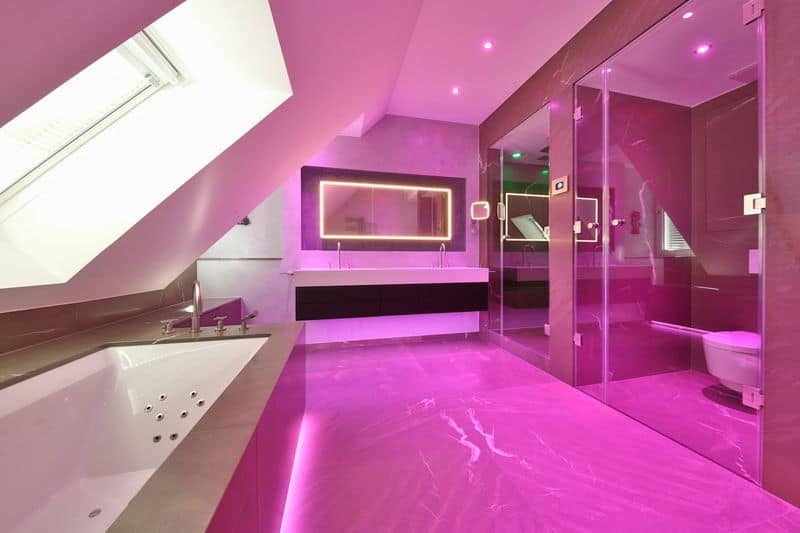
Hot pink floors can be polarizing. They may seem fun, but they often clash with other colors and materials.
In a kitchen, for instance, this vibrant hue can make stainless steel appear cold and unwelcoming. It’s a color that attracts attention but not necessarily in a good way.
3. Dark Purple
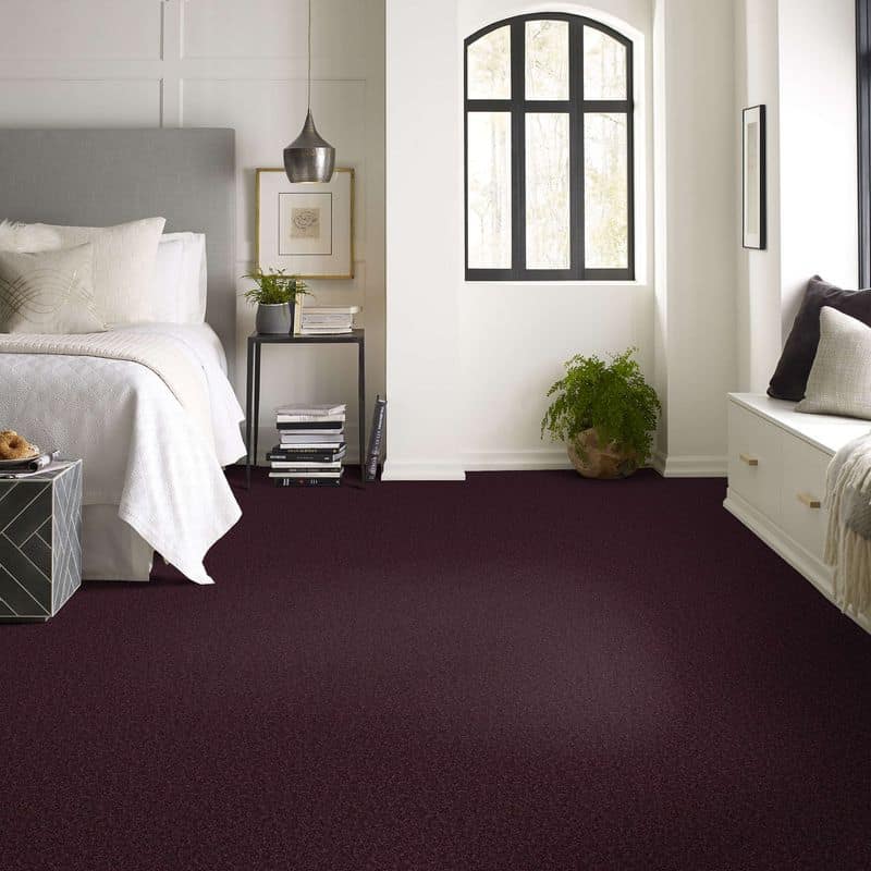
Dark purple floors can create a gloomy vibe. This intense color might drown out lighter or brighter decor elements, making spaces feel smaller and more constrained.
While it can add drama, it often does so at the expense of light and space, impacting the room’s openness.
4. Bright Yellow
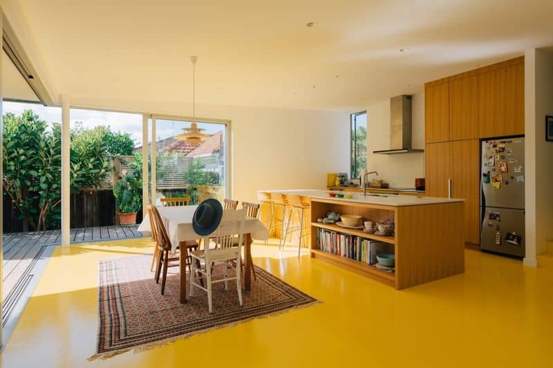
Bright yellow floors struggle to blend seamlessly with other elements. Although cheerful, this color can clash with more subdued tones, creating a disharmonious space.
In rooms like bathrooms, it often fights against cooler shades, undermining the intended calm and relaxing atmosphere.
5. Jet Black
Jet black flooring can appear sleek but is high-maintenance. It highlights every speck of dust and dirt, demanding constant cleaning.
In a dining room, this can be particularly problematic, as crumbs and spills become glaringly obvious. Black also absorbs light, making spaces seem smaller.
6. Baby Blue
Baby blue floors often clash with warmer tones. While soft and gentle, this color can appear too childish for more sophisticated spaces.
In an office, for instance, it can create a discordant atmosphere when paired with rich, warm woods, making it difficult to achieve a professional look.
7. Lime Green
Lime green flooring tends to clash with traditional or antique decor. It’s a bold choice that rarely complements other colors, making spaces feel unbalanced.
While it can inject energy, it’s often at the cost of elegance and harmony, especially in more classical or period-style homes.
8. Crimson Red
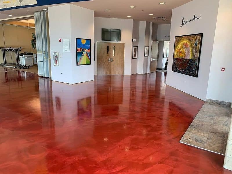
Crimson red floors are intense and dominate any space. This color can overpower softer, neutral tones, creating a space that feels aggressive rather than inviting.
In living rooms, red might draw attention, but often at the cost of peace and relaxation, essential for comfort.
9. Neon Green
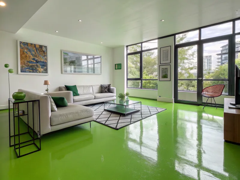
Neon green floors can be overwhelming. They clash with most decor styles, creating a discordant vibe.
This bright hue might appeal initially, but it often results in visual fatigue. A mismatch for classic or minimalist designs, neon green tends to dominate, leaving little room for subtlety or harmony.
10. Pastel Mint
Pastel mint floors, while delicate, can clash with bold primary colors often found in children’s spaces.
This subtle hue might seem calming, but it leads to visual discord when mixed with the bright and varied colors of toys and furniture, disrupting the playful and vibrant vibe required in nurseries.