Choosing the right paint color for a kid’s bedroom isn’t just about aesthetics; it’s also about creating a space that feels comfortable and inspiring. However, some colors just don’t make the cut.
Here’s a rundown of the 10 worst paint colors designers cringe at when it comes to decorating a child’s room.
1. Neon Green
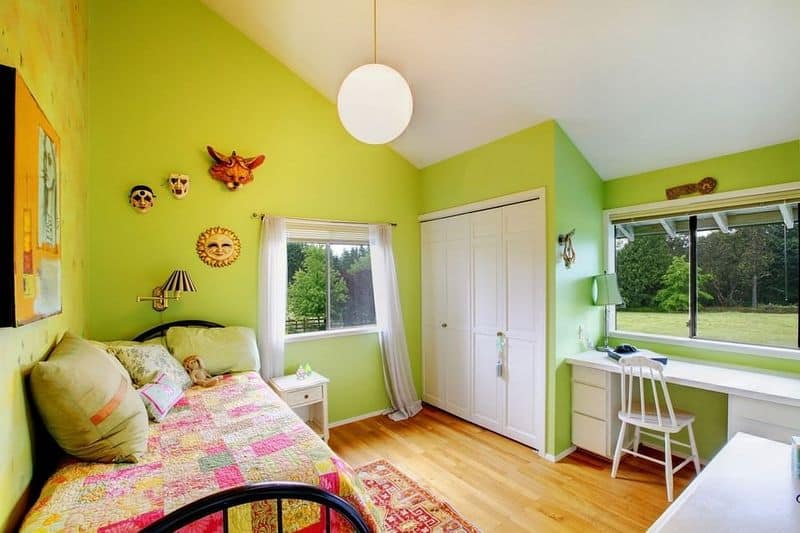
Neon green might catch your eye, but it can overwhelm a child’s senses. The intense brightness is anything but relaxing, often causing more agitation than tranquility.
This color takes the spotlight in the worst way possible, making it difficult for other elements in the room to shine.
Imagine toys, bedding, and wall art trying to compete with walls that scream for attention. Parents might think neon green is a fun choice, but children may end up feeling restless and irritated.
A softer green or pastel might still offer that lively touch without the harsh glare.
2. Dark Purple
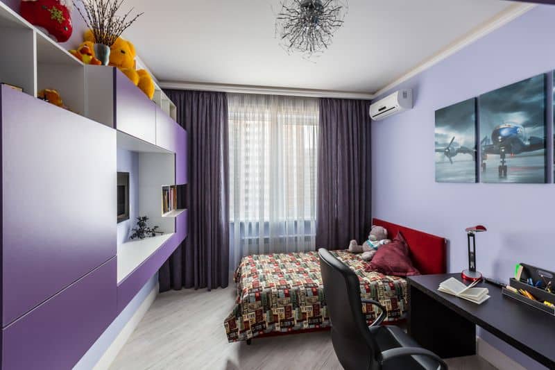
Dark purple might seem regal, but it casts a shadow over the playful energy needed in a child’s room. This deep hue absorbs light, leaving the space feeling small and dreary.
Instead of invoking creativity, it closes off the room’s potential for imagination.
While some might consider it sophisticated, children often prefer bright and airy spaces. Dark purple can be intimidating and may even lead to feelings of gloom.
Opting for a lighter shade of lavender can keep the regal charm without sacrificing the room’s lively spirit.
3. Bright Red
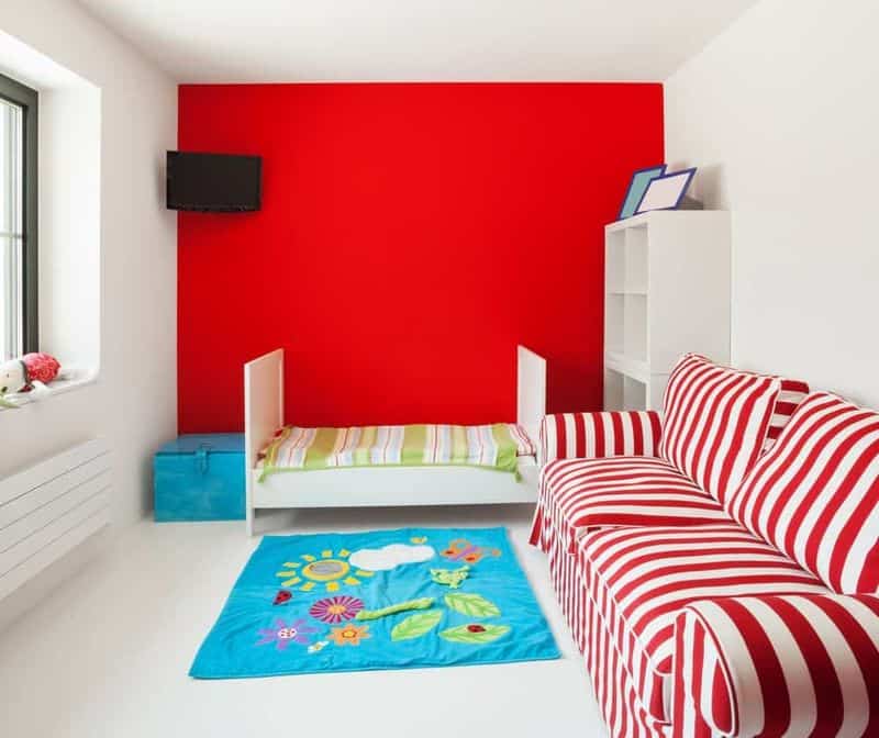
Bright red is known for its intensity and energy, but it might be too stimulating for a child’s bedroom.
This fiery shade can heighten emotions, leading to restlessness and difficulty focusing on calm activities like reading or sleeping.
While red can be exciting, it’s often better suited for play areas where energy is welcomed. In a bedroom, this color can overpower the senses, making relaxation a challenge.
To maintain a lively spirit without the chaos, consider using red as an accent rather than a dominant wall color.
4. Black
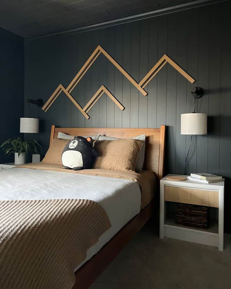
Black, though striking, is a heavy choice for a child’s room. This color is best left to accents rather than full wall coverage.
It can create a somber mood, making it difficult for children to feel at ease and playful.
The absence of light that black brings might stifle creativity, casting shadows rather than illuminating joyous moments.
For parents looking to employ black, consider pairing it with bright, cheerful accents to lift the mood. Better yet, save black for spaces where sophistication, rather than fun, is the goal.
5. Orange
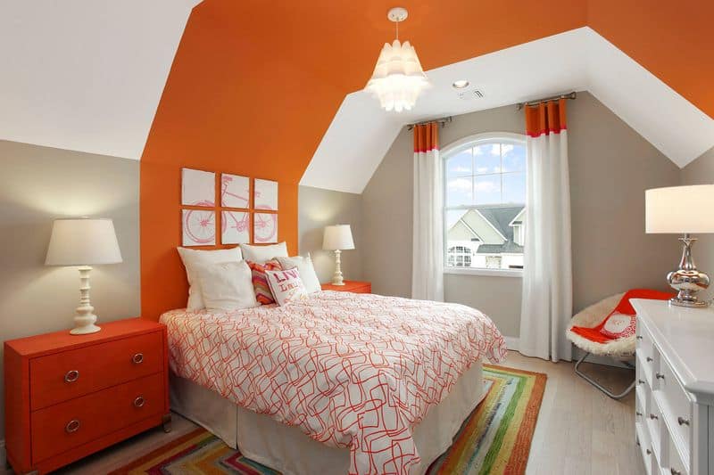
Orange is often seen as a fun, energetic color, but it can quickly become overwhelming in a child’s bedroom. This shade is loud and demanding, often clashing with other colors and patterns in the room.
While orange might seem playful, it can be difficult to decorate around, leading to a chaotic rather than harmonious space.
Instead of bright orange, a peach or softer shade can bring warmth without the visual noise. It’s all about balance, ensuring the room feels inviting rather than overpowering.
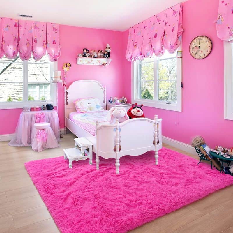
6. Pastel Pink
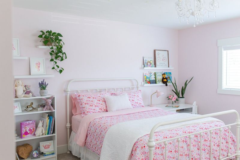
Pastel pink is a classic choice, but it can feel cliché and uninspired. While it does bring a gentle touch, it often leads to gender stereotypes, limiting room design to overly girly themes.
Kids need spaces that encourage diversity and creativity.
The softness of pastel pink can become monotonous, lacking the dynamic quality a child’s room deserves.
Consider using it sparingly or mixing it with more gender-neutral shades to foster a more inclusive environment. Incorporating various colors can lead to a much more imaginative space.
7. Beige
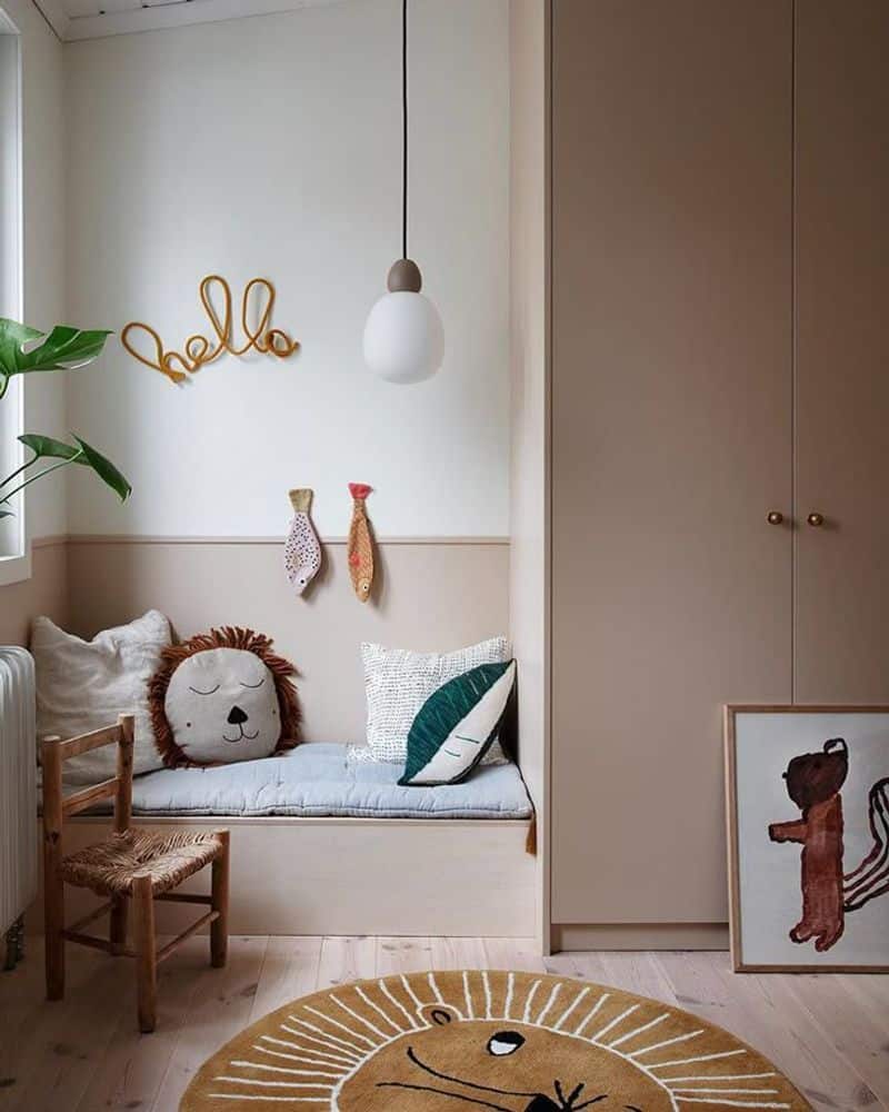
Beige might be neutral, but in a kid’s room, it translates to boring. This color lacks the personality and excitement that children crave in their personal spaces.
Though it provides a blank canvas, it often leads to uninspired decor.
Without bold features, a beige room feels flat and uninviting. Children thrive in environments that stimulate their senses, and beige simply doesn’t deliver.
For a more engaging alternative, consider adding pops of color that can easily be updated as the child grows, keeping the space fresh and vibrant.
8. Yellow
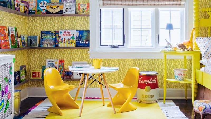
Yellow is a cheerful hue, but when too bright, it can overwhelm a child’s bedroom. This sunny shade reflects light intensely, often leading to overstimulation instead of a calm retreat.
While yellow can bring warmth, it needs careful balancing. In excess, it may cause irritability, making it harder for children to unwind.
A mellow yellow or muted tone might provide the desired cheerfulness without the sensory overload. This way, the room remains a joyful haven without becoming a jarring experience.
9. Hot Pink
Hot pink is bold and unapologetic, but it can overpower a child’s bedroom. This vibrant color commands attention, often making it challenging for other elements to coexist harmoniously.
While some might view hot pink as fun, it can quickly become overwhelming. Its intensity can lead to a visually chaotic environment, leaving little room for relaxation or focus.
Instead, consider using hot pink as an accent, allowing the space to breathe while still capturing that playful essence kids love.
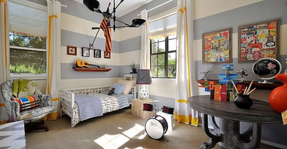
10. Gray
Gray might be trendy, but in a child’s room, it often feels dull and lifeless. This neutral hue lacks the energy and vibrancy needed to ignite a child’s imagination and playfulness.
While gray can provide sophistication, it falls short in delivering the stimulating environment kids need.
Incorporating colorful accents or vibrant artwork can help breathe life into the space, offering both style and creativity. It’s about finding the right balance that allows a room to feel lively, not drab.